kage
kage
cpcty.xyz
Design analysis
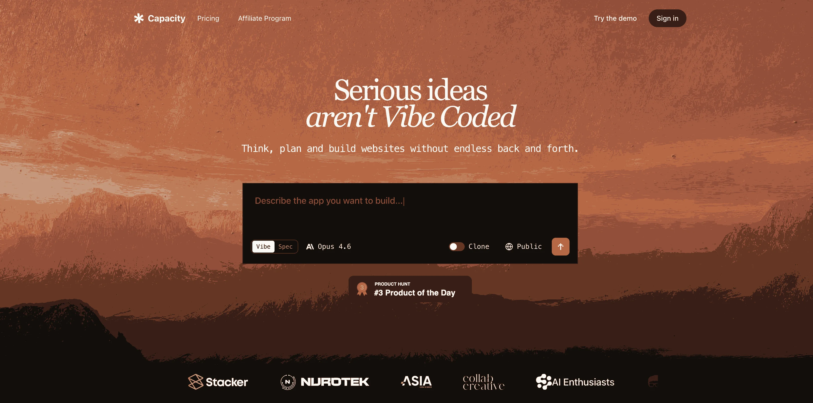
A 1200×630 social card built on a warm dusk-gradient backdrop that shifts from near-black at the edges to amber/orange in the centre, giving the headline a natural focal glow. A slim dark navigation strip with a wordmark and pill buttons anchors the top, then a large centred headline in cream type reads over the gradient, followed by a small supporting line. A floating product screenshot sits mid-card as proof-of-product, and a row of partner logos grounds the bottom. The composition uses the classic OG pattern — brand mark, one message, product proof, social proof — all within a single warm, cinematic colour treatment.
Prompt preview
## Reference images

Study these alongside the description below: hierarchy, rhythm, spacing, colour. Build for the product you are asked about, using this design language.

- Screenshot: https://kage-design-assets.t3.tigrisfiles.io/screenshots/capacity-so/53ec5ec1-3b06-4829-a348-c4f5738b6160-1791551913154.webp
- Design on Kage: https://kage.design/designs/capacity-og-image

## Before you start
Ask the user what product the social card is for, who the audience is, and what brand assets they already have (name, wordmark, logo, colours, typeface, headline). Wait for the answers. Everything below is applied to their brand, not to the reference.

## Goal
Produce a single **1200×630 social card image** (Open Graph / Twitter card). Implement it as HTML/CSS sized to exactly 1200×630 and render to PNG (e.g. with Playwright/Puppeteer), or as a standalone SVG. All text must remain crisp at small sizes.

## Page structure (top to bottom, all inside the 1200×630 canvas)
1. **Background layer**: a cinematic radial gradient — near-black (#0d0a08) at the top and bottom edges warming to amber/orange (#c86a2a → #e8934a) in the centre-upper third, so the headline area glows. Optionally add very subtle grain/noise to avoid banding.
2. **Top nav strip (optional, ~48px tall)**: a slim, darker translucent bar with a small wordmark on the left and 2–3 pill-shaped ghost buttons on the right — it frames the card and makes it feel like a real product moment rather than a poster.
3. **Headline block (vertically centred, upper-middle)**: one large headline in a warm cream/off-white (#f5ede2), ~56–72px bold, max-width ~800px, centred. One line only if possible; two max. Below it a single supporting subline, ~20–24px, in a muted warm tone (~70% opacity).
4. **Product proof (middle-lower)**: a floating screenshot or stylised UI mock of the user's product — a rounded rectangle card (~700–800px wide) with a soft drop shadow, slightly overlapping the gradient's darker lower half. Keep it small enough to leave breathing room; it is evidence, not the hero.
5. **Logo strip (bottom)**: a single row of 4–6 small, monochrome, low-contrast partner/customer logos centred near the bottom edge, ~40–50% opacity — social proof without competing with the headline.

## Design language
- **Focal hierarchy in one direction**: brand/nav → headline glow → product shot → logos. Eye flows top-to-bottom; only the headline and product card get full contrast, everything else is dimmed.
- **Colour rule**: one warm duotone (near-black + amber/orange + cream) carries the whole card. Use the gradient's brightest point directly behind the headline so light draws the eye, not decoration.
- **Type**: a single geometric or grotesque sans, bold weight for the headline, regular for the subline. Never mix more than two type sizes above the logos.
- **Shape treatment**: soft, generous border radius (~12–16px) on the product card and pill buttons; no hard rectangles anywhere.
- **Depth**: one soft, warm-tinted drop shadow on the floating product card only; the nav and logos stay flat.
- **Contrast discipline at small size**: test the render at ~200px wide — the headline must still be legible and the logos may blur but the headline must not.

## Never
- Do not use the reference product's name, wordmark, copy, logo, illustration style, or any of its actual text.
- Do not present the result as capacity.so or reuse its headline.
- No photography of people; no icon sets copied from the reference.