kage
kage
openswarm.com
Design analysis
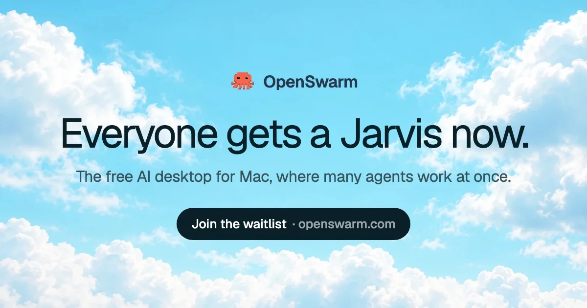
A 1200×630 social card built as one centered stack over a full-bleed photograph of bright sky and cumulus clouds. Hierarchy is purely typographic: a ~100px bold neo-grotesque headline in blue-black ink dominates the optical middle, bracketed by a small pixel-mascot wordmark lockup above and a full-radius dark pill CTA ('Join the waitlist · openswarm.com') below. Clouds are pushed to the corners so the central band stays calm and legible; the orange pixel mascot is the single saturated accent, and there are no cards, borders or shadows — depth comes entirely from the sky.
Prompt preview
## Reference images

Study these alongside the description below: hierarchy, rhythm, spacing, colour. Build for the product you are asked about, using this design language.

- Screenshot: https://kage-design-assets.t3.tigrisfiles.io/screenshots/openswarm/7ad4a3a2-bce8-4e46-b915-8b367fd80e74-1791525639402.webp
- Design on Kage: https://kage.design/designs/openswarm-og-image

## Before you start
Ask the user what product this card is for, who it is for, the exact headline, subline and domain they want shown, and what brand assets they already have (name, icon, colours, typeface). Wait for the answers. Everything below is applied to their product; if assets are missing, use neutral placeholders (their name, a simple icon shape, their domain).

## Deliverable
Produce a single **1200×630** social share card — either an HTML/CSS file sized exactly 1200×630 (no scroll, fixed viewport) rendered to PNG via a headless browser/screenshot step, or a self-contained 1200×630 SVG. Do not use responsive layout; the canvas is fixed.

## Page structure (top → bottom, one vertical centered column)
1. **Background (full canvas):** a full-bleed bright daytime sky — vertical gradient from vivid azure (≈`#7EC8F0`) at top to pale sky (≈`#C9E9FA`) below, with soft white cumulus cloud shapes concentrated in the four corners and lower edge. Keep the central band (roughly x:15–85%, y:20–75%) calm so text sits on clean gradient.
2. **Brand lockup (≈15% down):** a small icon (~40×40px, one playful element — e.g. pixel-art style mascot or simple mark) beside the wordmark in bold ~34px dark ink, horizontally centered as one row, ~12px gap.
3. **Headline (optical middle, ≈40% down):** one short declarative sentence on a single line if it fits, ~96–104px bold, tight tracking (-0.03em), blue-black ink. This is the dominant element — roughly 3× the wordmark size.
4. **Subline (≈44px below headline):** one line, ~30px regular, muted blue-gray, stating platform + one concrete benefit.
5. **CTA pill (≈72% down):** a full-radius dark pill (`#16232B`), ~56–64px tall, white ~26–28px semibold text in the pattern `Action phrase · domain.com` separated by a middle dot with thin spacing. Nothing else below it except background.

## Design language
- **Composition:** one centered column, all elements on a shared horizontal axis; vertical rhythm = lockup → large gap → headline → small gap → subline → larger gap → pill. Whitespace is the only separator; the card is airy, never dense.
- **Type:** a single neo-grotesque sans (Inter/Helvetica-class) for every element; hierarchy comes from size and weight steps (104 / 34 / 30 / 28), not from different typefaces or colour changes. Max four text elements on the card.
- **Colour:** sky blues `#7EC8F0` → `#C9E9FA`, cloud white `#FFFFFF`, ink `#16232B` (blue-black) for headline/wordmark, secondary text `#3D4A52`. Exactly one saturated accent (from the brand mark, e.g. orange `#F97316`) used once — in the icon only, never in text.
- **Contrast & legibility:** dark ink directly on the light sky, no text plates; never place text over dense white cloud detail. If the background is a photo, darken/pick a calm zone or add a subtle top-down scrim behind the text band.
- **Shape & depth:** the pill is the only filled, rounded element (radius = full). No cards, borders, strokes or drop shadows anywhere; depth comes from the sky gradient and cloud forms.
- **Tone & copy pattern:** headline = short, punchy, ends in a period; subline = `The [category] for [platform], where [key benefit]`; CTA = verb phrase + domain. One playful element (the icon) offsets the clean type so the card reads optimistic, not corporate.

## Never
- Never reuse the OpenSwarm name, octopus mascot, the copy "Everyone gets a Jarvis now." / "The free AI desktop for Mac…" / "Join the waitlist · openswarm.com", or that exact sky photograph.
- Never present the result as OpenSwarm's card; ship it as the user's brand or a clearly generic placeholder.
- Never add extra badges, screenshots, partner logos, heavy illustration, or text over busy cloud texture — one message, one stack, one accent.