kage
kage
luneresearch.com
Design analysis
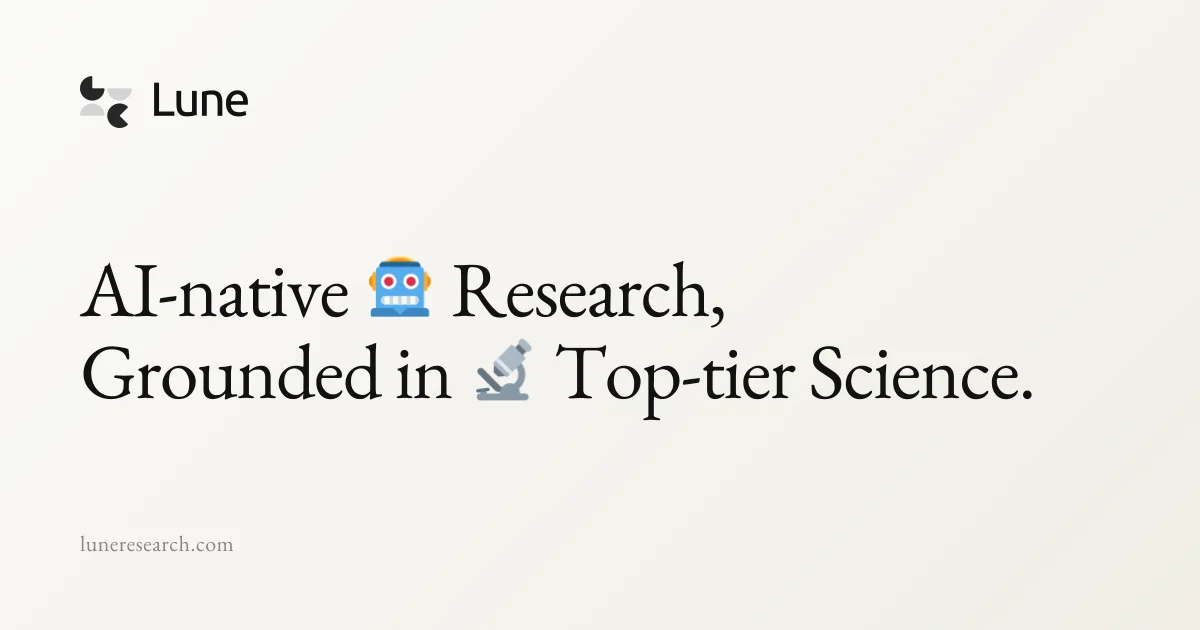
A 1200×630 share card built almost entirely from typography on a warm cream gradient: a small geometric mark plus serif wordmark top-left, an oversized two-line serif headline mid-left with inline emoji acting as the only colour, and a muted domain at bottom-left. All elements share one left axis with vast empty space on the right, so the ~100px headline against the 22px footer URL carries the hierarchy. The scholarly serif voice and paper-like background read as editorial restraint rather than tech-flash.
Prompt preview
## Reference images

Study these alongside the description below: hierarchy, rhythm, spacing, colour. Build for the product you are asked about, using this design language.

- Screenshot: https://kage-design-assets.t3.tigrisfiles.io/screenshots/lune/b101bd05-3922-4637-99fc-13196ba53772-1791698433714.webp
- Design on Kage: https://kage.design/designs/lune-og-image

# 1200×630 social share card

## Before you start
Ask the user what product or project this card is for, who it is for, and what brand assets they already have — name, logo, brand colours, and typeface preferences. Wait for the answers before building. Everything below is applied to *their* brand, not to any reference product.

## Page structure
Produce a single landscape image, exactly 1200×630 (deliver as HTML/CSS sized to that viewport and rendered to PNG, or as a standalone SVG — no scrolling, no responsive variants):

1. **Background** — one full-bleed warm cream canvas with a very subtle diagonal gradient (slightly lighter at the top-left, a touch deeper and warmer at the bottom-right). No texture, no pattern, no border.
2. **Brand lockup, top-left** — a small abstract logo mark (two or three simple geometric shapes, drawn in near-black and one muted grey — circles, crescents or squares are fine) sitting on the same baseline as the product name set in a serif face, roughly 48–56px. Position it ~90px from the top and ~90px from the left.
3. **Headline block, middle-left** — the hero statement in two lines, left-aligned, starting around 40% of the canvas height. Set it in a classic serif (e.g. a Georgia/Playfair/Tiempos-class face) at roughly 96–108px with tight-but-not-cramped line height (~1.15). Break the copy so each line reads as a complete phrase. Embed two emoji inline within the sentence, sized to the type, one per line — they are the only saturated colour on the card.
4. **Footer, bottom-left** — the domain or handle in the same serif, ~22–24px, in a muted warm grey, sitting ~70px above the bottom edge on the same left axis as everything above.

## Design language
- **One axis, three stops**: every element left-aligns to a single vertical axis (~90px margin). Hierarchy comes purely from position and size, never from boxes, rules or dividers.
- **Scale contrast does the work**: three type sizes only — wordmark (~50px), headline (~100px), footer (~22px). The headline should dominate at roughly 8× the footer size; that gap is what makes the card read at thumbnail scale in a Slack or X preview.
- **Colour discipline**: near-black ink (#17150F–#1A1A18) for wordmark and headline, muted warm grey (#8F8A7E–#9B968A) for the footer, cream gradient background from about #F7F4EC to #E9E4D8. The emoji are the only colour pops — if the user's brand has an accent colour, restrict it to one or two small inline accents the same way, never to backgrounds or full words.
- **Serif-only, flat everything**: one serif family across all three scales gives a scholarly, editorial voice. No shadows, no strokes, no rounded cards, no buttons — the image is typography on paper.
- **Negative space as structure**: the top-right and bottom-right thirds stay empty. Copy occupies a column covering roughly the left 60% of the canvas; resist the urge to fill the rest.
- **Emoji as punctuation, not decoration**: place them mid-sentence where a natural pause falls, so they read as part of the sentence rather than stickers.

## Never
- Do not use the Lune name, wordmark, crescent moon logo, or the exact copy from the reference card — substitute the user's own name and message in the same compositional slots.
- Do not add photography, illustrations, gradients beyond the faint background wash, drop shadows, borders, badges, or a second typeface.
- Do not centre the composition or add elements to the empty right half; the left-weighted asymmetry is the design.