kage
kage
Design analysis
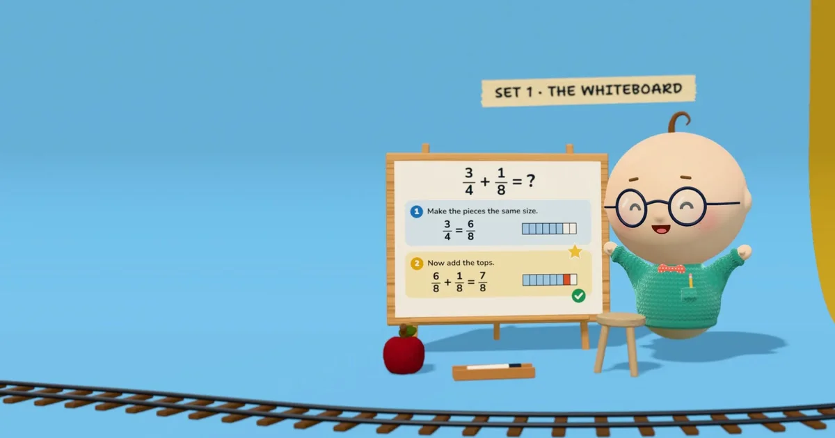
A 1200×630 social card that stages the product as a toy playset: a flat sky-blue field, a toy railway track curving along the bottom edge, and a 3D claymation tutor — sphere head, round glasses, teal knit sweater, arms thrown up — standing beside a wooden easel whiteboard carrying a two-step fraction lesson with segmented fraction bars, a gold star and a green check. A torn paper tape reading "SET 1 · THE WHITEBOARD" sits above the board as the headline, while the left ~40% of the canvas is left as empty blue so the focal cluster breathes and stays legible at thumbnail size. There is no wordmark; identity is carried entirely by the mascot, the set dressing and the tape label, with a warm wood/cream palette and red, yellow and teal used as single semantic accents.
Prompt preview
## Reference images

Study these alongside the description below: hierarchy, rhythm, spacing, colour. Build for the product you are asked about, using this design language.

- Screenshot: https://kage-design-assets.t3.tigrisfiles.io/screenshots/albie/4376bf10-7c3c-42b8-87e1-f0a1c6c81faa-1791439455758.webp
- Design on Kage: https://kage.design/designs/albie-og-image

# Design a 1200×630 Open Graph social card

Produce **one static image, exactly 1200×630**, delivered either as an HTML/CSS page (1200×630 body, no scroll) screenshotted to PNG at 2× and downscaled, or as a standalone SVG. Use **placeholder branding and placeholder content** throughout — nothing from the reference product.

## Before you start
Ask the user these questions and wait for the answers before writing any code:
- What product or feature is the card announcing, and what single idea should the card communicate?
- Who is the audience (kids, developers, executives…)? This sets the tone of the set dressing.
- What brand assets exist: name, tagline, colours (hex), typeface, and is there a mascot or logo shape to feature?
- Where will it be shared (X, LinkedIn, Slack, iMessage)? Confirm they need the 1200×630 format.

## Page structure
1. **Background field** — the full 1200×630 canvas is one flat, saturated colour (a sky blue ≈ `#77B7E4` in the reference; substitute the user's brand field colour). Add only a very subtle radial lightening toward the upper centre.
2. **Ground motif** — a repeating toy-like contour (railway track, scalloped path, dashed trail) hugging the bottom edge and curving gently upward toward one side. It occupies the bottom ~10–12% of the canvas and visually "seats" everything above it. Keep it low-contrast against the field.
3. **Focal cluster (right 55–60% of width)** — two elements grouped as one scene, sitting on the ground line:
   - A **framed board/panel on a stand** (wood frame ≈ `#C8995F` with corner pegs, cream paper face ≈ `#FBF3E2`, soft drop shadow falling to the lower left). Inside it, show the product actually working: 2–3 numbered steps, each with a small round numbered badge (blue `#2E7FD9`, then orange), a one-line instruction in a rounded sans at 28–34px, and a small concrete visual — segmented horizontal bars, blocks or a mini chart — that demonstrates the idea. Mark one step with a gold star and the final step with a green check (`#3AA76D`).
   - A **character or mascot element** beside the board at matched height: built from 3–4 simple shapes (one big head shape, small egg body, one signature accessory like oversized glasses, one bright clothing colour such as teal `#2FB7A6`), posed energetically (arms raised, leaning in). It must read clearly at 300px wide.
4. **Headline tape** — a small torn-paper or sticker strip just above the board, rotated −2° to +2°, carrying a short all-caps label (scene/feature name) in a hand-drawn marker style, dark gray `#3B3B3B`, 36–44px. This is the card's only "headline" — no separate H1 block.
5. **Props** — two or three small objects near the base of the board (an apple, a pencil tray, a stool equivalent) to fill the lower right and add depth. Each gets its own soft elliptical shadow.
6. **Negative space** — the left ~40% of the canvas stays completely empty field colour, crossed only by the ground motif. Do not fill it; this is the safe zone that keeps the composition calm and crop-tolerant.

## Design language
- **One flat field, one focal cluster.** Hierarchy comes from placement, not from adding more elements: a single saturated background, one scene placed off-centre at roughly 60–85% horizontal, generous emptiness on the opposite side.
- **Diagonal balance.** The ground motif curves one way, the tape headline sits high, the subject sits low-right — the eye travels tape → board → character → ground.
- **Toy-set logic.** Every object is placed on the ground line with a soft, blurred elliptical shadow from a single upper-right light. No hard outlines, no long dramatic shadows; everything feels like clay on a playmat.
- **Board content is the demo.** The card proves the product by showing a real, nearly-finished lesson/task on the board — numbered steps, small data visuals (rounded segmented bars, one filled in blue with a single red accent segment), progress marks (star, check). Copy is short: instruction lines under ~45 characters.
- **Accent economy.** Red, yellow and green each appear exactly once and each means something (an object, an achievement, a completion). They are semantic, never decorative filler.
- **Type pairing.** One hand-drawn/display caps face for the tape headline only; one clean rounded sans for all in-board text. Two sizes total: headline ~40px, body ~30px at full 1200×630 scale. Nothing smaller — assume the card is previewed at 300–600px wide.
- **Warm/cool split.** Cool saturated field (blue) against warm props (wood, cream, yellow star ≈ `#F6B93B`) so the focal cluster pops without outlines or glows.

## Never
- Do not copy Albie's mascot (baby with single hair curl, round glasses, red bow tie, teal knit sweater), the "SET 1 · THE WHITEBOARD" tape text, the fraction-lesson copy, the toy railway track, or the apple/pencil-tray/stool prop set. Substitute the user's own mascot or an abstract brand shape, their own feature name, and their own demo content.
- Do not add a conventional wordmark, logo lockup, tagline paragraph, photographic imagery or real third-party logos; the reference card carries identity through character and set dressing alone.
- Never present the result as Albie's card or imply affiliation; the deliverable is a card in this composition style for the user's own product.