kage
kage
aside.com
Design analysis
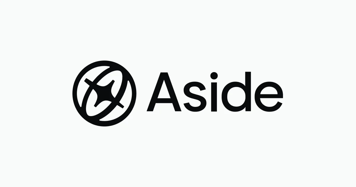
A 1200×630 social card reduced to a single centered logo lockup: a black compass-like circular mark (a ring with an orbiting ellipse and four-point star) beside the wordmark "Aside" in a heavy geometric sans. The off-white background and vast empty margins do all the work — the lockup occupies roughly the middle third, giving the card a calm, confident, almost print-like presence. There is no headline, tagline, or imagery; the brand mark alone carries hierarchy through scale and pure black-on-ivory contrast.
Prompt preview
## Reference images

Study these alongside the description below: hierarchy, rhythm, spacing, colour. Build for the product you are asked about, using this design language.

- Screenshot: https://kage-design-assets.t3.tigrisfiles.io/screenshots/aside/6a689bc8-9872-4a01-9807-2ff8021b6393-1789452036588.webp
- Design on Kage: https://kage.design/designs/aside-og-image

## Before you start
Ask the user what product or company the card is for, who it is for, and what brand assets they already have (name, logo/SVG, colours, typeface). Wait for the answers before building. Everything below is applied to their brand, not to the reference product.

## Goal
Produce a single social share card (Open Graph / Twitter summary_large_image) sized exactly **1200×630**. Build it as a standalone HTML file with a 1200×630 fixed-size stage (render to PNG with a headless browser, or export an equivalent SVG). Use placeholder branding and copy if the user hasn't supplied assets.

## Page structure
1. **Canvas**: one full-bleed background layer, off-white (#F5F5F2).
2. **Focal lockup, centered both axes**: an abstract geometric mark (circular, built from a thick ring plus one or two simple intersecting strokes or shapes) at ~220px, optically aligned to the left of the wordmark with ~40px gap; wordmark in a bold geometric sans at ~200px cap height, pure black (#0A0A0A). Nothing else on the canvas.

## Design language
- One idea per card: a single centered lockup, no headline, no tagline, no URL unless the user asks.
- Generous negative space — the lockup should occupy only the middle ~50% of width; margins feel deliberate.
- Palette restricted to two values: near-black on warm off-white (#0A0A0A on #F5F5F2). Optional single accent only if the brand demands it.
- Type: one geometric grotesque (e.g. a system-safe equivalent of Inter/Poppins bold), tight letter-spacing (-0.02em), no mixed weights.
- The mark should be simple enough to read at 60px — thick strokes, no fine detail, flat fills, no gradients or shadows.
- Optical centering: nudge the lockup up ~1% since cap-height sits above mathematical center.

## Never
- Never reuse the reference's compass/orbit mark, the word "Aside", or its specific letterforms — invent a distinct placeholder mark and name.
- No stock illustration, photography, or emoji.
- Never present the output as belonging to the reference product.