kage
menlo.ai
Design analysis
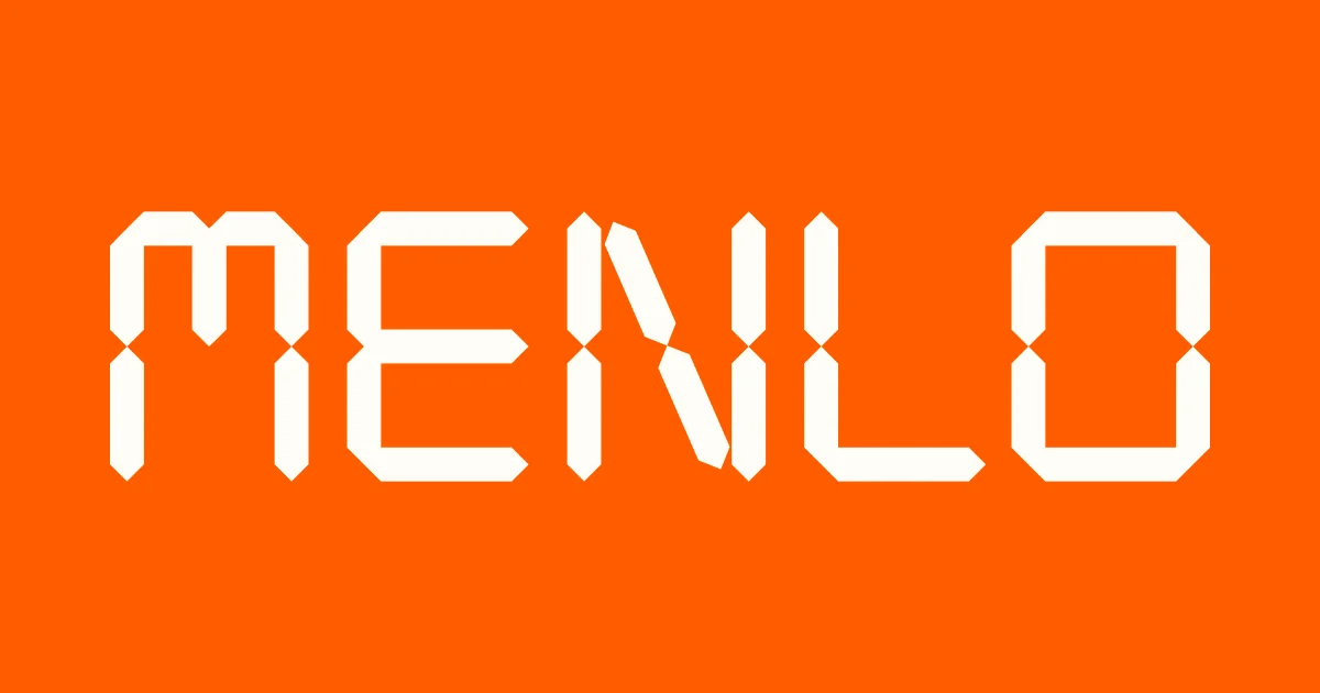
A maximal social card: a solid saturated orange field with a single oversized geometric wordmark filling nearly the full canvas width. The letters are drawn from angular, robot-kit–like segments with notched joints — a logotype that itself does the work of product imagery — so no headline, photo or product shot competes. Extreme figure–ground contrast and generous padding give it instant legibility at thumbnail size.
Prompt preview
## Reference images

Study these alongside the description below: hierarchy, rhythm, spacing, colour. Build for the product you are asked about, using this design language.

- Screenshot: https://kage-design-assets.t3.tigrisfiles.io/screenshots/asimov-1/3220711a-8ad5-4bdb-9b3f-58285b275f72-1792562734903.webp
- Design on Kage: https://kage.design/designs/asimov-1-og-image

## Before you start
Ask the user what product or project the card is for, what one word or short wordmark should appear, and any brand colours they already have. Wait for the answers before building. Everything below is a composition to adapt, not copy.

## Task
Produce a single 1200×630 social card (OG image), rendered as HTML/CSS to PNG or as an SVG.

## Page structure (canvas composition)
- **Full-bleed background**: one flat, saturated brand colour (e.g. vivid orange #FF5B00) with no gradients, imagery or texture — the colour is the brand.
- **Single focal element**: a wordmark set enormous and centred, occupying ~80% of the canvas width and roughly the vertical middle third. Build the letterforms from angular segments with notched/mitred joints (a geometric, robot-kit or seven-segment-inspired display face), so the type itself evokes the product instead of a photo.
- **Nothing else**: no tagline, no URL, no logo lockup, no product imagery. If the user insists on a secondary line, keep it tiny (≤24px) in the bottom-left corner in the same white.

## Design language
- **Rule of one**: one background colour, one element, one idea. Scale does all the hierarchy work.
- **Type**: white (#FFFFFF) display letterforms on the saturated ground; letterspacing slightly tightened so the wordmark reads as a single shape.
- **Contrast**: max figure–ground contrast; the mark must survive a 200×105 thumbnail.
- **Padding**: generous, even margins (~80–100px) on all sides; no elements touch the canvas edge.
- **Motion**: none — it's a static asset; keep it a single exported image.

## Never
No wordmarks, letterforms, names or copy from the reference (do not render "MENLO"). Use the user's own brand word in placeholder-safe geometry; never present the card as belonging to the reference product.