kage
composio.dev
Design analysis
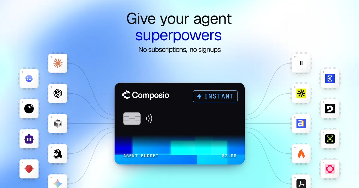
A 1200×630 social card built around a metaphor: a dark virtual credit card sits at centre as the single focal object, framed by two staggered columns of app-icon tiles whose connector lines curve into the card like a chip's contact points. Type hierarchy is three-step and centre-aligned — large sans headline with the key word in saturated blue, small subline in gray — leaving most of the canvas to the soft blue-to-cyan gradient wash behind the card. The mono "AGENT BUDGET $2.00" strip at the card's foot reinforces the pay-per-use story in one glance.
Prompt preview
## Reference images

Study these alongside the description below: hierarchy, rhythm, spacing, colour. Build for the product you are asked about, using this design language.

- Screenshot: https://kage-design-assets.t3.tigrisfiles.io/screenshots/composio-instant/969f0e43-9412-465b-be9b-ddde79d067bf-1792562786662.webp
- Design on Kage: https://kage.design/designs/composio-instant-og-image

Produce a **1200×630 Open Graph social card** (build it as HTML/CSS sized to 1200×630 and render to PNG, or as an SVG). Use entirely placeholder branding and copy — never the reference product's name, logo, icons or imagery.

## Before you start
Ask the user what product the card is for, who it is for, and what brand assets exist (name, wordmark style, one or two brand colours, preferred typeface). Wait for the answers before writing code. Everything below is a composition to adapt, not a template of the reference.

## Canvas structure (top to bottom)
- **Background (full canvas):** a soft radial gradient wash — light near-white/ice blue at the corners flowing into a saturated sky-blue and cyan glow behind the centre. It must stay airy and low-contrast so the dark focal object pops.
- **Headline block (top ~25%, centred):** two lines, large geometric sans (~56–64px), near-black; render the key word in a saturated brand blue. Below it a single small (~20px) gray subline of four to six words.
- **Central focal object (~40% down, horizontally centred, ~480×300):** a "virtual card" metaphor — a dark near-black rounded rectangle (radius ~24px) with a subtle top edge highlight and a soft drop shadow. Layout inside: wordmark + small outlined pill badge (uppercase, letter-spaced) top-left/top-right; a chip glyph and contactless arcs at mid-left; a footer strip with a translucent blue gradient bar, uppercase mono label (e.g. "BUDGET") on the left and a mono dollar amount on the right.
- **Side flanks (left and right of the card, full height):** two staggered vertical clusters of small rounded app-tile placeholders (~70×70, white, radius ~14px, thin light border, tiny notch dots on edges like chip packages). Use neutral generic glyphs (asterisk, circle, square, flame shape) in varied accent colours. Stagger rows so the columns aren't aligned grids. Draw thin, very light curved connector lines from each tile flowing inward toward the card's left and right edges, like traces into a chip — lines fade before touching the card.

## Design language
- One dark focal object on a light gradient field; all hierarchy radiates from it — keep everything else small, light and low-contrast.
- Three-step type scale only: hero line, accent line, small caption. Centre-align the top block; let the object own the rest.
- Colour budget: ~70% light blue/white field, ~20% near-black card, ~10% saturated blue/cyan accents. Exact accent hues from the user's brand.
- Rounded geometry everywhere (14–24px radii); borders 1px light gray; shadows soft and wide, never hard.
- Mono type for data/labels on the card (uppercase, wide tracking) to signal "machine-readable payments".

## Never
No logos, wordmarks, product names, real service icons, photography or copy from the reference. Use placeholder marks and generic copy only, and never present the output as the reference product.