kage
s.krea.ai
Design analysis
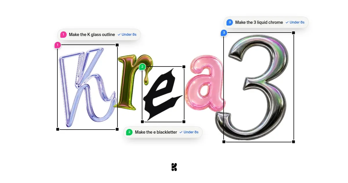
A 1200×630 launch card that turns the product name into a mock editing session: five glyphs, each in a different AI-rendered material (lavender glass K, olive liquid-chrome r, solid black blackletter e, pink inflated a, oversized iridescent-chrome 3), each boxed in a thin black selection rectangle with solid corner handles. Numbered white pills ("Make the K glass outline ✓ Under 8s") float around the frames with magenta, green and blue dots, so the eye reads the card as an edit sequence 1→2→3 rather than a headline. The near-white field, hairline black UI chrome and tiny bottom-center logo keep it airy and tool-like; scale contrast between the small middle letters and the giant chrome 3 does all the hierarchy work.
Prompt preview
## Reference images

Study these alongside the description below: hierarchy, rhythm, spacing, colour. Build for the product you are asked about, using this design language.

- Screenshot: https://kage-design-assets.t3.tigrisfiles.io/screenshots/krea-3/92870539-33d8-4f9b-b83f-45d725245023-1792389703141.webp
- Design on Kage: https://kage.design/designs/krea-3-og-image

## Before you start
Ask the user what they are promoting (a product, model version, or feature launch), who the audience is, and what brand assets they already have (name or wordmark, logo glyph, brand colours, typeface). Wait for the answers before designing — everything below is applied to their product and brand, not to the reference.

## Canvas
Produce a single **1200×630 social card** (for example an HTML/CSS page rendered to PNG at 2× = 2400×1260, or a standalone SVG). Near-white background (`#FAFAF8`–`#FFFFFF`), no border, no vignette. Keep all meaningful content at least 40px inside the edges — link previews crop margins on some platforms.

## Composition zones (top to bottom)
1. **Empty field**: the card breathes — roughly 15% clear margin at the top and 20% at the bottom. No headline text, no URL bar, no badges.
2. **Central typographic artwork (the whole message)**: spell the brand or product name in individual glyphs plus one oversized numeral/letter marking the version. Each glyph gets its own material treatment — one translucent glass/outline letter, one blobby liquid-chrome letter in an olive/gold tone, one completely flat solid-black display letter (a blackletter or heavy grotesque), one inflated glossy candy-coloured letter, and one hero glyph in mirror chrome with iridescent purple/blue/green shifts, roughly 2–3× the height of the others, dominating the right ~40% of the canvas.
3. **Selection frames**: wrap each glyph in a 1.5–2px black rectangle with 8–10px solid black square handles at the four corners, like a design-tool selection. Let frames overlap and glyphs overflow their boxes slightly so the row reads as a collage, not a typeset line.
4. **Annotation pills**: three floating white pills (fully rounded, soft 0–10px shadow, ~40–48px tall) anchored above-left, below-middle and top-right of their frames. Each pill contains: a coloured numbered dot (magenta `#EC4899`, green `#22C55E`, blue `#3B82F6`), a short imperative instruction written for the user's product (pattern: "Make the [element] [material/style]"), and a blue check chip reading "Under [X seconds/m whatever their real metric is]". Echo the dot colours as small matching tag chips clipped to the frame edges.
5. **Footer mark**: one small single-colour brand glyph, ~40px, centred at the very bottom with generous whitespace around it.

## Design language
- **Hierarchy by scale, not copy**: there is no headline — the artwork is the headline. One hero glyph carries the card; reading order is enforced by the numbered pills 1→2→3.
- **Rhythm through variety**: alternate glyph sizes, baselines and frame heights (large–small–small–medium–hero) so the eye travels left to right with a crescendo into the hero glyph.
- **Colour discipline**: a near-white field, black hairlines and exactly one solid black glyph as the 2D anchor; material colours limited to 3–4 saturated hues drawn from the user's brand (reference uses lavender-blue glass, olive-gold chrome, pink, silver) plus the three pill-dot accents. Nothing else is coloured.
- **Type**: all UI text (pill labels, chips) in a neutral grotesque sans, medium weight, 16–20px at 1200×630 scale; never mix a second UI typeface in. The display glyphs may each use a different face — that mismatch is the point.
- **Borders and shadows**: hairline black strokes and solid square handles for all frame UI; pills get only a whisper of shadow. Gradients live inside the rendered materials (chrome iridescence, glass refraction, glossy inflation), never on UI chrome or backgrounds.
- **Rendering the materials**: if image generation is available, render each glyph as a separate material pass and composite; otherwise approximate with layered CSS text using background-clip gradients, inset highlights and blur for glass/chrome, keeping the flat black glyph as crisp vector contrast.
- **Motion**: static image — no suggested animation.

## Never
- No Krea wordmark, logo glyph, or the word "Krea" spelled out in the artwork; use the user's own name.
- Do not reuse the reference's exact instruction copy ("Make the K glass outline", "Under 8s") or its exact letter/numeral-to-colour mapping; write equivalent instructions for the user's product and metric.
- No photography, stock icon sets, extra badges, or additional text blocks; the composition is strictly glyphs + selection frames + three pills + one logo mark.