kage
kage
audimate.ai
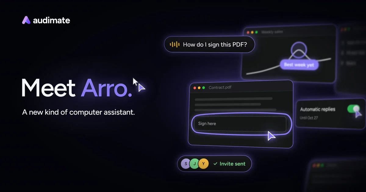
Design analysis
A 1200×630 social card uses a near-black canvas with a left-weighted typographic focal point and a softly blurred collage of assistant UI windows on the right. The small white wordmark sits in the upper-left, while the large “Meet Arro.” headline pairs white and violet text; thin purple outlines, cursor shapes, and glowing interface chips create depth without adding visual clutter.
Prompt preview
## Reference images

Study these alongside the description below: hierarchy, rhythm, spacing, colour. Build for the product you are asked about, using this design language.

- Screenshot: https://kage-design-assets.t3.tigrisfiles.io/screenshots/audimate/f4b9063d-692d-4f0d-b520-47ac3b3fbe7b-1792130544661.webp
- Design on Kage: https://kage.design/designs/audimate-og-image

## Before you start
Ask the user what they are building, who it is for, and what brand assets they already have, including the brand name, colours, typefaces, logo or mark, and preferred copy. Wait for their answers before designing. Apply everything below to their product rather than reproducing the reference brand.

## Page structure
- **1200×630 social-card canvas:** Create a fixed-ratio Open Graph image intended for sharing on social platforms, with a deep near-black background.
- **Upper-left brand lockup:** Place a small placeholder logo mark and wordmark with comfortable inset margins; keep it legible but subordinate to the headline.
- **Left-side headline block:** Set a short placeholder headline around the vertical middle-left, using a large two-part phrase with the first part in white and the key product or concept word in violet.
- **Supporting line:** Add one concise placeholder sentence beneath the headline in smaller white or cool-gray type.
- **Right-side product collage:** Fill the right half with several overlapping, dark translucent application-window fragments and floating assistant controls, suggesting the product working across familiar apps.
- **Floating interaction chips:** Include a few compact pill-shaped UI callouts—such as a question, action, status, or participant indicator—distributed around the collage rather than arranged as a conventional dashboard.
- **Foreground focal window:** Make one central-right window sharper and slightly brighter than the others, with secondary windows receding through blur, opacity, and scale.
- **Atmospheric finish:** Add restrained violet halos and soft bloom around active controls, keeping the left copy area comparatively clean for thumbnail readability.

## Design language
- **Build hierarchy through asymmetry:** Reserve roughly 40% of the canvas for copy and 60% for an energetic interface collage; keep the headline as the clearest element after the brand lockup.
- **Use a dark atmospheric palette:** Start with near-black/navy `#05060D` or `#070812`, use white `#F5F4FA` for primary type, cool gray `#A8A7B5` for supporting text, and violet accents around `#8B6CFF` to `#A78BFA`.
- **Pair clean geometric typography:** Use a modern sans-serif with a high x-height. Scale the headline generously, approximately 64–82px at 1200px width, with compact line height; use 18–26px for supporting copy and 16–20px for the wordmark.
- **Emphasize one phrase chromatically:** Keep most headline text white and colour only the key word or phrase violet; avoid multiple competing accent colours.
- **Construct interfaces as soft-glass layers:** Use charcoal panels with approximately 75–90% opacity, 1px violet-gray borders, 14–24px corner radii, and subtle inner highlights. Apply blur, reduced opacity, and lower contrast to background windows.
- **Use glow sparingly:** Add violet outer glows to active outlines, cursors, and pills with broad low-opacity shadows; the glow should create depth rather than make every element luminous.
- **Mix sharp and blurred depth:** Keep the main foreground UI and headline crisp, while placing partially cropped windows near the top-right and bottom-right with Gaussian blur, lower opacity, and slight perspective or rotation.
- **Make controls tactile but minimal:** Render pills with dark fills, thin lavender borders, compact white labels, and occasional small yellow or green status accents. Use simple abstract bars, dots, toggles, and cursor triangles instead of detailed icon sets.
- **Control the composition for social thumbnails:** Keep all essential branding and copy inside generous safe margins, avoid placing critical text behind imagery, and ensure strong contrast at small sizes.
- **Keep motion out of the final asset:** Produce a static PNG or SVG, though layered HTML/CSS may be used during generation to create blur, glow, and depth before rasterizing.

## Never
- Do not use the reference product’s logo, wordmark, product name, character name, exact headline, tagline, UI copy, or recognizable interface labels.
- Do not copy the reference imagery or reproduce its exact windows, arrangement, or branded visual assets; use placeholder branding, placeholder copy, and an original abstract application collage.
- Do not present the result as Audimate or imply affiliation with it.
- Do not deliver a webpage instead of the requested image: produce a 1200×630 social card, for example by rendering HTML/CSS to PNG or by generating an SVG and rasterizing it.