kage
kage
framerusercontent.com
Design analysis
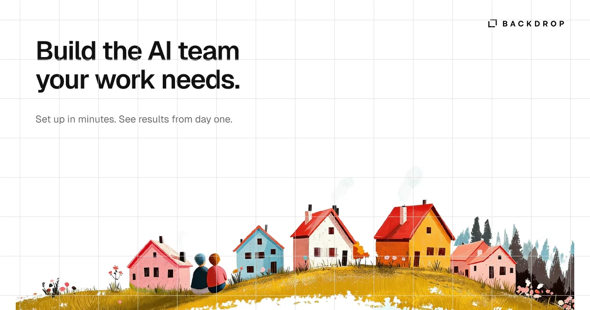
A 1200×630 social card built on a white field covered in a faint 1px grey blueprint grid. The upper-left quadrant carries a two-line ~80px heavy grotesque headline with a small grey subline beneath, while the only other type — a bracket glyph plus letterspaced-caps wordmark — sits quietly top-right. The bottom 40% is a painterly storybook scene (mustard hillside, red-orange and pink cottages, two seated figures, dark conifers) that bleeds off the bottom edge, trading the clinical grid above for warm, hand-made texture below.
Prompt preview
## Reference images

Study these alongside the description below: hierarchy, rhythm, spacing, colour. Build for the product you are asked about, using this design language.

- Screenshot: https://kage-design-assets.t3.tigrisfiles.io/screenshots/backdrop/e222b430-5f71-44c8-b1e1-8f8b634193b6-1792130584262.webp
- Design on Kage: https://kage.design/designs/backdrop-og-image

## Before you start
Ask the user what product or announcement the social card is for, who will see it when the link is shared (Slack, X, LinkedIn, iMessage), and what brand assets they already have (name, logo mark, colours, typeface). Wait for the answers. Everything below is a compositional template: apply it to *their* brand, copy and palette — never to the reference product.

## Page structure
Produce a single fixed-size image asset at exactly **1200×630** (the standard OG canvas). Build it as a standalone HTML file with a 1200×630 container rendered to PNG, or as an SVG. Zones, top to bottom:

1. **Background field** — full-bleed white with a faint blueprint grid: 1px lines at roughly 75–80px pitch, very low contrast. The grid runs under everything, including the illustration band, as texture rather than a layout constraint.
2. **Wordmark row (top-right)** — a small geometric brand glyph plus the product name in uppercase with wide letter-spacing, ~18–20px tall, sitting ~40px from the top and ~48px from the right edge. It is the only element in that corner; keep it small and quiet.
3. **Headline block (upper-left)** — the main message as a two-line statement, starting ~75px from the left and ~65px from the top, capped at roughly half the canvas width. Break the line at a deliberate, balanced point (e.g. "Build the AI team / your work needs." → their own equivalent claim in two lines of similar length).
4. **Subline** — one short supporting sentence, ~40px below the headline, flush with the same left edge, in muted grey. One line only.
5. **Illustration band (bottom ~40%)** — an original, warm, storybook-style scene anchored to and bleeding off the bottom edge: a golden hillside with simple cottages, small trees, wildflowers and one or two tiny human figures, massed centre-to-right so the headline keeps clear air above it. Build it from layered flat SVG shapes (hills, roof polygons, simple window/door rectangles, stylised trees) so it renders with no external assets; alternatively reserve this band as a clearly marked placeholder zone if the user supplies their own illustration.

## Design language
- **Two registers, one canvas**: a clinical, typographic top half against an organic, hand-illustrated bottom half. That contrast — precise grid and type above, painterly warmth below — is the core idea; preserve it even as you swap in new copy and art.
- **Grid texture**: lines at `rgba(17,17,17,0.06)`, 1px, 75–80px cells. Subtle enough to read as paper, not as a wireframe.
- **Colour**: near-white field `#FFFFFF`; ink text `#111111`; subline grey `#6E6E6E`. Illustration palette is warm and muted, max ~5 hues: mustard/olive gold `#B9891F`–`#C9A227` for terrain, brick red `#D95436` and blush pink `#F0A9B6` for buildings, dusty blue `#8FB8C6` as one accent, deep pine `#2E3A31` for trees. Keep all illustration colours desaturated so they never compete with the black headline.
- **Type**: one grotesque family throughout (Inter/Helvetica-class). Headline: weight 700–800, ~80px, line-height ~1.05, letter-spacing ~-0.02em, near-black. Subline: 24–26px, regular weight. Wordmark: 18px, uppercase, letter-spacing ~0.2em. Hierarchy reads headline → illustration → subline → wordmark.
- **Composition**: rule-of-thirds — the text mass owns the upper-left third, the illustration mass sits lower-centre/right; keep a band of empty grid between them rather than filling it.
- **Edge treatment**: let the illustration bleed off the bottom and slightly past the side edges; a few small white dapple/splatter marks over the illustration's bottom edge add hand-made texture. Corners are square — no rounded card container, no border, no shadow.
- **Motion**: none. This is a static export; design for legibility at small share sizes (headline must stay readable at ~500px wide).

## Never
Do not use the reference's name ("Backdrop"), its bracket-corner glyph, its headline copy ("Build the AI team your work needs.") or subline, or a reproduction of its village illustration. Use the user's placeholder brand, original copy, and an original illustrated scene in the same warm storybook spirit. Never present the output as the reference product.