kage
kage
make0.ai
Design analysis
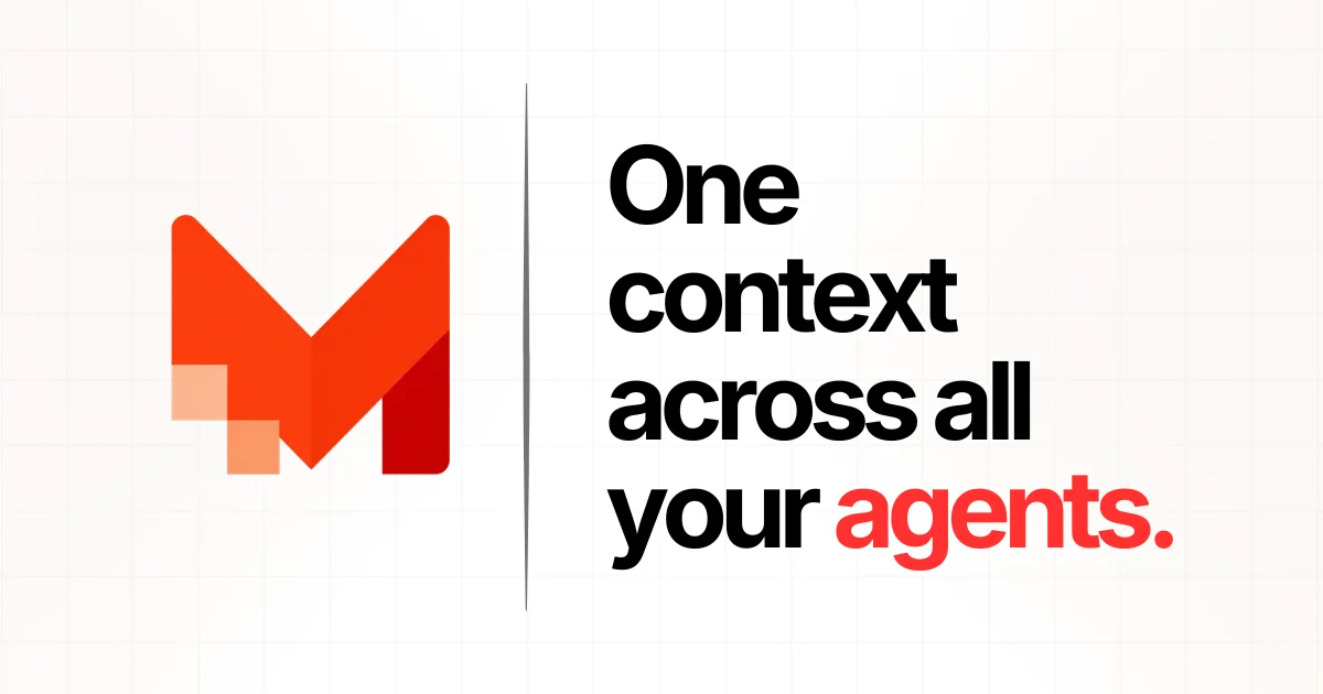
A 1200×630 share card on a warm off-white canvas textured with a faint blueprint grid. A single vertical hairline splits the frame: the left half holds one oversized angular lettermark in orange-to-red with two translucent squares stepping off its lower edge, while the right half stacks a four-line headline in a heavy black grotesque at roughly 120px with tight leading — only the final word and its period flip to the brand red. Two elements, one accent colour and extreme type scale do all the work, so the card stays legible at feed-thumbnail size.
Prompt preview
## Reference images

Study these alongside the description below: hierarchy, rhythm, spacing, colour. Build for the product you are asked about, using this design language.

- Screenshot: https://kage-design-assets.t3.tigrisfiles.io/screenshots/make0-brain/44a23ce6-18b1-49c5-b845-9316fd6aef86-1792044169586.webp
- Design on Kage: https://kage.design/designs/make0-brain-og-image

## Before you start
Ask the user what product this social card is for, who it is for, and what brand assets they already have: brand name, a logo or mark (or whether one must be invented as a placeholder), brand colours, tagline or one-line positioning, and any preferred typeface. Wait for the answers before designing. Everything below is applied to *their* brand — the reference is only a composition lesson.

Produce the card as a single self-contained HTML file sized exactly 1200×630 (render to PNG via screenshot) or as a standalone SVG. Export at 2× for crispness if raster.

## Page structure
A single fixed 1200×630 canvas, no scroll, no folds. Top to bottom / left to right:

- **Background layer**: full-bleed warm off-white with a faint square grid — 1px lines every ~90px at very low opacity, sitting over the whole canvas like graph paper.
- **Left zone (0–42% width)**: one large abstract brand mark, optically centred vertically and horizontally in its half, roughly 300–360px tall. This is the only imagery on the card.
- **Divider**: a single 1–2px vertical hairline running the full height of the canvas at ~42% width, separating mark from message.
- **Right zone (42–100% width)**: a stacked headline of 3–4 short lines, left-aligned, vertically centred, filling the zone nearly edge to edge. No subcopy, no URL, no badges — the headline is the entire right half.

## Design language
- **Two-element rule**: the card contains exactly one mark and one headline. Hierarchy comes from scale contrast between them, not from adding more content. If the user's copy needs a supporting line, it becomes part of the stacked headline, not a separate small-text block.
- **Type**: a heavy neo-grotesque (Inter Black / Helvetica Now Black class). Headline 110–130px, line-height 0.92–0.98, letter-spacing -0.02em to -0.03em, sentence case with a terminal period. Break the headline so each line is 1–2 words, ragged but intentional; never hyphenate.
- **One accent moment**: everything is near-black except one word (and the final period) set in the brand accent. Reserve the accent for that single moment so it reads instantly at thumbnail size.
- **Colour**: warm off-white ground ~#F6F3F0, text near-black ~#141414, accent orange-red ~#F0442A with a deeper shade ~#C21F1F for dimension inside the mark. Substitute the user's accent throughout; keep the same three-role structure (ground / ink / accent).
- **Texture over decoration**: the faint background grid (~black at 4–5% opacity) is the only ornament. No shadows, no glows, no radius — edges stay sharp and print-like.
- **Mark treatment**: build the mark from chunky angular shapes with a subtle two-tone or gradient inside it. Add a signature motif of 2–3 small squares in a lighter tint of the accent (~30–40% opacity) stepping off one corner of the mark — a small detail that rewards a second look.
- **Motion**: none — it is a static asset. Design it to survive being cropped to a square or read at 200px wide: strong silhouette, high contrast, no fine detail smaller than ~12px.

## Never
- Never reproduce the reference's M lettermark, the name "Make0", or the copy "One context across all your agents." — use the user's own name and tagline.
- No stock photography, no device mockups, no icon sets, no QR codes, no URL slugs pasted into the corner.
- Never present the result as the reference product or reuse its exact colour values unless they are the user's own brand colours.