kage
kage
framerusercontent.com
Design analysis
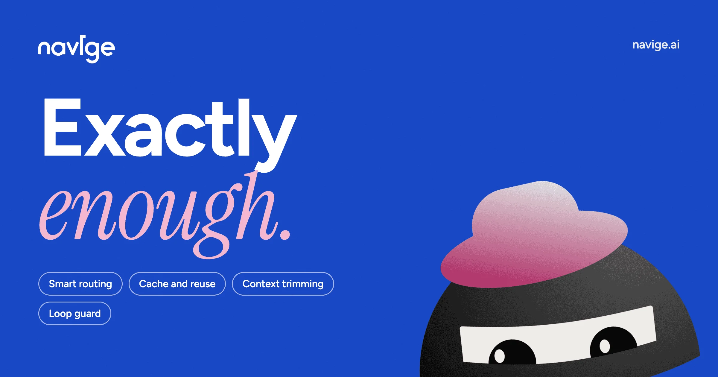
A single flat cobalt-blue canvas carries the whole card: the left column stacks a small lowercase wordmark, a two-line headline that pairs a heavy white geometric sans ('Exactly') with a soft pink italic serif ('enough.'), and four hairline-outline feature pills; corner metadata keeps the wordmark top-left and the domain top-right so the centre stays clear. The bottom-right corner is anchored by a flat black ninja mascot in a pink-gradient beret, deliberately cropped by the canvas edge for depth. Contrast comes entirely from type pairing and one accent colour — no boxes, borders or shadows anywhere.
Prompt preview
## Reference images

Study these alongside the description below: hierarchy, rhythm, spacing, colour. Build for the product you are asked about, using this design language.

- Screenshot: https://kage-design-assets.t3.tigrisfiles.io/screenshots/navige/0462fd70-0958-454d-9b99-97eadf1739b3-1792130596683.webp
- Design on Kage: https://kage.design/designs/navige-og-image

## Before you start
Ask the user what product this social card is for, who it targets and where it will be shared (X, Slack, LinkedIn, iMessage), and what brand assets they already have (name, wordmark, colours, fonts). Wait for the answers before designing. Everything below is applied to **their** product; if assets are missing, use placeholder branding and copy.

## Deliverable
Produce a **1200×630 social card image** as a single self-contained HTML file (inline CSS, no external requests) meant to be rendered to PNG — or a standalone SVG with text outlined if fonts can't be embedded. Note the export step: screenshot at exactly 1200×630 (2× for retina).

## Card structure
1. **Canvas** — one flat, saturated brand colour fills the entire frame edge to edge; no gradient, border, texture or vignette.
2. **Wordmark, top-left** (~64px inset) — the product name in lowercase, white, ~34px; small and quiet.
3. **Domain, top-right** (~64px inset) — the bare domain (e.g. `productname.com`) in white, ~20px, optically aligned with the wordmark.
4. **Headline block** — left-aligned in a column starting ~72px from the left edge, sitting slightly above vertical centre. Line 1: the product's promise in an ultra-heavy geometric sans, white, ~150–160px, tight leading. Line 2: a second word or phrase in a large **italic serif**, accent colour, ~130–140px, ending with a full stop. The lines left-align but deliberately clash in style.
5. **Capability pills** — under the headline, 3–4 hairline-outline chips naming key features in 2–3 words each, wrapping naturally onto a second row with a small gap.
6. **Hero graphic, bottom-right** — one flat vector illustration occupying roughly 40% of the canvas width, anchored so it is cropped by the bottom (and optionally right) edge, implying it continues beyond the frame.

## Design language
- **One colour does the structural work.** Pick a single saturated ground (the reference sits near cobalt `#2445F0`) and keep it perfectly flat; depth comes from composition, not effects.
- **Three colours total:** the ground, white for all type and strokes, and one warm accent — here soft pink `#F5C4D4` for the serif line, deepening to magenta `#C9409C` inside a single gradient on the illustration. The accent appears in exactly two places and nowhere else.
- **Hierarchy through type pairing, not containers.** A heavy grotesk (700–800 weight) for the primary line against a high-contrast italic serif for the response line creates the card's personality; the terminal period gives it a spoken, confident cadence. No boxes, dividers or shadows anywhere.
- **Scale:** wordmark ≈ 1/18 of canvas height, headline ≈ 1/4 of canvas height. Reserve ~55% of the width for the text column and let the graphic own the rest; keep outer margins generous (~64–72px).
- **Chips are the only UI element:** 1.5px white stroke, fully rounded (`border-radius: 999px`), transparent fill, no icons — their smallness against the giant headline establishes the tertiary layer.
- **Illustration stays flat vector:** 2–3 filled shapes in black/white with one linear-gradient accent, no outlines or shading, cropped by the canvas edge.
- **No motion** — this is a static export. Verify it reads in one glance at feed size: the headline must stay legible when the card is ~600px wide.

## Never
- Never reuse the reference's wordmark, domain, headline copy ("Exactly enough."), feature-pill wording, or the ninja-with-beret mascot — invent a placeholder brand name, domain, copy and a different simple character or object.
- Never present the result as the reference product; it is a composition template applied to the user's own brand.
- No photography, no UI screenshots, no stock illustration packs — typography plus one flat vector graphic only.