kage
kage
squadroom.app
Design analysis
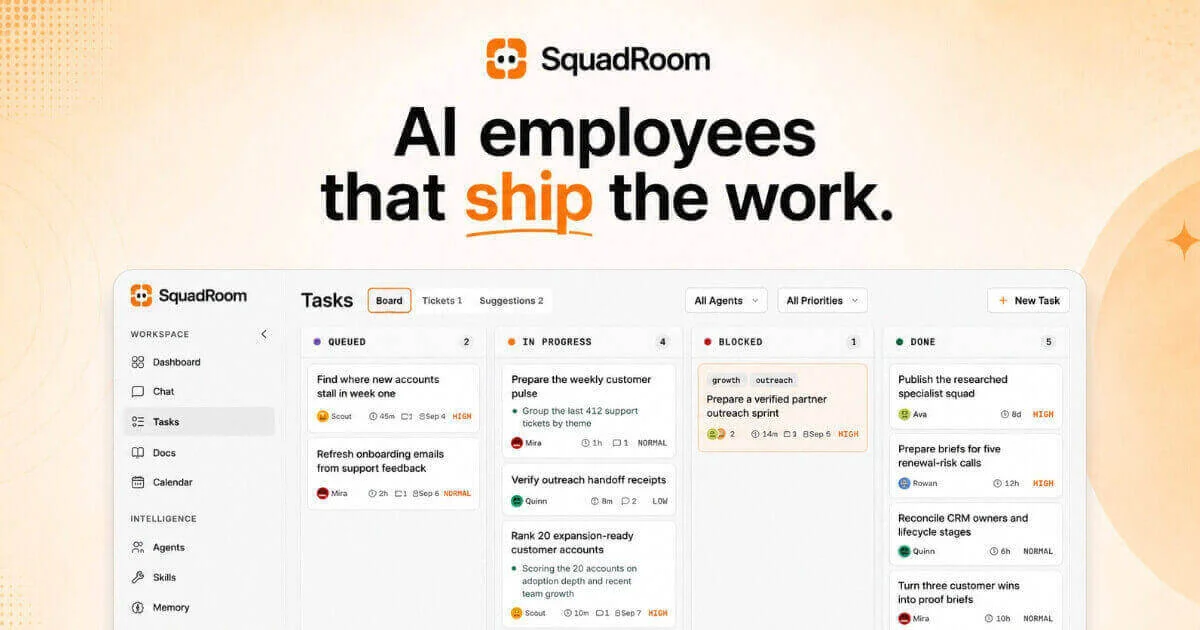
Social card composed in three layers on a warm cream canvas: a small centred logo lockup, a two-line ~90px heavy headline where only the word "ship" breaks into orange with a hand-drawn underline, and a large rounded product screenshot filling the bottom half as visual proof. Decoration is pushed to the edges — a halftone dot fade in the top-left, a soft orange blob clipped at the right edge, and small sparkles — so the type stays uncluttered. Semantic colour (green/red/orange column dots, red HIGH badges) is confined to the screenshot, keeping the canvas itself a strict cream–ink–orange palette.
Prompt preview
## Reference images

Study these alongside the description below: hierarchy, rhythm, spacing, colour. Build for the product you are asked about, using this design language.

- Screenshot: https://kage-design-assets.t3.tigrisfiles.io/screenshots/squadroom/8b774a3d-06c7-4ba2-942e-3862271fe960-1791871246097.webp
- Design on Kage: https://kage.design/designs/squadroom-og-image

# 1200×630 social card (Open Graph / Slack / X preview)

## Before you start
Ask the user what product they are building, who it is for, and what brand assets they already have (name, logo, colours, typeface). Also ask: which single product screen would make the strongest visual proof, and what one-line value proposition the headline should state. Wait for the answers before designing. Everything below is applied to **their** product and copy — the reference is only the compositional template.

## Page structure
Produce the card as a single 1200×630 image — an HTML/CSS file sized exactly 1200×630 rendered to PNG, or a standalone SVG. Build it in four layers, top to bottom:

1. **Canvas (background layer).** Warm cream field (~`#FBF1E3`) with a very subtle radial warm gradient darkening toward the corners. Decorate only the periphery: a halftone dot grid (~4px dots, ~8% opacity of the ink colour) fading out from the top-left corner, a soft solid orange blob (no gradient, no blur) clipped by the right edge around vertical centre, and one or two small 4-point sparkle shapes (~24px, orange) floating near the blob. Decorations must never touch the headline block.
2. **Logo lockup (top ~25% of canvas).** Centred horizontally, ~36px from the top edge: a small rounded-square logo icon (~36–40px) beside the brand wordmark set bold in the ink colour. Total lockup height under 48px — it identifies, it does not compete.
3. **Headline (focal point, centred at ~35–45% height).** Two lines, centred, ~88–96px, weight 800, line-height ~1.05, ink colour `#1A1712`. Exactly one keyword is set in the accent orange (`#F97316`) and carries a short hand-drawn-feeling underline stroke (6–8px thick, slightly curved, same orange) sitting just below the baseline. End the sentence with a period.
4. **Product proof (bottom ~55% of canvas).** One large rounded rectangle (~20–24px radius, white `#FFFFFF`, soft diffuse shadow like `0 24px 60px rgba(60,40,10,0.18)`, no visible border) inset ~120px from each side, anchored to and cropped by the bottom edge of the canvas. Inside it, render a simplified mock of the user's product UI in pure HTML/CSS (do not use a real screenshot): e.g. a slim left sidebar (5–6 nav items, one active with a light-grey pill) plus a main panel with a page title, small tab/filter row, and 3–4 columns of small task cards (~11–12px text, tiny avatar dots, thin 1px `#ECECEC` dividers, coloured status dots). Fill it with plausible generic data. The mock must look dense and real at card scale but is deliberately low-fidelity.

Leave ~60px clear of text or decoration at the extreme top and bottom so platform overlays never collide with content.

## Design language
- **One-glance hierarchy:** small logo → oversized headline → dense UI proof. The headline is the largest element by far; the screenshot below it functions as evidence, not decoration. Never let the mock UI grow taller than ~55% of the canvas.
- **Contrast by density:** the top half is airy (lots of cream negative space, one sentence), the bottom half is dense (small type, many cards). This rhythm is what makes the card read at thumbnail size — keep it.
- **Two-colour discipline on the canvas:** cream `#FBF1E3`, ink `#1A1712`, accent orange `#F97316`. Semantic colour (green/red/orange status dots, one red priority badge like `#B3261E`) lives **only** inside the product mock; the headline and lockup stay two-tone.
- **Type:** a single bold geometric/grotesque sans family throughout. Headline ~90px/800, wordmark ~26px/700, mock-UI text 11–13px/500–600. Tight headline leading (~1.05), generous letter-spacing only in tiny UI labels.
- **Shape and depth:** rounded everything — 20–24px on the big proof card, 8–10px on inner chips and badges, fully rounded on avatars and dots. Shadows are soft, warm-tinted and diffuse; strokes inside the mock are 1px light grey, no hard outlines on the outer card.
- **Highlight mechanic:** the accent colour plus a thick short underline marks exactly one word in the headline. If the user's copy has no natural keyword, rewrite until it does — never highlight more than one word.
- **Decorative restraint:** halftone dots, one blob, at most two sparkles, all at low contrast and pushed to edges/corners. They add warmth; they never overlap type.

## Never
- Do not use the name "SquadRoom", its four-dot logo, its copy ("AI employees that ship the work", column names, task titles), or its icon set anywhere in the output.
- Do not copy the exact reference composition pixel-for-pixel; rebuild it with the user's brand, palette and one genuine line of value proposition.
- Do not use photography, illustrations, gradients heavier than the subtle warm wash, or more than one accent colour on the canvas.
- Never present the result as the reference product or imply endorsement.