kage
kage
Design analysis
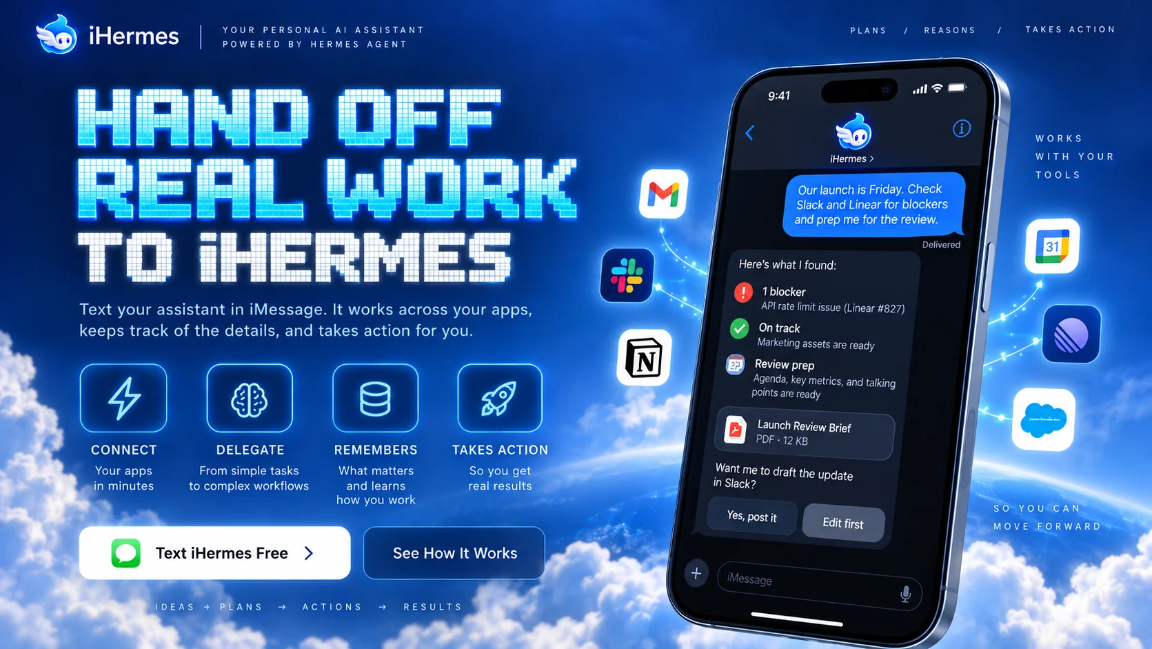
A dense 1200×630 social card for the iHermes AI assistant, set against a photographic blue sky with clouds. The left two-thirds carry the message: a small wordmark plus descriptor top-left, a huge retro pixel-block headline in cyan gradient ("HAND OFF REAL WORK TO IHERMES"), a short two-line subheading, a row of four outlined feature icons with labels, and two CTAs (a white primary button and a glass secondary). The right third is dominated by a tilted iPhone mockup showing a dark chat UI, orbited by floating app icons (Gmail, Slack, Notion, Calendar) connected by glowing dotted arcs, with small letter-spaced captions on the far edge. Contrast is handled well — dark phone and white type stay legible over the busy sky — and the pixel display type against photographic clouds gives it a memorable retro-futurist identity.
Prompt preview
## Reference images

Study these alongside the description below: hierarchy, rhythm, spacing, colour. Build for the product you are asked about, using this design language.

- Screenshot: https://kage-design-assets.t3.tigrisfiles.io/screenshots/iris/d1c2578f-32f1-4207-af96-a78ee8125d5c-1790748182728.webp
- Design on Kage: https://kage.design/designs/iris-og-image

# 1200×630 social card — retro-futurist AI assistant style

## Before you start
Ask the user what they are building, who it is for, and what brand assets they have (name, colours, type, logo). Wait for the answers. Everything below is applied to their product, not to the reference.

## Output
Produce a single 1200×630 social card image (HTML/CSS rendered to PNG, or an SVG). Use placeholder branding and copy throughout.

## Page structure
- **Canvas**: 1200×630, split roughly 60/40. Left two-thirds = brand + message; right third = a tilted phone mockup with orbiting app icons. Background is a full-bleed photographic sky-with-clouds in saturated blue, darker at top for legibility.
- **Top-left header**: small circular logo mark + wordmark, a vertical divider, then a short uppercase descriptor in letter-spaced small caps.
- **Top-right corner**: three tiny uppercase nav-ish labels separated by slashes (letter-spaced, low-contrast white).
- **Headline block (left, upper-middle)**: three stacked lines of enormous pixel/blocky display type with a cyan→light-blue gradient fill and subtle pixel-grid texture. Uppercase, very tight leading, ~90–110px per line.
- **Subheading**: two short lines of regular sans, white, ~20px, directly under the headline.
- **Feature icon row**: four rounded-square outlined icons (thin white 2px stroke, glassy fill) with uppercase labels and one-line micro-descriptions beneath each, evenly spaced across the left column.
- **CTA row**: a white pill/rounded button with an emoji-style icon and dark text (primary), plus a translucent glass button with white text (secondary).
- **Bottom-left footer strip**: a tiny letter-spaced flow "IDEAS → PLANS → ACTIONS → RESULTS" in white caps.
- **Phone mockup (right)**: large iPhone-style device rotated ~10°, dark chat UI inside (bubbles, a status list with coloured dots, a file card, two reply chips), status bar, input bar.
- **Floating app icons**: 4–6 rounded white/dark app-tile icons scattered around the phone, connected by thin glowing dotted arcs; two small uppercase letter-spaced captions on the far right edge ("WORKS WITH YOUR TOOLS" style).

## Design language
- Palette: saturated sky blue (#1a6fd4 → #3b9ae8 range), pure white text, near-black phone chrome (#0d1117), cyan gradient accents (#5fd4ff → #2f8fff), one green accent for success/emoji dots.
- Hierarchy: one oversized display headline dominates; everything else steps down fast — subheading ~1/5 its size, captions ~1/10.
- Type: pair a chunky pixel/retro display face (uppercase, gradient-filled) for the headline with a clean geometric sans for body and letter-spaced uppercase micro-labels.
- Density: left column is packed but aligned to one grid; right column breathes with the mockup and floating icons; micro-captions fill corners.
- Effects: glassmorphism on secondary buttons and icon tiles (translucent white, 1px light borders), soft drop shadows under phone and icons, glowing dotted connector lines, subtle dark scrim behind headline text.
- Phones/tiles: 20–40px radius; buttons pill-shaped (~999px or 12px).

## Never
Do not copy the iHermes name, winged logo, actual headline copy, the specific app icons, or the chat message content. Use placeholder brand, copy, and generic icon shapes. Never present the card as iHermes.