kage
kage
spira.ai
Design analysis
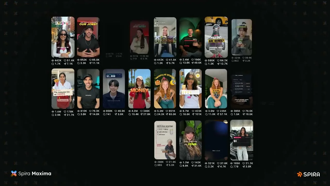
A 1200×630 dark social card that sells through proof rather than a headline: three staggered rows of 9:16 video thumbnails form a loose mosaic across the canvas, each followed by a tiny grey stat line (views, likes, shares) that quantifies virality. Saturated thumbnail frames — red, green, yellow — pop hard against the near-black background, which carries a barely-visible scattered glyph pattern for texture. Branding is confined to opposite corners (spark glyph + "Spira Maxima" bottom-left, "✳ SPIRA" bottom-right), keeping the content wall as the single focal element.
Prompt preview
## Reference images

Study these alongside the description below: hierarchy, rhythm, spacing, colour. Build for the product you are asked about, using this design language.

- Screenshot: https://kage-design-assets.t3.tigrisfiles.io/screenshots/spira-maxima/3803824a-c9e5-4d32-9fc6-33e38ed7985a-1791266450641.webp
- Design on Kage: https://kage.design/designs/spira-maxima-og-image

# 1200×630 social card — "wall of proof" video mosaic

## Before you start
Ask the user what product they are building, who it is for, and what brand assets they already have (name, logo mark, colours, typeface). Wait for their answers. Everything below is applied to *their* product with placeholder branding and copy — it is not a recreation of the reference.

## Page structure
Produce a single **1200×630** image (HTML/CSS rendered to PNG, or an SVG). Top to bottom:

1. **Full-bleed canvas** — near-black background (`#0A0A0A`) with a faint repeating texture of small glyphs (sparkles/asterisks) at ~4% opacity, so the black feels printed rather than empty.
2. **Thumbnail mosaic (the hero)** — three horizontal rows of vertical 9:16 video frames, each roughly 110×195px, rounded corners (~10px). Rows are staggered, not grid-aligned: row 1 has 8 cards with one deliberate gap, row 2 is the fullest with 9 cards, row 3 has 4–5 cards pulled toward the centre. The stagger reads as a wall of live content, not a table.
3. **Stat lines** — directly under each thumbnail, one tight line of tiny (~12–13px) grey type: `views · likes · shares` with small icon glyphs, e.g. `◉ 442K  ♥ 51.4K  ↗ 1.7K`. These numbers are the product's argument; keep them uniform in format across all cards.
4. **Bottom-left brand anchor** — small multicolour spark/asterisk glyph plus the product name at ~28px in two weights (light + bold: "Name **Product**"), white on black.
5. **Bottom-right brand anchor** — a secondary wordmark treatment (accent-coloured glyph + uppercase wordmark, letter-spaced), mirrored to balance the corner.

## Design language
- **Hierarchy by proof, not headline**: no hero title. The mosaic of real output IS the message; wordmarks only anchor the corners. Let the content dominate ~85% of the canvas.
- **Colour discipline**: card chrome is strictly `#0A0A0A` background, `#FFFFFF` for brand type, `#9CA3AF` for stat text. Reserve one warm accent (~`#FF6B35`) for the logo glyph only. All colour saturation lives inside the thumbnails — they become the palette of the card.
- **Type**: one geometric sans in three jobs — a two-weight wordmark pairing (light + bold, ~28px), tiny tabular-feeling stat lines (~12px), and nothing else. No display headline anywhere.
- **Shape & depth**: rounded corners (~10px) on thumbnails, optional hairline border `rgba(255,255,255,0.08)`; flat throughout — no drop shadows, no gradients on the chrome.
- **Rhythm**: stagger rows and vary row length (8 / 9 / 4–5 cards) so the eye travels diagonally; the single gap in row 1 adds air and stops the wall feeling templated. Keep ~14–18px gutters between cards, tighter between a thumbnail and its stat line.
- **Safe area**: keep all text and wordmarks inside a ~48px margin so link previews that crop edges never clip them.
- **Motion**: none — this is a static export.

## Never
Do not use the reference product's name, wordmark, spark logo, or any of its thumbnail imagery or copy. Stand in thumbnails with coloured gradient blocks or abstract frames, use placeholder stats, and use the user's own brand (or an obvious placeholder like "Acme Maxima"). Never present the result as the reference product.