 kage
kage
cognition.com
Design analysis
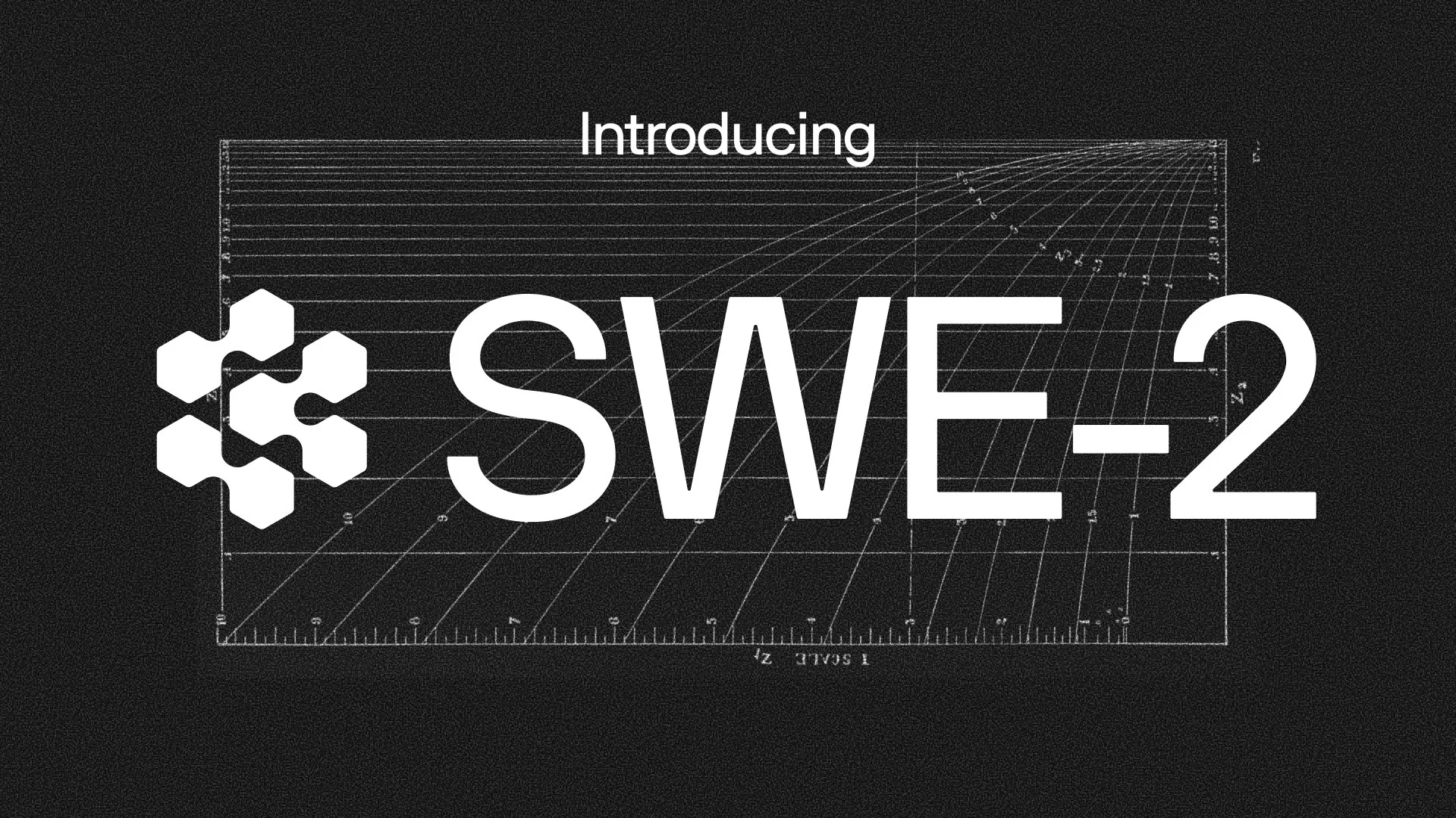
A 1200×630 announcement card built almost entirely from one centered lockup on a near-black ground: a small kicker line sits above a huge tightly-tracked grotesque headline paired with a hexagonal logomark. Behind it, a faint white-on-black technical chart — ruler ticks, ruled horizontals and a fan of curves with tiny numerals and mirrored micro-labels — supplies depth without competing for attention. A subtle film-grain overlay and a strict black/white/gray palette make the giant type read as the only real subject.
Prompt preview
## Reference images

Study these alongside the description below: hierarchy, rhythm, spacing, colour. Build for the product you are asked about, using this design language.

- Screenshot: https://kage-design-assets.t3.tigrisfiles.io/screenshots/cognitions-swe-2/606419e4-9cd5-4268-925b-66228e762f06-1789365637424.webp
- Design on Kage: https://kage.design/designs/cognitions-swe-2-og-image

# Announcement social card (1200×630)

## Before you start
Ask the user what they are announcing, who the audience is, and what brand assets they already have: brand/product name, a logo file or mark they may use (or whether you should draw a simple placeholder mark), preferred typeface, and any version number, price or metric the card should carry. Wait for their answers before designing. Everything below is applied to *their* product, not to the reference.

## Page structure
Produce a single 1200×630 image (build it as HTML/CSS at exactly 1200×630 and render to PNG, or as an SVG with `viewBox="0 0 1200 630"`).

1. **Ground layer** — full-bleed near-black canvas (#0B0B0B) with a faint monochrome film-grain overlay (~4% opacity, SVG `feTurbulence` noise) so large dark areas don't band.
2. **Chart backdrop** — one hairline technical diagram occupying the central band (roughly x 150→1050, y 115→570): a rectangular frame whose edges are ruler-style tick marks, several thin horizontal ruled lines, a fan of thin curves sweeping from lower-left toward upper-right, tiny numerals sitting on some of the rules, and two micro-labels — one rotated 90° along the right frame edge, one flipped upside-down along the bottom edge. All strokes are white at 18–30% opacity. This layer is atmosphere only; it must never fight the headline.
3. **Kicker** — one short word or phrase (e.g. "Introducing", or the user's equivalent) in medium-weight sans, ~44px, white, optically centered horizontally near the top of the chart frame (y ≈ 120).
4. **Focal lockup** — the single focal element, sitting just above vertical center: the user's logomark (~140px tall) placed immediately left of their announcement name set in enormous white grotesque sans, ~230–260px, one line, tight tracking, baseline-aligned with the mark. Together they span most of the canvas width with ~110–150px side margins.

## Design language
- **Hierarchy has exactly three tiers**: the giant name, the small kicker, and the near-invisible chart. Nothing at a middle size — the gap between 44px and ~240px is the whole trick.
- **Colour is strictly monochrome**: #0B0B0B ground, #F4F4F1 for all type and the mark, hairlines as pure white at 18–30% opacity. No colour accents, no gradients, no glows.
- **Type**: one neo-grotesque family (Inter, Helvetica Neue or similar) for every element. Display size uses tight letter-spacing (about −2 to −4%), medium weight, minimal leading since it is a single line. The kicker is the same family at ~44px with normal tracking.
- **Alignment**: the kicker is centered; the lockup is one flush horizontal unit (mark + name share a baseline, small gap between them); the chart frame is centered behind everything.
- **Texture**: grain over the entire canvas unifies the layers; keep it subtle enough that the headline edges stay crisp.
- **Line work**: all backdrop geometry is 1px hairlines. Curves fan out from a shared origin near a frame corner so the chart reads as measured data, not decoration.
- **Whitespace**: keep the top ~110px and bottom ~60px of the canvas nearly empty; the composition breathes because the lockup floats in darkness.
- **No shadows, no borders, no cards** — contrast between white type and black ground does all the work.

## Never
- Never reuse the reference's hexagon logomark, the name "SWE-2", the exact kicker copy, or the mirrored/rotated label texts; use placeholder branding and copy supplied by the user.
- Never name competitors from the reference or include comparison claims from it.
- Never add colour, gradients, drop shadows, photography or illustration; never present the finished card as the reference product's asset.


