kage
kage
maybloc.com
Design analysis
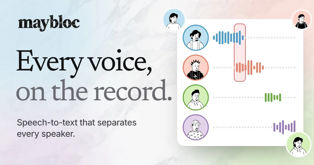
A 1200×630 social card that reads like an editorial print spread pasted onto a pastel marble wash. The wordmark sits top-left in a chunky serif; the headline dominates the left half with a two-step colour hierarchy — "Every voice," in near-black, "on the record." in warm grey — followed by a small clean sans subline. The right third is a white rounded panel showing four speaker rows: circular line-drawn avatars with coloured rings and dotted timeline tracks carrying small waveform bars, one row wrapped in a red selection capsule. Extra avatar bubbles break the panel's edge at the corners, giving the otherwise flat layout depth and a playful, hand-illustrated feel.
Prompt preview
## Reference images

Study these alongside the description below: hierarchy, rhythm, spacing, colour. Build for the product you are asked about, using this design language.

- Screenshot: https://kage-design-assets.t3.tigrisfiles.io/screenshots/maybloc/e848f710-2870-4b8b-81a3-baffe171e20f-1792216973631.webp
- Design on Kage: https://kage.design/designs/maybloc-og-image

# 1200×630 social card (OG image)

Produce a single 1200×630 social sharing card — as an HTML/CSS file sized exactly 1200×630 and rendered to PNG, or as an SVG — inspired by the composition described below. Use placeholder branding, copy and illustration; do not reproduce the reference product's name or artwork.

## Before you start
Ask the user:
- What product or announcement is the card for, and what single sentence must the headline carry?
- Who is the audience (developers, general consumers, enterprise)?
- What brand assets exist: wordmark text, brand colours, preferred typefaces?
- Where will it be shared (X, LinkedIn, Slack) — any legibility constraints at small sizes?
Wait for the answers, then apply everything below to *their* brand and copy.

## Page structure
A landscape canvas, roughly 55% content column on the left, 45% product visual on the right:
1. **Top-left wordmark**: small-to-medium brand lockup in a distinctive serif, generous margin (~70px) from the top-left corner.
2. **Headline block, left column, vertically centred-ish**: two-line display headline in a large serif (~90px). Break the colour across lines — line one in near-black, line two in a muted warm grey — so the eye reads one continuous sentence with two tones.
3. **Subline**: below the headline, a two-line supporting sentence in a small humanist sans (~28px), dark grey, tight line height.
4. **Right panel**: a large white rounded-corner card (radius ~24px, soft shadow) containing 4 horizontal rows. Each row = a circular avatar (line-drawn portrait with a coloured ring) + a dotted horizontal timeline track + a short cluster of rounded vertical bars (a waveform). Give each row its own pastel accent (blue, coral/red, green, purple).
5. **Highlight device**: wrap one row's waveform in a tall translucent red capsule to suggest selection/playback position.
6. **Breaking bubbles**: let 2–3 additional avatar circles overlap the panel's edges (top, right, bottom-right), partially cropped by the canvas, so the visual feels layered rather than boxed.
7. **Background**: a soft multi-hue pastel marble or watercolour wash (pale blue, blush, mint, cream), very low saturation, with the white panel floating on it.

## Design language
- **Hierarchy is two-voice type**: a display serif for the wordmark and headline carrying personality; a quiet sans for the subline doing the explaining. Contrast them hard in size (≈90px vs ≈28px) and soft in colour.
- **Colour rule**: pastel, airy field + one saturated accent. Background tones stay around #E8F0F4 / #F6E9E4 / #EAF3E6; headline ink near #1A1A1A; secondary line in warm grey ≈ #8A8A88; accent set limited to four pastels — blue ≈ #4A9ED8, coral/red ≈ #E8604C, green ≈ #6FBF4A, purple ≈ #9B6FD8 — each owning exactly one row so colours read as identity labels.
- **Editorial spacing**: big left margin, no dividers, no chips; the layout breathes because the right panel is the only boxed element.
- **Illustration treatment**: line-drawn, friendly portrait avatars with coloured ring outlines; waveform bars are short rounded rectangles with slight height variation, aligned to a dotted grey track (~#C9C9C9).
- **Depth discipline**: only the white panel casts a shadow (soft, low-opacity, large blur); bubbles overlapping it are the only other layering. Nothing else floats.
- **Legibility at thumbnail size**: headline must be readable at ~300px wide; subline may go blurry — it's a garnish, not the message.

## Never
- No logos, wordmarks, product names, taglines, illustration style, or avatar drawings copied from the reference.
- Never present the card as made by the reference product; it is a template applied to the user's own brand and copy.