kage
kage
duvi.ai
Design analysis
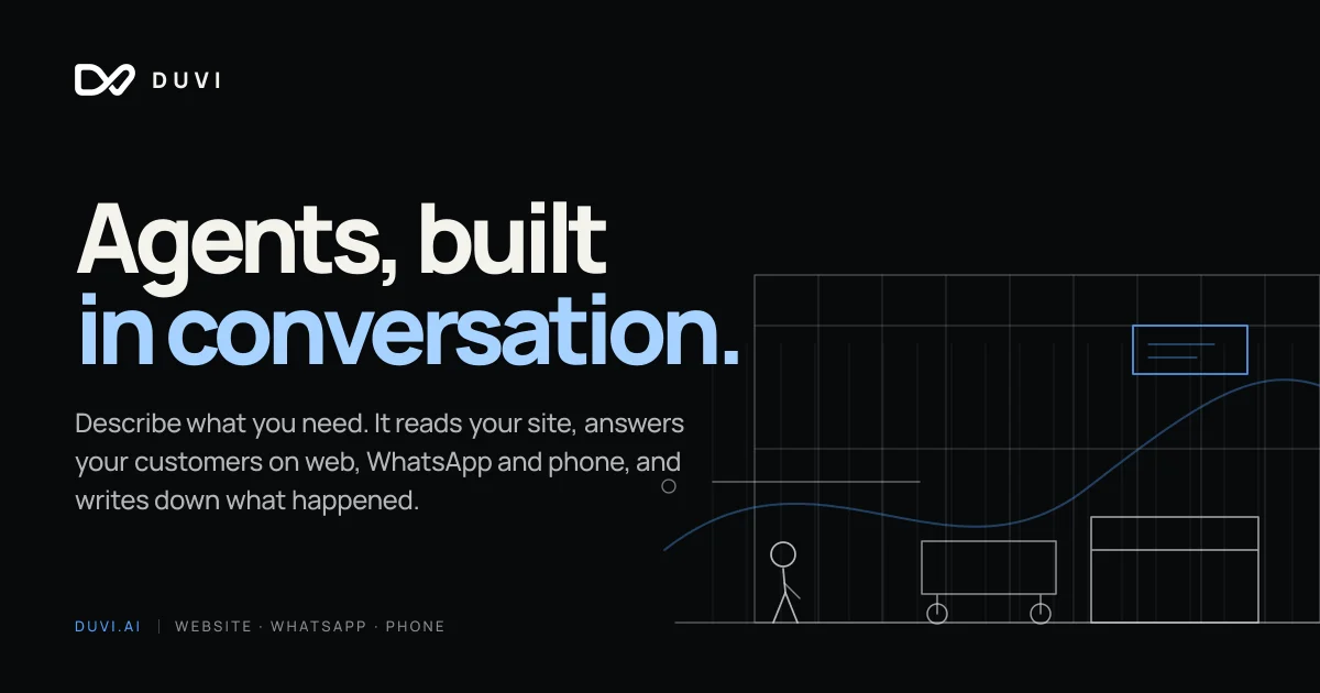
A 1200×630 dark social card split into a text-dominant left half and a line-art illustration right half. The two-tone headline carries the focal weight: line one in warm off-white, line two in cornflower blue, with a small letterspaced wordmark anchored top-left and a small-caps meta footer (domain + channels) pinned bottom-left. The right half is a faint 1px blueprint wireframe — stick figure, cart, counter, bar grid — where a single blue chat card and a blue-highlighted flowing curve echo the headline accent, keeping the whole card tied to one accent colour.
Prompt preview
## Reference images

Study these alongside the description below: hierarchy, rhythm, spacing, colour. Build for the product you are asked about, using this design language.

- Screenshot: https://kage-design-assets.t3.tigrisfiles.io/screenshots/duvi/10ac6a8e-0fd0-40c0-9114-1a65c1331627-1789884105335.webp
- Design on Kage: https://kage.design/designs/duvi-og-image

# Build a 1200×630 Open Graph social card

Produce a single social share card at exactly **1200×630 px**, delivered as HTML/CSS sized to that canvas and rendered to PNG (e.g. Playwright/Puppeteer screenshot) or as a standalone SVG. Use placeholder branding and copy throughout — this is a composition to imitate, not a product to reproduce.

## Before you start
Ask the user:
1. What product or company is the card for, and what does it do in one sentence?
2. Who is the audience and where will the card be shared (X, Slack, LinkedIn, iMessage)?
3. What brand assets exist — name, logo mark, brand colours, and typeface if any?

Wait for the answers. Everything below is applied to *their* brand: swap the wordmark, headline copy, channel list, and accent hue to match. Only the layout system and visual language come from this reference.

## Card structure
- **Canvas**: 1200×630, flat near-black background, no gradient, no texture. Content sits inside ~72 px safe margins.
- **Header row (top-left)**: a small logo mark (~36 px) beside a wordmark set in all-caps with wide letter-spacing (~0.2 em). This is the only element on the top band; leave the rest empty.
- **Main block (left half, vertically centred slightly above middle)**: a two-line, two-tone headline in a bold geometric grotesque, ~110–120 px, tight leading (~0.95). Line one in warm off-white, line two in the accent colour, ending with a period. Keep the block under ~55% of canvas width so it never collides with the illustration.
- **Subcopy (below headline)**: two or three short sentences, ~28 px, light grey, generous line-height (~1.5), same left edge as the headline, max-width ~620 px.
- **Meta footer (bottom-left)**: one row in small-caps letterspaced type, ~18 px — domain in the accent colour, a thin vertical divider, then three keywords separated by middle dots in muted grey. Pin it to the baseline margin.
- **Illustration zone (right ~45%)**: a faint 1 px-stroke wireframe scene that bleeds off the top, right and bottom edges. Build it from simple line primitives: a grid of vertical bars like a bar chart, horizontal guide lines, abstract boxes/counter shapes, and one small rounded rectangle "card" in the accent colour containing two thin lines (a chat-message stand-in). Overlay one continuous flowing curve (a gentle sine-like spline) crossing the zone, drawn in grey with a segment near the card re-stroked in the accent colour.

## Design language
- **Palette**: near-black background `#0e0e10`; warm off-white for primary text `#f5f1e8`; one cornflower-blue accent `#8fb8f6`; light grey body text `#cfcfc9`; illustration strokes muted grey `#4a4d55`. The accent appears in exactly three places — headline line two, the small chat card, and the highlighted curve segment — which is what unifies the card.
- **Focal hierarchy**: headline → accent elements → illustration → subcopy → meta footer. Nothing competes with the two-tone headline.
- **Type pairing**: one bold geometric grotesque family throughout; hierarchy comes from size, colour and letter-spacing rather than a second family. All-caps is reserved for the tiny wordmark and footer only.
- **Line treatment**: the illustration is technical blueprint line-art — uniform 1 px strokes, no fills, no shadows, rounded joins. It reads as scaffolding behind the text, so keep opacity low and let shapes crop off-canvas for depth.
- **Layout feel**: asymmetric split (text left, art right), strong left alignment for all text, flat surfaces everywhere, generous negative space in the upper-right corner between wordmark and illustration.
- **No motion** — it is a static image; ensure legibility at small preview sizes (headline still readable at ~300 px wide).

## Never
- Do not use the reference product's name, logo glyph, headline copy, subcopy, channel list, or its stick-figure/cart illustration content.
- Do not present the result as that product; all text and imagery must be the user's own or clearly generic placeholders.
- Do not add photography, gradients, drop shadows or emoji to the card.