kage
kage
getelva.ai
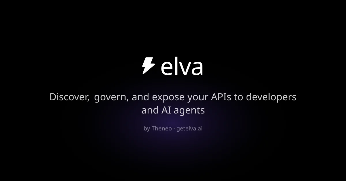
Design analysis
A 1200×630 social card built on near-black with a faint purple radial glow bleeding up from centre. Everything is a single centred vertical stack: a white lightning-bolt glyph beside a large lowercase wordmark, a two-line light-grey value proposition at roughly half the wordmark's size, then a small muted "by Thenéo · getelva.ai" attribution line. Hierarchy comes purely from type scale and opacity steps against the empty dark field — no imagery, borders or UI chrome.
Prompt preview
## Reference images

Study these alongside the description below: hierarchy, rhythm, spacing, colour. Build for the product you are asked about, using this design language.

- Screenshot: https://kage-design-assets.t3.tigrisfiles.io/screenshots/elva/d3b4691e-13c8-418f-aad1-aa6f9b27ccff-1789452037033.webp
- Design on Kage: https://kage.design/designs/elva-og-image

## Before you start
Ask the user what product the card is for, who it targets, and what brand assets exist (name, logo/glyph, colours, typeface). Wait for answers. Everything below is applied to their product with placeholder branding, never to the reference.

## Deliverable
Produce a single 1200×630 social/OG card image (e.g. an HTML/CSS page rendered to PNG at exactly 1200×630, or an SVG of that viewBox).

## Page structure
1. **Background**: near-black canvas (#050505–#0a0a0f) with a soft radial purple glow (#3b2a6a at ~15–20% opacity) centred slightly below middle, fading to black at the edges. Nothing else in the background.
2. **Focal lockup** (upper-centre, ~30% from top): one centred horizontal row — a simple white geometric glyph (bolt/star/abstract mark, ~64px) with ~16px gap, then the wordmark in lowercase, large (72–90px), white, medium weight.
3. **Value proposition** (~55% from top): one or two centred lines, max-width ~75% of the canvas, in light grey (#b8b6c4), 32–36px, line-height ~1.35. Contrast this at ~60% opacity relative to the wordmark.
4. **Attribution line** (~72% from top): small centred meta line, 18–20px, muted grey (#6f6d7c), format "by {Company} · {domain}". Generous empty black below.

## Design language
- Single centred vertical column; every element horizontally centered; optical centre slightly above the true middle.
- Hierarchy achieved only via scale and opacity: glyph+wordmark brightest and largest, headline mid, attribution smallest and dimmest — three clear steps.
- One dark colour field, one accent hue used only as ambient glow, never as text colour.
- A clean geometric or neo-grotesque sans throughout; lowercase wordmark for a modern developer-tool feel.
- No borders, cards, shadows, photography or screenshots — pure typographic minimalism with breathing room (outer padding ≥ 96px).
- Keep total text under ~15 words so it stays legible at small preview sizes.

## Never
- No reference product names, wordmarks, copy, logos or the lightning-bolt glyph from the source card.
- Never present the result as the reference product; use the user's own placeholder branding.