kage
ilha.app
Design analysis
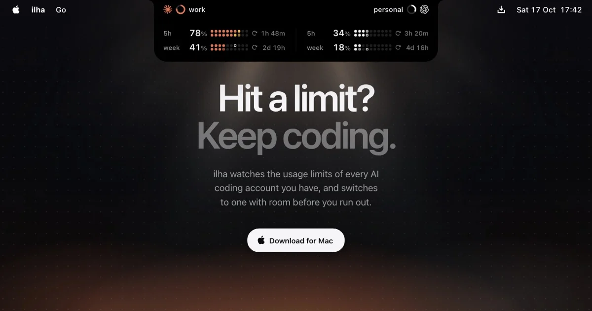
The composition is centered and highly vertical, designed to maximize impact as a social media preview. A subtle, dark header mockup establishes a high-tech, application-like context, while the main message uses a bold, high-contrast typographic hierarchy. The color palette is strictly monochromatic (dark gray and white) against a deep black background, emphasizing a minimal, futuristic aesthetic.
Prompt preview
## Reference images

Study these alongside the description below: hierarchy, rhythm, spacing, colour. Build for the product you are asked about, using this design language.

- Screenshot: https://kage-design-assets.t3.tigrisfiles.io/screenshots/ilha/06360886-d43d-46d5-ad03-fc1dc16c66f1-1792648835228.webp
- Design on Kage: https://kage.design/designs/ilha-og-image

## Before you start
Ask the user what product they are building, who their target audience is, and what branding assets (name, primary colours, typography) they have. Wait for the answers before proceeding.

## Page structure
1. **Header Mockup:** A thin, horizontal strip at the top simulating a mobile application's status bar, displaying subtle time, network, and status indicators using minimal, small-size text and monochromatic colors.
2. **Primary Headline:** The main, centered question ("Hit a limit?") is displayed in a very large, bold, white typeface, establishing the core emotional hook.
3. **Secondary Headline/Value Prop:** A slightly smaller but still prominent phrase ("Keep coding.") immediately follows the primary headline, providing the solution and action statement.
4. **Body Copy:** A concise paragraph below the headlines that explains the core value proposition using a neutral, readable size.
5. **Call to Action (CTA) Button:** A centered button with a subtle container/background, displaying the action text ("Download for Mac") in a contrasting, minimalist style.

## Design language
*   **Canvas:** The output must be a square or slightly wide, impactful social media card composition, approximately 1200x630 pixels.
*   **Colour Treatment:** Use a deep black or near-black background (#000000). All main typography should be bright white or light gray (#FFFFFF / #CCCCCC). Accent colors should be extremely minimal, derived from the subtle status bar elements (e.g., subtle gray or orange-red indicators).
*   **Typographic Hierarchy:** The design relies on extreme scale contrast. The Primary Headline is massive and heavily weighted. The Secondary Headline is large but less massive. Body copy uses a neutral, high-readability size.
*   **Layout:** Elements are strictly centered along the vertical axis. The design uses negative space heavily to make the centered text feel isolated and important.
*   **Aesthetic:** The overall style must be dark, high-contrast, and highly minimal, invoking a modern, futuristic, 'code-utility' feel.
*   **Borders/Shadows:** Use no heavy borders or large shadows; keep containers and elements flat and sharp.

## Never
Never use the specific logos, product name (Ila), taglines, or specific icons from the reference. Do not present the result as the original product.