kage
kage
ultracite.ai
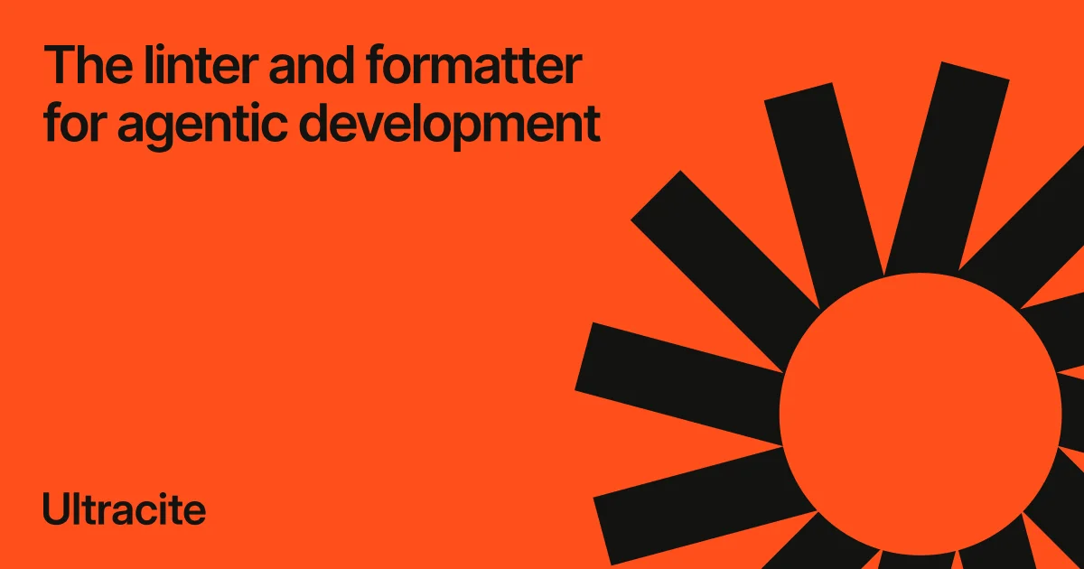
Design analysis
A poster-style social card built from exactly two values: a saturated vermilion field (~#FF4400) and near-black ink. Hierarchy comes purely from scale and placement — a two-line neo-grotesque headline (~76px, tight leading) sits top-left, a giant flat sunburst (filled circle plus eleven tapered rays) bleeds off the top, right and bottom edges on the right half, and the wordmark sits small at bottom-left, closing a diagonal reading path. The empty orange centre keeps the card legible at thumbnail size; there are no gradients, shadows or secondary elements anywhere.
Prompt preview
## Reference images

Study these alongside the description below: hierarchy, rhythm, spacing, colour. Build for the product you are asked about, using this design language.

- Screenshot: https://kage-design-assets.t3.tigrisfiles.io/screenshots/ultracite-v8/16f1522c-d4aa-42a2-ac98-c63de87cbc28-1792303235761.webp
- Design on Kage: https://kage.design/designs/ultracite-v8-og-image

# Build a 1200×630 social share card (og-image)

## Before you start
Ask the user what product or announcement the card is for, who the audience is, and what brand assets they already have (name, mark or logo idea, brand colours, typeface). Wait for the answers before writing any code. Everything below is applied to their brand — the reference is only the composition template.

## Page structure
Produce one flat image, exactly 1200×630. Deliver it as an SVG with `viewBox="0 0 1200 630"`, or as a single HTML file containing a fixed 1200×630 stage (plus a note on how to export it to PNG with a headless browser screenshot). No scrolling page, no extra UI.

1. **Full-bleed field** — the entire canvas is a single saturated brand colour. No header, footer, border or chrome of any kind.
2. **Headline block, top-left** — the value proposition in 2–3 short lines of sentence case, starting ~60px from the top and left edges and occupying roughly the left 55% of the canvas. This is the largest element on the card.
3. **Signature mark, right half** — one oversized flat geometric mark (e.g. a filled circle with 11–12 evenly rotated tapered rays around it, or the user's own single-shape symbol), anchored to the right half at ~600px diameter and deliberately bleeding off the top, right and bottom edges so the cropping reads as intentional.
4. **Wordmark, bottom-left** — the product name alone, ~60px from the left and bottom edges, at roughly 60% of the headline size. No tagline, URL, version badge or button.
5. **Clear zone** — the centre-left third of the canvas stays empty background. Nothing may compete with the headline.

## Design language
- Two colours only: one saturated field (~#FF4400 vermilion in the reference — substitute the user's brand colour) and one near-black ink (#141414). No gradients, no tints, no shadows, no strokes, no outlines.
- Hierarchy is built purely from scale and placement: headline biggest, mark loudest by mass, wordmark smallest. There are no icons, labels or secondary text layers.
- One typeface throughout — a neo-grotesque such as Helvetica Now, Neue Haas Grotesk or Inter. Headline ~76px, line-height ~1.05, letter-spacing about −0.02em, sentence case, wrapped to 2–3 lines with no line longer than ~22 characters. Wordmark ~48px, same family, same ink.
- The mark is simple flat geometry: one filled shape plus repeated rotated elements at even angular steps. Draw it large enough that being cut by the canvas edge is a feature, not an accident.
- Compose on an asymmetric diagonal: headline top-left → empty colour through the middle → mark bottom-right → wordmark bottom-left. Keep a consistent ~60px outer margin on all text.
- Design for the thumbnail test: at 200px wide the headline must still be readable. That constraint drives every size decision; if it fails, increase type, not contrast tricks.
- Static asset: no motion, no interaction states.

## Never
- Do not use the name "Ultracite", its wordmark, its sunburst mark or its tagline "The linter and formatter for agentic development". Use the user's own name and copy, and invent a different geometric mark in the same flat, poster-like spirit.
- Do not add screenshots, device mockups, photography, illustrations, gradients, drop shadows or a third colour.
- Do not present the result as the reference product or reproduce its exact composition with its branding.