kage
resend.com
Design analysis
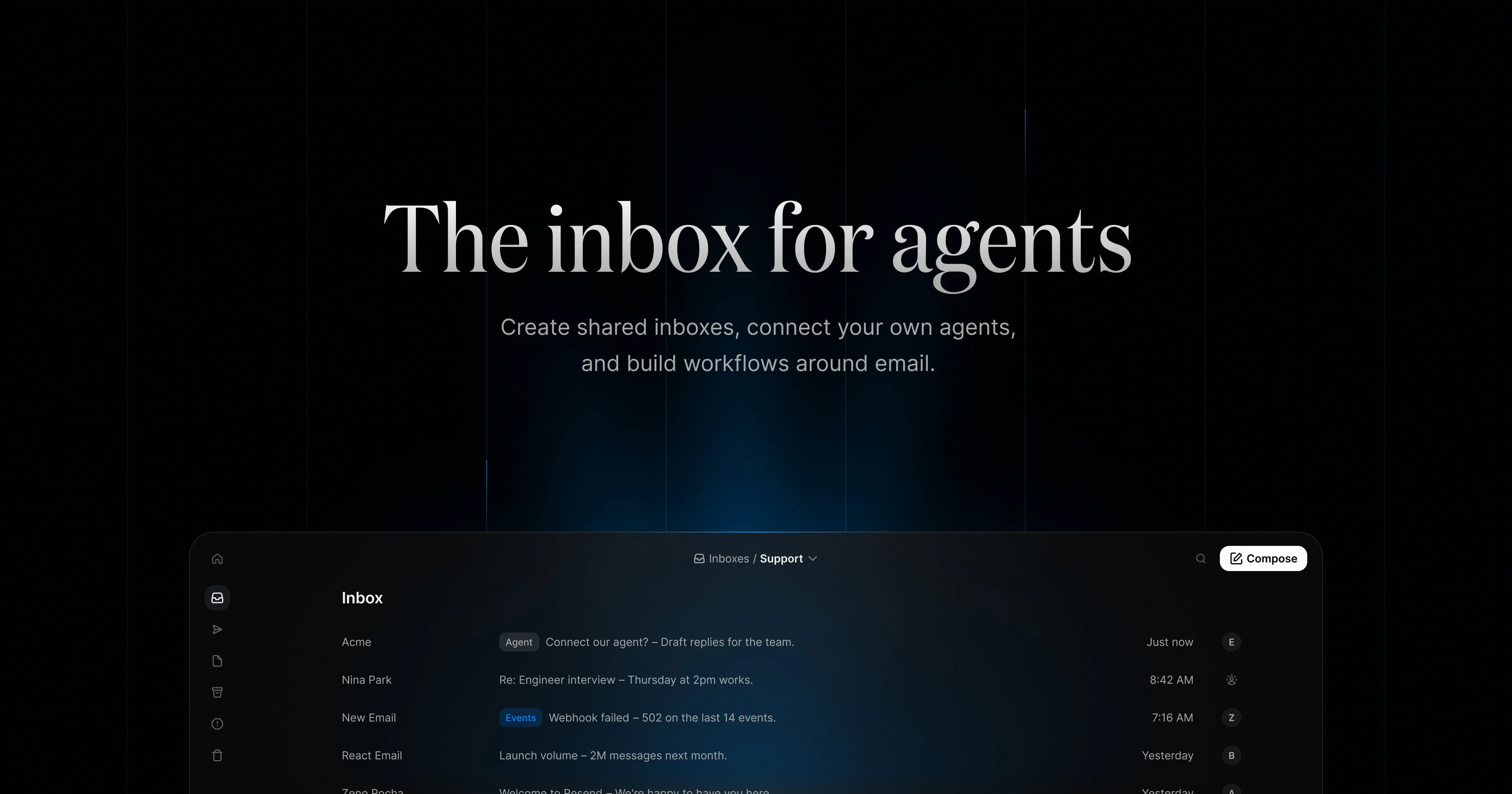
This Open Graph social card utilizes a high-contrast, centralized composition to ensure maximum impact in social feeds. A large, crisp sans-serif headline dominates the upper third, providing immediate context ('The inbox for agents'). This is followed by a concise subtext detailing the value proposition. The lower portion grounds the abstract marketing copy with a low-contrast, dark-themed UI element, reinforcing the product's technical nature without clutter.
Prompt preview
## Reference images

Study these alongside the description below: hierarchy, rhythm, spacing, colour. Build for the product you are asked about, using this design language.

- Screenshot: https://kage-design-assets.t3.tigrisfiles.io/screenshots/resend-inboxes/e1e01559-d1ee-41a0-a265-1be87e0394d0-1792735451184.webp
- Design on Kage: https://kage.design/designs/resend-inboxes-og-image

## Before you start
Ask the user what their product is, who it is for (e.g., developers, teams), and what brand assets they already have (name, primary and secondary colors, preferred font).

## Please create an OG social card image, approximately 1240x630 pixels, inspired by this design concept, using placeholders for all specific text and branding.

## Structure
1. **Background:** A solid, deep black or very dark gray background. The design is centered.
2. **Primary Headline:** A very large, bold, white sans-serif typeface. This text must be placed in the upper-middle section of the canvas.
3. **Subtext:** A much smaller, light gray sans-serif typeface, centered immediately below the headline, providing a one-sentence value proposition.
4. **Visual Anchor:** In the bottom quarter of the card, render a small, dark-themed UI element or panel. This element should resemble a software interface (like a sidebar or a simple list view) to reinforce the technical context, but should remain low-contrast relative to the text.

## Design Language
*   **Layout:** Centered, vertical hierarchy with a strong top-to-bottom reading flow.
*   **Contrast:** Extreme contrast is key: bright white text against a black canvas for maximum readability and visibility in small social media previews.
*   **Type:** Use a clean, modern, geometric sans-serif font. The main headline should be at least 500% larger than the subtext. All text should be sharply rendered.
*   **Color:** Primary use of #000000 and #FFFFFF.
*   **Vibe:** Professional, tech-forward, minimalist, and attention-grabbing.

## Never
Do not use any specific brand names, logos, unique wordmarks, product names, specific icons, or copyrighted imagery from the reference. The result should be a completely fresh, template-ready mock-up.