kage
kage
Design analysis
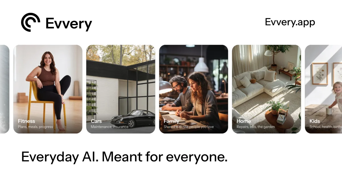
A 1200×630 social card on a warm off-white ground, organised in three stacked bands: a slim header with a black spiral mark and wordmark left against the domain right; a centred filmstrip of five portrait lifestyle photos in rounded corner cards that bleeds off both canvas edges to imply "many more categories"; and one large left-aligned near-black headline anchored at the bottom. Focal hierarchy runs headline → photo strip → brand header, with all colour quarantined inside the warm, naturally lit photography while every piece of typography stays pure black. A single modern grotesque carries the whole card — medium wordmark, ~64px headline with tight leading — and small two-line white captions over soft scrims sit inside each photo's bottom-left corner.
Prompt preview
## Reference images

Study these alongside the description below: hierarchy, rhythm, spacing, colour. Build for the product you are asked about, using this design language.

- Screenshot: https://kage-design-assets.t3.tigrisfiles.io/screenshots/evvery/4497fbb5-3984-46d6-be0d-926b0fa0b88b-1790402435524.webp
- Design on Kage: https://kage.design/designs/evvery-og-image

# Build a 1200×630 Open Graph social card

The reference is a social share card for a consumer AI product. You are producing an original card in the same composition language for the user's own product, with placeholder branding and copy.

## Before you start
Ask the user what they are building, who it is for, and what brand assets they already have (name, logo mark, colours, typeface). Wait for the answers. If they have no assets yet, invent a neutral placeholder name and mark and say so. Everything below is applied to their product, never to the reference product.

## Deliverable
One static image, exactly 1200×630. Build it as a single HTML file containing a fixed `1200×630` stage (no scrolling, no interactivity) and render it to PNG with a headless-browser screenshot, or hand-author it as an SVG and export. Keep all critical content inside an ~80px safe margin on every side; only the photo strip is allowed to touch the edges.

## Card structure (top to bottom)
1. **Header band** (~top 100px): logo mark + wordmark top-left, site domain or handle top-right, both baseline-aligned on the ~80px side margin. Slim, quiet, purely black-on-light.
2. **Photo band** (vertical centre, ~340px tall): a horizontal filmstrip of five portrait photo cards (~250×340, ~20px corner radius, ~20px gutters). The strip bleeds off both left and right canvas edges so the first and last cards are cropped — this signals abundance without adding chrome. Each card: photographic fill, a soft dark scrim over its bottom third, and a caption pinned bottom-left — one bold white category label (~20px) above one smaller white sub-line (~13px, slightly softened).
3. **Headline band** (bottom ~130px): a single left-aligned headline at the brand margin, ~60–68px, near-black, tight leading, sitting low on the canvas with ~48px of air below. It is the largest type on the card and the only sentence-level copy.

## Design language
- **Hierarchy**: bottom-left headline is the focal point; the photo strip is the texture and life of the card; the header is the smallest, quietest band. Never let the header compete with the headline.
- **Rhythm**: calm top, dense and alive middle, calm bottom. Uniform side margins (~80px) frame all three bands; only the photo band breaks the frame by bleeding.
- **Colour**: neutral canvas (~#FAFAF7 off-white, not pure white) with ~#111111 type. All colour lives inside the photography — pick placeholder photos in one warm, naturally lit palette (soft beiges, warm greys, one or two saturated accents) so the strip feels curated, not random.
- **Type**: one grotesque sans family across the entire card, medium weights only (no heavy blacks). Wordmark ~44px medium, domain ~30px regular, headline ~64px medium with ~1.05 line-height, photo captions at a two-step scale (20px bold / 13px regular white).
- **Shape and surface**: ~20px radius on photo cards, square everywhere else. No borders, no drop shadows; the only darkening is the caption scrim (e.g. `linear-gradient(transparent, rgba(0,0,0,0.45))` on the bottom third of each card).
- **Static**: this is one flat frame — no motion, no hover states, no gradients on the background or type.

If the user has no photography, fill the cards with labelled duotone or gradient placeholder blocks in the same warm palette and same caption treatment; composition must survive without real images.

## Never
- No logos, marks, wordmarks, domain strings, headlines, category names or caption copy from the reference — all text is the user's own or clearly placeholder.
- No photography from the reference; use licensed placeholders, user assets, or abstract blocks.
- Do not present or describe the result as the reference product; it is the user's card in this composition style.