kage
media.aftermark.ai
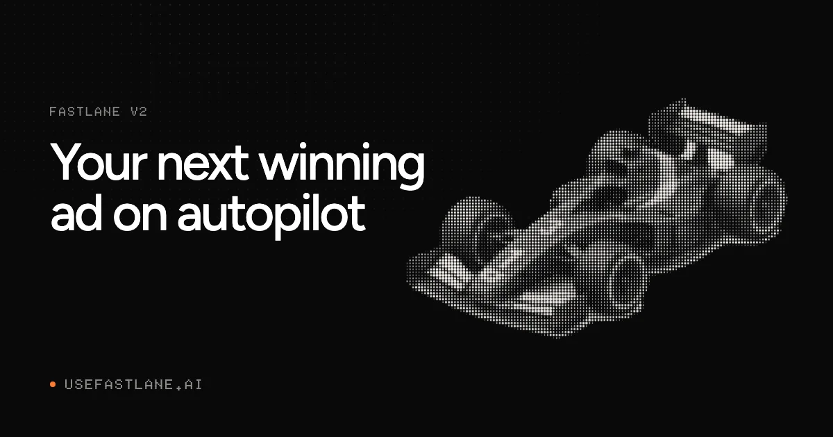
Design analysis
Social card built on a near-black field with an asymmetric split: a monospace eyebrow and a two-line oversized grotesque headline hold the left column, while a dithered dot-matrix race car fills the right half at a slight angle, cropped by the canvas edge. A faint halftone dot strip runs along the top edge, and the bottom-left footer pairs a single orange dot with a gray monospace domain. The design runs on restraint — two type voices (huge sans vs. micro uppercase mono), one accent colour, and one textured object that stays legible even at thumbnail size.
Prompt preview
## Reference images

Study these alongside the description below: hierarchy, rhythm, spacing, colour. Build for the product you are asked about, using this design language.

- Screenshot: https://kage-design-assets.t3.tigrisfiles.io/screenshots/fastlane-2-0/8bb1ef25-9c76-419d-a686-deeada1f5a7e-1792735246372.webp
- Design on Kage: https://kage.design/designs/fastlane-2-0-og-image

# 1200×630 OG / social share card

Produce a **1200×630 social card image** (the graphic shown when a link is shared on X, Slack, LinkedIn or iMessage). Build it as a single fixed-size HTML/CSS file rendered to PNG at exactly 1200×630 (e.g. via headless Chrome/Puppeteer), or as a standalone 1200×630 SVG. Use placeholder branding, headline copy and imagery for the user's product — the reference is a composition study only.

## Before you start
Ask the user:
1. What product is this card for, and who is it for?
2. What brand assets exist — name, domain, logo, colours, typefaces?
3. What is the one-line message the card must carry (launch, version bump, feature, announcement)?
Wait for the answers. Everything below is applied to *their* product, not to the reference.

## Page structure
One canvas, five zones, top to bottom:
1. **Canvas**: full-bleed near-black field (#0A0A0A) with a generous outer margin (~72px on all sides). No border, no card frame — the dark ground is the card.
2. **Top texture strip**: a subtle band of halftone dots fading across the top edge, very low contrast, purely textural.
3. **Eyebrow (upper left)**: one small monospace uppercase label (product name / version tag), muted gray, wide letter-spacing (~0.1em), sitting on the left margin.
4. **Headline (left, vertically upper-middle)**: a two-line headline in large white sans-serif, left-aligned, constrained to ~55% of canvas width, tight line-height.
5. **Hero object (right half)**: one large subject rendered as a white-on-black **halftone/dot-matrix image**, slightly rotated, anchored to and cropped by the right edge. This is the only visual — it does all the illustrative work.
6. **Footer (bottom left)**: a small orange dot bullet followed by the domain or CTA in small monospace uppercase, aligned to the same left margin and optically centered in the bottom band.

## Design language
- **Hierarchy is three tiers only**: oversized headline, micro monospace labels, one accent dot. Nothing else competes.
- **Asymmetric split**: text column occupies roughly the left 55%, hero object the right 45%; both align to a single strict left margin, and the footer repeats that margin so the card reads as one grid.
- **Negative space is deliberate**: keep the lower-left quadrant almost empty except the footer — it gives the headline room and makes the card legible when cropped by chat clients.
- **Colour**: near-black ground `#0A0A0A`, white type `#FFFFFF`, muted gray `#7A7A7A` for monospace micro copy, and **exactly one** saturated accent (e.g. orange `#FF5A1F`) used once as a dot marker. No gradients, no surfaces, no panels.
- **Type pairing**: a neo-grotesque sans (Inter / Helvetica-like) for the headline at ~76–88px with line-height ≈1.05 and normal weight — no bold shouting; pair it with a monospace at 16–20px, uppercase, letter-spaced, for eyebrow and footer. The contrast of scale between the two voices is the main character of the card.
- **Texture technique**: render the hero subject as a dot-matrix/halftone — mask a radial-gradient dot grid (2–4px dots on a ~6–8px pitch) with the subject's silhouette, or use an SVG `<pattern>`; keep dots monochrome white on black so the image reads as texture, not photography. Optionally dither the density so edges resolve and flat areas fall away.
- **Composition rules for the object**: one subject only, tilted a few degrees, bleeding off the right edge; never centre it, never overlap the headline.
- **Motion**: none — this is a static asset. Optimise for legibility at ~600×315 preview size: headline must remain readable, micro labels may not.

## Never
- No logos, wordmarks, product names, copy, illustrations, photography or icon sets taken from the reference; never present the result as that product.
- No literal racing cars or motorsport imagery unless the user's brand genuinely calls for it — choose a placeholder hero subject that fits their product.
- No extra accent colours, cards, shadows, rounded panels or decorative gradients; resist filling the empty zones.