kage
kage
Design analysis
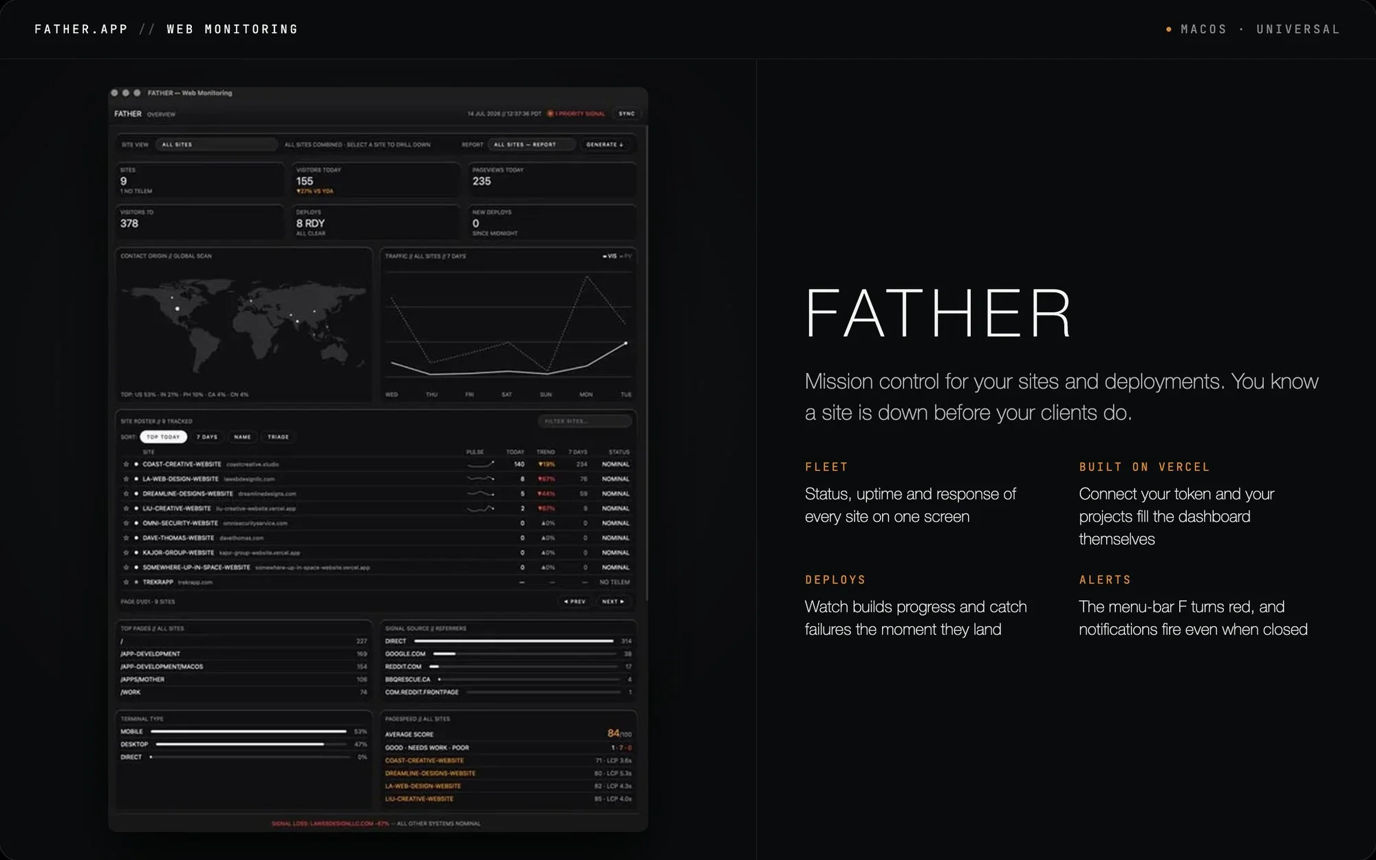
An OG social card that reads like a mission-control console: a near-black canvas split between a framed screenshot of a dense dark dashboard (stat tiles, world map, sparkline table) on the left and an airy typographic column on the right. A hairline top strip in letterspaced mono uppercase ("FATHER.APP // WEB MONITORING" against a "● MACOS · UNIVERSAL" status cluster) sets a terminal tone, while the right side pairs an oversized light-weight grotesque wordmark with a two-line value proposition and a 2×2 feature grid whose orange mono labels are the only strong accent. The composition works through deliberate contrast — heavy instrument-panel texture left, generous whitespace right — with a single signal-orange doing all the accent work at every scale.
Prompt preview
## Reference images

Study these alongside the description below: hierarchy, rhythm, spacing, colour. Build for the product you are asked about, using this design language.

- Screenshot: https://kage-design-assets.t3.tigrisfiles.io/screenshots/father/53ba7416-d6f3-4ba6-b8b9-5b0aa706ecfd-1789538498168.webp
- Design on Kage: https://kage.design/designs/father-og-image

# Build a 1200×630 OG social card in a "mission-control terminal" style

Produce a **1200×630 social card image** (e.g. a single HTML/CSS file rendered to PNG with Playwright/Puppeteer at `deviceScaleFactor: 2`, or a standalone SVG at that exact viewBox). This is a share image for X/Slack/LinkedIn — no scrolling, no responsive behaviour, everything must fit the fixed canvas.

## Before you start
Ask the user:
1. What product or project is the card for, and what does it actually do?
2. Who will see it and where (devs on X, clients on LinkedIn, teammates in Slack)?
3. What brand assets exist: name, tagline, colours, fonts, and is there a real product screenshot to feature?

Wait for the answers. Everything below is applied to **their** product with placeholder branding and copy — never to the reference product.

## Page structure
- **Canvas**: one landscape card, 1200×630, near-black background, ~24px safe margin on all sides.
- **Top status strip** (~56px full-width bar with a 1px bottom hairline): left corner holds an uppercase letterspaced mono wordmark in the pattern `BRAND.APP // CATEGORY`; right corner holds a status cluster like `● PLATFORM · EDITION` with a small orange dot as the only colour hit.
- **Left panel (~48% width)**: the product visual — a real screenshot or a mocked dark-UI mini-dashboard — inset from the top strip, wrapped in a 1px hairline border, ~10px radius, faint shadow. Fill it with *dense fake interface rows* (stat tiles, a map or chart block, a table with tiny sparklines, small footer readouts) so it reads as instrument-panel texture even at feed size.
- **Right column (~52% width)**: generous padding (~64px). Top: the brand name as a huge display wordmark (one word, light weight, ~110px). Below it: a two-line value proposition, ~22px, in soft white/gray. Below that: a **2×2 feature grid** — each cell is an orange uppercase mono micro-label (~12px, letterspaced) over two short lines of gray body copy (~15px, 1.5 line-height).
- **Bottom edge (optional)**: a single dim mono status line hugging the bottom of the left screenshot, like a terminal readout with one orange alert fragment.

## Design language
- **Hierarchy by scale, not weight**: exactly one giant element (the wordmark), one supporting sentence, then everything else drops to micro-size labels. Contrast comes from optical size jumps (110px → 22px → 12px), not from bolding.
- **Colour discipline**: ground ≈ `#0B0B0C`, panel ≈ `#141416`, hairlines ≈ `#26262A`, primary text ≈ `#F4F4F2`, secondary ≈ `#A3A39E`, dimmed ≈ `#6D6D68`. One signal accent — warm orange ≈ `#FF5A1F` — reserved for dots, micro-labels and one alert fragment. Never use it for body copy or large fills.
- **Type pairing**: a monospaced face (e.g. IBM Plex Mono or JetBrains Mono) for all uppercase chrome at +0.15em tracking; a light-weight wide grotesque (e.g. Inter/Neue Haas at 300) for the display wordmark; a plain humanist sans at 15–22px for body. Three sizes maximum per column.
- **Borders and shadow**: hairline 1px borders everywhere, 8–12px radius only on the screenshot frame, at most one very soft shadow. No glows, no gradients heavier than a barely-there radial lift on the background.
- **Rhythm**: left half dense (tiny rows, tables, readouts — texture, not legibility), right half airy (few elements, lots of black). That tension is the whole idea; don't average the two sides.
- **Terminal mood devices**: `//` separators, uppercase dot-prefixed status chips, mono footer readouts, the word "NORMAL/OK" style statuses. Use sparingly — 3–5 touches total.

## Never
- No FATHER.APP name, wordmark, tagline, domain or client names, and no recreation of its exact dashboard content — all copy is the user's own or clearly generic placeholder.
- No copying of the reference's exact label wording (FLEET / DEPLOYS / ALERTS etc.) — invent labels for the user's features.
- Never present the card as that product or imply endorsement; it is a composition study applied to the user's brand.