kage
kage
geardex.app
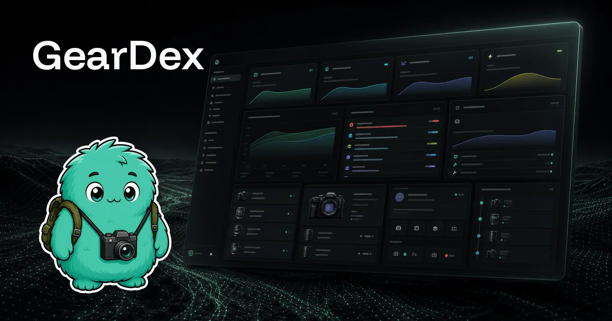
Design analysis
The card reads in three anchors on a near-black field: a heavy white wordmark at top-left, a sticker-style teal mascot with backpack and camera at bottom-left, and a perspective-tilted dark dashboard filling the right two-thirds with a mint rim light along its top edge. Detail inside the mockup is deliberately illegible — sparklines, status pills and gear thumbnails act as texture that signals a dense, real product at thumbnail size. A faint dotted topographic terrain grounds the lower third, and the disciplined mint-on-black palette with only micro-accents of purple, amber and red makes the whole card feel like one lit scene rather than pasted elements.
Prompt preview
## Reference images

Study these alongside the description below: hierarchy, rhythm, spacing, colour. Build for the product you are asked about, using this design language.

- Screenshot: https://kage-design-assets.t3.tigrisfiles.io/screenshots/geardex-app/6cb610a2-152b-4f3e-9914-df35f469083a-1791941485681.webp
- Design on Kage: https://kage.design/designs/geardex-og-image

# 1200×630 social card in a dark mascot-plus-dashboard style

## Before you start

Ask the user:
- What product is this card for, and what single idea should a viewer take away in two seconds?
- Who is it for (hobbyists, professionals, teams)?
- What brand assets exist: exact product name, brand colours as hex values, typeface files or a close Google Fonts substitute, and any logo or mascot artwork (SVG/PNG with transparency)?
- What should the card show: a product-UI mockup, an illustration, photography, or type only?

Wait for the answers before building. Everything below is applied to their product, not to the reference.

## Canvas and output

Produce a single fixed 1200×630 image. Recommended approach: one HTML file with a 1200×630 body rendered to PNG via Playwright or Puppeteer; a standalone SVG is also acceptable. No responsive behaviour — this is fixed-canvas artwork.

## Canvas composition

1. **Background layer** — a near-black field (#070a09) with a subtle topographic terrain of dotted mint contour lines occupying the bottom third, fading out at a soft horizon around 55–60% canvas height and at the edges. Add a gentle vignette so corners recede.
2. **Wordmark** — top-left with ~4% margins: the product name set very large (~90–110px, extrabold geometric sans, pure white, tight tracking, optionally tilted about 2°). This is the only full-contrast text on the card; no tagline required.
3. **Product mockup** — right two-thirds of the canvas: a dark dashboard built as generic HTML/CSS components (icon sidebar, bento grid of stat cards with small area charts, a list row block with coloured status pills, one media/item card). Wrap it in a rounded ~16px panel, tilt it in 3D perspective so it recedes away to the right, and let it bleed off the top and right edges.
4. **Mascot or brand character** — bottom-left: a sticker-style illustration with a thick white outline, flat cel shading and a soft drop shadow, holding or wearing a prop tied to the user's product. It overlaps the terrain layer and slightly overlaps the mockup's left edge, anchoring the composition.
5. **Light accents** — a soft mint radial glow behind the mascot and a 1px mint highlight along the mockup's top rim.

## Design language

- **Three-anchor hierarchy:** wordmark (read first), product mockup (dominant mass, ~60% of canvas), mascot (emotional counterweight). Keep wordmark and mascot stacked in the left column so the mockup owns the right side; never centre-stack the layout.
- **The mockup is texture, not information:** fill it with tiny text bars, sparklines and pills instead of readable copy. At social-card size it must read as "a rich, dense product" in one second.
- **Colour discipline:** one near-black base (#070a09), panel surfaces around #0e1418–#121a1f, one hero accent (mint/teal, ~#2fe3a6) used for the glow, charts and rim light, and white reserved for the wordmark and mascot outline. Allow two or three micro-accents (purple ~#7c6cf0, amber ~#e6b95a, red ~#e05b5b) only inside the mockup at thumbnail scale.
- **Type:** one heavy geometric sans at exactly two scales — giant for the wordmark, illegibly small for fake UI text inside the mockup. No second typeface, no body copy on the card.
- **Depth and light:** apply something like `perspective(1800px) rotateY(-10deg) rotateX(4deg)` to the mockup, give it a mint top-edge highlight and a soft outer shadow with a faint mint cast; the mascot gets a drop shadow, not a glow ring.
- **Texture rhythm:** keep the dotted terrain at ~8–15% opacity so it reads as ground rather than pattern, and leave the top half of the canvas clean black to protect wordmark contrast.
- **Sticker craft:** 5–6px white stroke around the character silhouette, flat two-tone shading, one small highlight per shape.

## Never

- No GearDex name, wordmark, mascot design, gear/photography copy or the reference's exact dashboard arrangement — use placeholder branding and copy drawn from the user's answers only.
- No real screenshots; rebuild any UI as generic components.
- No readable sentences inside the mockup, no secondary typefaces, no gradients loud enough to fight the black field, and never present the result as GearDex.