kage
kage
ovoplayer.com
Design analysis
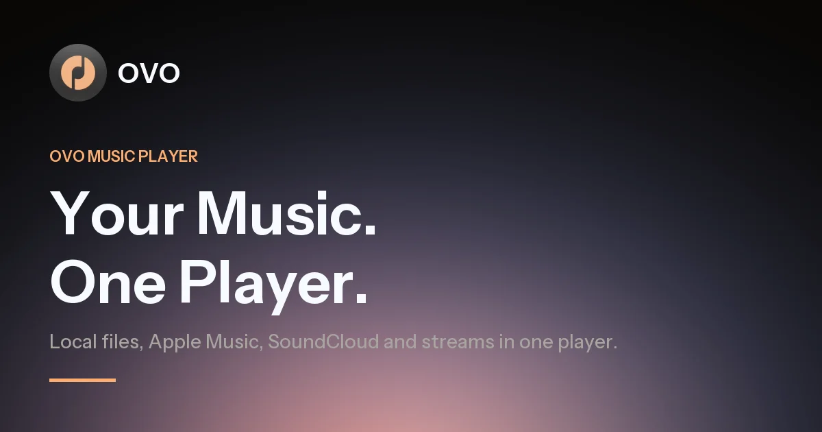
A 1200×630 social card that stacks everything in the left column against an empty right half: a dark circular app icon with a lowercase wordmark sits top-left, above an orange letterspaced eyebrow, a two-line extra-bold white headline, a muted lavender subline and a short orange accent rule. The background does the atmospheric work — near-black charcoal at the top dissolving into deep plum, with a warm peach-orange glow rising from the bottom edge. The tight vertical rhythm of five left-aligned elements against roughly 45% of untouched gradient keeps the card legible at thumbnail size.
Prompt preview
## Reference images

Study these alongside the description below: hierarchy, rhythm, spacing, colour. Build for the product you are asked about, using this design language.

- Screenshot: https://kage-design-assets.t3.tigrisfiles.io/screenshots/ovo/e3f55d6f-dc50-4019-85b6-8874a456f7b9-1789452171282.webp
- Design on Kage: https://kage.design/designs/ovo-og-image

# 1200×630 OG social card — dark gradient with left-aligned type stack

## Before you start
Ask the user what product the card is for, who it's for, and what brand assets they already have: brand name/wordmark, an icon or logo mark, brand colours, and a typeface if any. Wait for the answers before writing any code. Everything below is applied to *their* brand with placeholder copy — not to the reference product.

## Page structure
This is a single static image, not a page. Build it as a self-contained HTML file with a fixed 1200×630 body (render to PNG via screenshot) or as a single 1200×630 SVG. Layers, top to bottom:

1. **Background canvas** — full-bleed vertical gradient: near-black charcoal at the top, passing through deep plum, with one warm orange radial glow rising from the bottom (strongest bottom-centre/bottom-right).
2. **Logo lockup** (top-left, ~80px from edges) — a circular dark app icon (~90px) with a simple single-colour glyph, wordmark in lowercase beside it.
3. **Eyebrow label** — one short uppercase, letterspaced category line in accent orange ("PRODUCT CATEGORY" style placeholder).
4. **Headline** — a two-line product statement in extra-bold white; the largest element by far, one short phrase per line.
5. **Subline** — a single muted sentence naming what the product does or connects, directly under the headline.
6. **Accent rule** — a short horizontal orange bar (~100×6px) bottom-left, anchoring the column.

All content is left-aligned in one column occupying ~55% of the canvas width. The right ~45% stays pure gradient — no text, shapes or imagery there.

## Design language
- Canvas is exactly 1200×630 with ~80px padding on all sides; keep nothing within ~60px of an edge and keep text out of the extreme bottom-right corner where platform UI overlays appear.
- Hierarchy is built almost entirely from scale and weight: headline ~92px at weight 700–800, line-height ~1.05, slight negative letter-spacing; eyebrow ~22px uppercase with ~0.12em tracking and semibold weight; subline ~28–30px regular; wordmark ~40px lowercase semibold. Vertical gaps between stack elements run ~48–56px, tightening around the headline/subline pair.
- Colour: background from `#0B0A0E` through `#2A1822` into a radial glow of `#E89A6E` / `#C9744A` at the bottom; headline pure `#FFFFFF`; eyebrow and accent rule `#F0A268`; subline a muted lavender-grey `#A39AA6` — tint it toward the plum background, never a flat grey; icon circle dark `#2C2C30` with an accent-tinted glyph.
- The gradient is the only decoration: one smooth, low-contrast vertical wash plus one warm glow. No banding, no noise, no patterns, no shapes in the empty right zone.
- Type: one modern sans (the user's brand font, or Inter as fallback), differentiated by weight and size only — no serif pairing, no more than three sizes on the canvas.
- No borders, strokes or drop shadows on elements; all depth comes from the background glow.
- Static image — no motion. Check legibility by previewing at ~300px wide: the subline must still read, and the headline should carry the message alone.

## Never
- No OVO name, wordmark, icon, the copy "Your Music. One Player.", or references to Apple Music/SoundCloud — use the user's own brand and placeholder service names.
- Never present the result as the reference product's card or reuse its exact glow-to-plum palette unless it is genuinely the user's brand palette.