kage
kage
callfifi.app
Design analysis
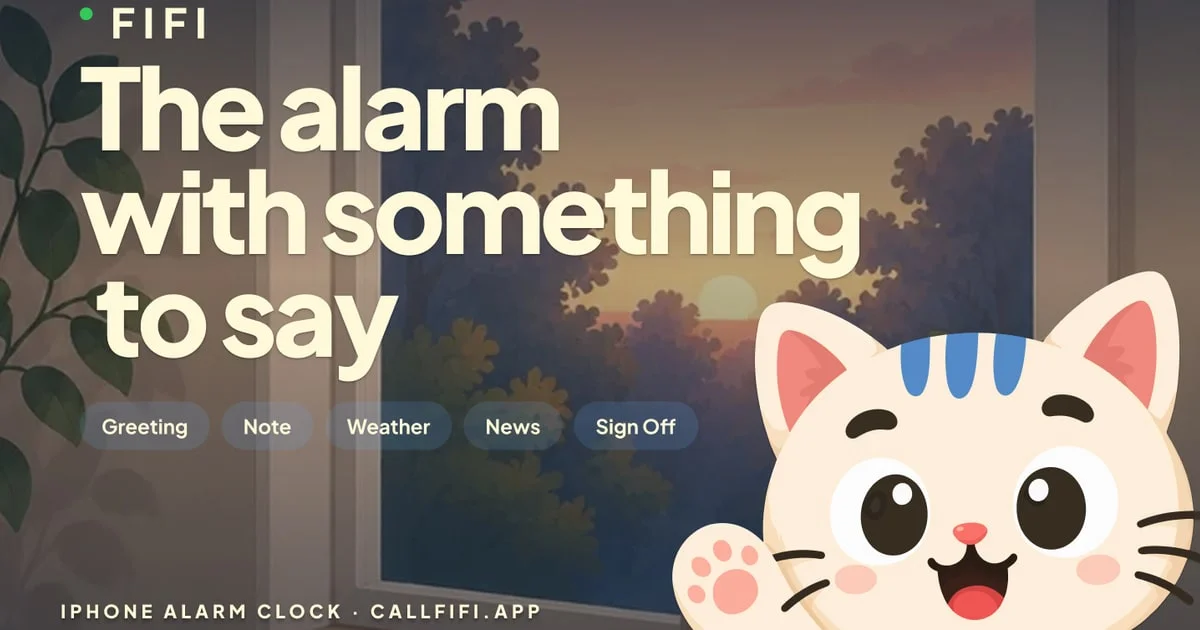
A 1200×630 share card composed like a still from a cozy animated short: a dim interior with a sunrise behind a window supplies the entire palette, while all type is pushed into the left half over the darkened wall. Hierarchy runs small letterspaced wordmark → a three-line cream headline in a heavy rounded sans (~120px, tight leading) → five translucent feature pills → a tiny uppercase footer strip. The illustrated cat mascot anchors bottom-right, cropped by the canvas edge, giving the card one bright focal point that balances the text mass.
Prompt preview
## Reference images

Study these alongside the description below: hierarchy, rhythm, spacing, colour. Build for the product you are asked about, using this design language.

- Screenshot: https://kage-design-assets.t3.tigrisfiles.io/screenshots/fifi/b50ae862-29cc-4093-9491-59ed7c8502f4-1789538431569.webp
- Design on Kage: https://kage.design/designs/fifi-og-image

# Social share card (1200×630) — cozy dawn scene with mascot

## Before you start
Ask the user what product or project the card is for, who it's for, and what brand assets they already have (name, colours, type, mascot or illustration style, domain). Wait for the answers before building — everything below is applied to *their* product, not to the reference.

## Goal
Produce one social share image at exactly **1200×630**. Build it as a single HTML file with a fixed 1200×630 `.card` element styled in CSS (a rounded friendly webfont such as Nunito/Baloo-class), rendered to PNG via a headless-browser screenshot — or as an equivalent standalone SVG. All branding, headline copy, chip labels and the character are placeholders invented for the user's product.

## Page structure
1. **Canvas**: full-bleed illustrated scene — an interior at dawn with a large window; silhouetted foliage in the near foreground on the left; a low sun in a lavender-to-peach sky behind the glass. Add a dark scrim over the left third so type stays legible.
2. **Wordmark row (top-left, ~48px from edge)**: a small round status dot in accent green plus the brand name in uppercase, heavily letterspaced (~0.2em), cream, ~28px.
3. **Headline (upper-left half)**: three stacked lines, left-aligned, ~120px, heavy rounded geometric sans, line-height ~0.95, cream. Copy is a short value statement broken at natural phrase points.
4. **Feature chip row (directly under the headline)**: five fully-rounded pill chips — `rgba(255,255,255,0.18)` fill, no border, ~15px white text, ~12px 22px padding — each naming one feature in a single word.
5. **Footer (bottom-left, ~40px from edge)**: one line, ~15px uppercase with wide tracking: product category `·` domain.
6. **Mascot (bottom-right)**: one large illustrated character, cropped by the right and bottom canvas edges, overlapping the window scenery; the brightest, most saturated element on the card.

## Design language
- **Composition**: split the canvas — the left ~55% is a quiet dark type zone, the right holds scenery plus the mascot. Keep ≥60px safe padding on all sides except where the mascot intentionally crops (social clients may round corners).
- **Colour**: dark desaturated backdrop (walls #1f2028–#2a2b36), dusk gradient from #8b7cb8 lavender to #cfa98e peach at the horizon, cream type #f3efdc (never pure white), one green accent dot #3ecf8e; pink and blue appear only inside the mascot. Never place saturated colour behind the headline.
- **Type**: one friendly rounded sans throughout; the scale contrast does all the work — tiny letterspaced wordmark/footer vs. the huge headline. No italics, no mixed fonts.
- **Legibility & depth**: any illustrated area behind text gets a dark scrim; text never overlaps the mascot; no drop shadows on type.
- **Mood**: cozy, dusk-lit, soft-edged; the pills are the only "UI" chrome on the card — everything else is scene and type.

## Never
- No Fifi name, cat mascot, "The alarm with something to say" copy, Greeting/Note/Weather/News/Sign Off labels, or callfifi.app domain — invent equivalent placeholder content for the user's product.
- Never present the result as Fifi or trace its illustration style verbatim; the character must be the user's own or a clearly generic placeholder.
- No real logos, photography or icon sets from the reference.