kage
kage
tell-we.vercel.app
Design analysis
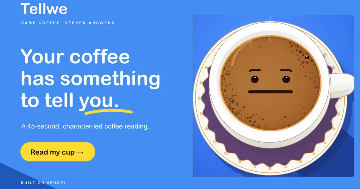
A 1200×630 social card split roughly 55/45 between a flat saturated blue type column and a lighter blue panel holding an oversized top-down coffee cup drawn with a neutral face. One rounded sans carries everything: a ~90px three-line headline with a hand-drawn yellow swoosh under the last word, letterspaced uppercase kickers at top and bottom, and a yellow pill CTA that reuses the accent a second and final time. Depth comes purely from colour blocking — no shadows or borders — while the cup bleeding past its panel and diagonal corner triangles keep the flat layout from feeling static.
Prompt preview
## Reference images

Study these alongside the description below: hierarchy, rhythm, spacing, colour. Build for the product you are asked about, using this design language.

- Screenshot: https://kage-design-assets.t3.tigrisfiles.io/screenshots/tellwe/1813ae1d-dca4-4cea-9f2b-b1a3bd799f5e-1790488917480.webp
- Design on Kage: https://kage.design/designs/tellwe-og-image

Produce a 1200×630 Open Graph social card image — either a single HTML/CSS file with a fixed 1200×630 artboard that can be screenshotted to PNG (e.g. with Playwright), or an equivalent standalone SVG. Use placeholder branding and copy supplied by the user; this is a composition study, not a clone.

## Before you start
Ask the user, and wait for the answers before writing code:
- What product or page is the card for, and what single action should the card drive?
- Who is the audience, and what one sentence should the card communicate?
- What brand assets exist: name/wordmark, primary and accent colours, typeface, and whether there is a mascot or illustration style?
- What is the call-to-action label to show on the card?

Apply every rule below to *their* product; use placeholders only for anything they don't supply.

## Page structure
1. **Canvas** — one flat, saturated background colour filling 1200×630. Split it roughly 55/45: left column for type, right panel for one hero illustration. Keep ≥60px outer padding so nothing clips in link previews.
2. **Wordmark** (top-left) — the product name as large plain white text, no logo artwork.
3. **Kicker** (under the wordmark) — one micro-line, uppercase, wide letter-spacing, short phrase separated by middots, ~18px.
4. **Headline** (left column, roughly vertically centred) — the main message broken across 2–3 short lines at ~90px bold; underline the final word with a slightly imperfect hand-drawn swoosh stroke (an SVG path, not a straight rule) in the accent colour.
5. **Support line** — one sentence, ~26px, lighter weight, max ~40 characters per line.
6. **CTA pill** (below the support line) — a fully rounded pill, 2–4 words plus a → arrow, dark text on the accent colour.
7. **Footer line** (bottom-left) — a tiny uppercase letterspaced credit line, ~14px, lowest emphasis on the page.
8. **Illustration panel** (right side) — a slightly lighter rectangle of the background colour occupying the full right side; inside it, one bold flat-style illustration of the product's subject, drawn oversized so it bleeds past the panel's top and bottom edges.
9. **Corner accents** — two or three flat diagonal triangles in a lighter tint of the background colour at the bottom-left corner, purely decorative.

## Design language
- **One flat field, no gradients.** The whole card sits on a single saturated colour (reference uses blue ~#4287F5); the illustration panel is a lighter tint of the same hue (~#5E9BF7). Depth comes from colour blocking, never from shadows.
- **One accent, used exactly twice.** A warm accent (reference yellow ~#FFD43B) appears only as the headline underline and the CTA pill, so the eye travels headline → button. Everything else is background + white type.
- **Type is one family, scaled hard.** A single rounded geometric sans throughout: ~90px/1.1 bold headline, ~26px support line, ~18px uppercase kicker with ~0.25em letter-spacing, ~14px footer. Deliberately nothing in between those roles.
- **Hierarchy by size jump, not weight tweaks.** Headline ≈ 3× the support line ≈ 5× the kicker. All text is light-on-dark except the dark text inside the accent pill.
- **Shape language: soft and friendly.** Fully rounded pill CTA, rounded type terminals, organic/scalloped curves allowed in the illustration. No borders, no drop shadows, no card containers.
- **Illustration rules.** Flat vector shapes with 3–4 fill colours total (reference uses brown ~#A9683A, purple ~#6B4FA0, white), oversized relative to its panel, plus one characterful detail — a simple face or expression on the product's subject — so the subject reads as a character rather than a stock photo.
- **Balance.** The left column is a strict left-aligned stack with consistent ~28–36px gaps; the right illustration is centred and allowed to overflow. The asymmetric split plus the corner triangles keeps it from reading as a centred template.
- **Static output, half-size check.** No motion; verify the card stays legible when scaled to ~600px wide (contrast, line breaks, CTA still readable) before delivering.

## Never
- Do not reuse the reference's name, wordmark, tagline, headline copy, credit line, or its coffee-cup-with-a-face illustration. Build the same composition with the user's own branding, subject and copy.
- Do not add third-party logos or platform marks unless the user supplies them.
- Never present the result as the reference product.