kage
kage
notchpop.com
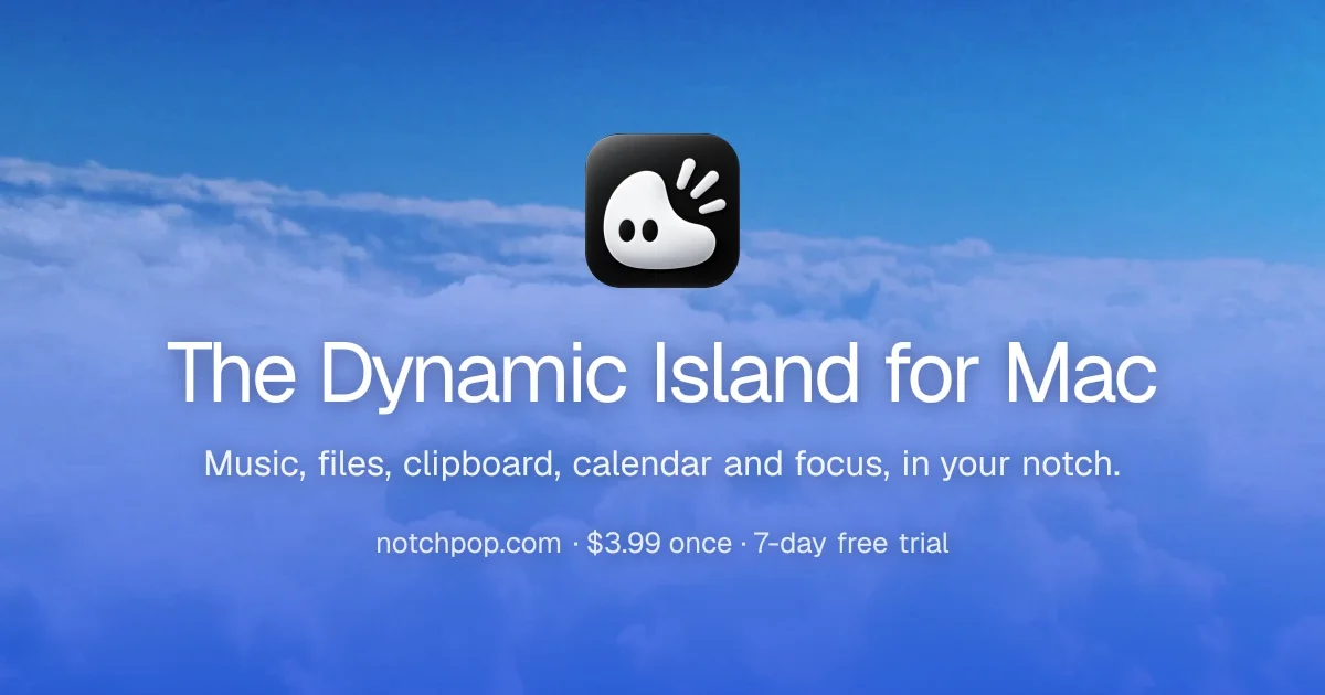
Design analysis
A 1200×630 social card built as a single centered stack over a full-bleed above-the-clouds sky photo that gradients from deep blue at the top to lavender-purple at the bottom. The glossy black app icon with a cute white blob character sits at the optical top-center, followed by a large white headline, a one-line feature subline, and a small meta line of dot-separated facts (domain, price, trial). Soft drop shadows under all text keep the white type legible over the bright photo, and the generous vertical spacing gives the card a calm, poster-like hierarchy.
Prompt preview
## Reference images

Study these alongside the description below: hierarchy, rhythm, spacing, colour. Build for the product you are asked about, using this design language.

- Screenshot: https://kage-design-assets.t3.tigrisfiles.io/screenshots/notchpop/a987fb6e-d8c3-4f69-bbd9-1da65b1c2213-1790316210000.webp
- Design on Kage: https://kage.design/designs/notchpop-og-image

## Before you start
Ask the user what product the card is for, who it is for, and what brand assets they already have (name, colours, type, app icon file). Wait for the answers before building. Everything below is applied to their product, not to the reference.

Produce a **1200×630 social card image** (the Open Graph / Twitter card size). Build it as a self-contained HTML/CSS file sized exactly 1200×630 (use a headless browser or screenshot tool to export PNG, or produce an equivalent SVG). Use placeholder branding and copy throughout — never the reference product's.

## Page structure
A single fixed-size canvas with one vertical, horizontally centered stack:
- **Background (full canvas)**: one rich photographic or gradient scene spanning edge to edge — in this reference, an above-the-clouds sky going from deep blue (#2f6fd0-ish) at the top to soft lavender-purple (#8f8fd8-ish) at the bottom. For the user's product, choose or generate a background that expresses the product's mood at similar saturation and depth; a large CSS gradient or a real photo both work.
- **App icon (top center, ~130×130px, ~40px radius squircle)**: the brand's icon rendered at large scale, placed just above the vertical midpoint of the canvas. If the user has an icon asset, use it; otherwise build a placeholder squircle with a simple abstract glyph.
- **Headline (centered, ~70–76px)**: one short line, e.g. "The [category] your [platform] was missing" style, white, medium-weight sans (SF Pro / Inter), tight leading.
- **Subline (centered, ~30–34px)**: one line listing 4–5 concrete features separated by commas, ending with a location phrase. White, regular weight.
- **Meta line (centered, ~24–26px)**: `domain · price · offer` separated by interpuncts (`·`) with comfortable letter spacing. White at slightly reduced opacity or same white.
- All text sits in the lower two-thirds; the icon is the only element above the headline. Total stack is optically centered with the icon just above center.

## Design language
- **One idea per card**: icon → headline → subline → meta, in a straight centered column. No logos beyond the icon, no buttons, no imagery collaged to one side.
- **Vertical rhythm**: ~90–110px gap between icon and headline, ~28–36px between headline and subline, ~40–48px between subline and meta. Generous, poster-like spacing — the card should read at a glance in a 200px-tall preview.
- **Type**: a single geometric/neo-grotesque sans (SF Pro Display or Inter) at three sizes (~72px / ~32px / ~25px). Medium weight for the headline, regular for the rest. No all-caps, no letterspaced label text.
- **Colour**: white type throughout; let the background carry all the colour. Background should be saturated and atmospheric (blues, purples, warm skies) rather than flat corporate gradients.
- **Legibility treatment**: every text element gets a soft drop shadow (roughly `0 2px 12px rgba(0,0,0,0.35)` or a subtle dark blur under the baseline) so white type stays crisp over bright areas of the background. The icon may get a slight shadow to lift it off the sky.
- **Meta line convention**: use interpuncts `·` as separators and keep it to short, scannable facts (where to get it, price, trial). This is a signature move — reproduce it with the user's own facts.
- **Safe area**: keep all content inside ~60px horizontal margins; nothing important in the outer 10% since some platforms crop edges.

## Never
No copying of the reference's blob-character icon, wordmark, copy ("The Dynamic Island for Mac", the feature list, the price line), or its cloud photograph. No mentioning or imitating NotchPop in the output. Present the finished card as the user's own product with their placeholder branding and copy.