kage
kage
hob.dev

Design analysis
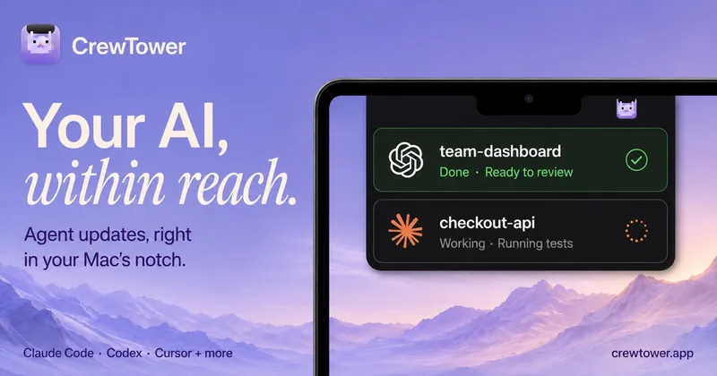
A disciplined two-zone composition at 1200×630: a centered three-line headline in a heavy white grotesque occupies the top half on near-black, while a cropped dark app window rises from the bottom edge and provides the product proof. All colour weight is deliberately withheld — the canvas is black/white/gray until the small circular white badge with a teal-to-orange bar mark, which does double duty as wordmark and focal accent. The window is rendered as atmosphere (low-contrast UI chrome, readable diff colours but illegible body text) so the headline and badge stay the only fully legible elements even at feed thumbnail size.
Prompt preview
## Reference images

Study these alongside the description below: hierarchy, rhythm, spacing, colour. Build for the product you are asked about, using this design language.

- Screenshot: https://kage-design-assets.t3.tigrisfiles.io/screenshots/hob/9db9b271-0399-4efb-b126-2cc2cc862641-1789106471939.webp
- Design on Kage: https://kage.design/designs/hob-og-image

## Before you start
Ask the user what product they are building, who it is for, and what brand assets they already have (name, logo mark or wordmark, brand colours, typeface). Wait for the answers before writing any code — everything below is applied to *their* product, not to the reference.

## Page structure
Produce a single **1200×630 Open Graph social card** — build it as a standalone HTML/CSS document sized exactly 1200×630 (screenshot to PNG via Playwright/Puppeteer) or as a standalone SVG. It is one static image, not a scrollable page. Zones, top to bottom:

1. **Headline zone (top ~45% of canvas):** the product's one-line value proposition, centered, broken across 2–3 lines, set in white on the near-black canvas. Generous top margin (~64–80px) so the text never feels cropped in feeds.
2. **Product window (bottom ~55%):** a dark, realistic-looking application window — title bar with traffic lights and a tab/search strip, a narrow left icon rail, a file-tree or list column, and a main pane with code or diff content. Its top corners are rounded (~10–12px) and its bottom edge runs off the canvas, cropped. This zone is texture and proof, not reading material.
3. **Logo badge (overlay, right third):** a white circular badge (~140–160px) with a soft drop shadow, overlapping the window's right side, containing a single abstract mark built from 2–3 rounded shapes in the brand accent (a small gradient is fine). This anchors the composition and carries the brand.

## Design language
- **Canvas:** near-black `#0A0A0C` with a very subtle radial lift to `#17171B` behind the window and slightly darker vignette corners. Flat — no textures, patterns, or decorative shapes.
- **Hierarchy:** headline → badge mark → window UI. Only the headline and badge need to be legible at feed-thumbnail size; the window's body text is intentionally low-contrast (gray `#8A8A8E` on `#141416` panels) so it reads as a real product without competing for attention.
- **Type:** one grotesque family (Inter/SF-style). Weight does all the pairing: ~64–72px at weight 700–800 with line-height ~1.05 and -0.02em tracking for the headline; weight 400–500 at 11–13px inside the window chrome. No second typeface.
- **Colour discipline:** ~90% of the canvas is black, white, and gray (`#0A0A0C`, `#141416`, `#FFFFFF`, grays). Brand accent appears only inside the badge mark (e.g. teal `#2DD4BF` → orange `#F59E0B` gradient) and as tiny functional touches in the UI (green `+` / red `−` diff colours).
- **Window craft:** give the fake UI believable structure — traffic-light dots, a command/search bar pill, tab labels, indented tree rows, monospaced code lines with syntax colouring — but keep panel contrast low and edges crisp. Rounded top corners only; a faint 1px light border (`rgba(255,255,255,0.08)`) separates the window from the background.
- **Spacing:** center everything on the vertical axis; the badge is the only deliberately off-axis element. Keep ~48px side clearance for the headline so platforms' rounded link previews don't clip it.
- **Motion:** none — this is a static export. Test legibility by zooming the render to 25–50%: headline and badge mark must still read instantly.

## Never
- Do not reuse the reference product's name, wordmark, stacked-bars logo, headline copy, file names, diff content, or any UI copy — invent placeholder branding and copy for the user's product.
- Do not present or caption the result as the reference product; it is a new card in the same compositional style.