kage
kage
Design analysis
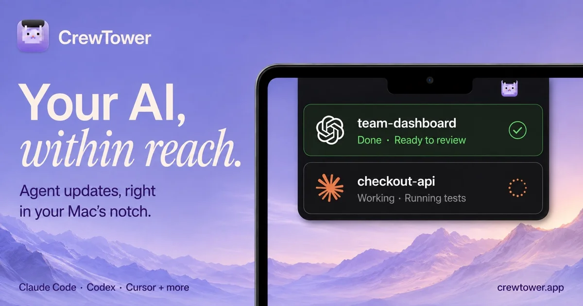
A 1200×630 social card set on a dusk-lavender gradient sky with a soft mountain silhouette, so it reads like a macOS desktop rather than a marketing banner. The left column stacks a small icon-plus-wordmark lockup, a two-line headline that pairs a heavy cream sans ('Your AI,') with an italic serif ('within reach.'), and a deep-indigo subhead; the right half is a black MacBook frame cropped by the card edges, its notch anchoring a floating dark notification stack — one green-tinted 'Done · Ready to review' card with a check ring, one charcoal 'Working · Running tests' card with an orange dotted spinner, the status contrast doing the storytelling. A quiet baseline footer row closes it: supported agents bottom-left, domain bottom-right, both in small indigo type.
Prompt preview
## Reference images

Study these alongside the description below: hierarchy, rhythm, spacing, colour. Build for the product you are asked about, using this design language.

- Screenshot: https://kage-design-assets.t3.tigrisfiles.io/screenshots/crewtower-mod-for-claude-code/d4383e77-43d1-4de9-af94-ec23be1ab2b7-1792303276630.webp
- Design on Kage: https://kage.design/designs/crewtower-mod-for-claude-code-og-image

## Before you start
Ask the user what product or feature the card announces, the exact headline, subhead and domain copy, which tools/integrations to list in the footer, and what brand assets exist (app icon, logo, brand colours, fonts). Wait for the answers before writing any code — apply everything below to *their* brand; use neutral placeholders only where they have none.

## Deliverable and page structure
Produce a single **1200×630 social card image** — either an HTML/CSS file with a fixed 1200×630 canvas (render to PNG at 2× for crispness) or an SVG with the same geometry. Sections, in order:

1. **Background layer** — full-bleed vertical gradient sky (lavender top fading to a warmer mauve/pink horizon) with a soft, abstract mountain-ridge silhouette across the bottom third. Abstract gradient shapes, not a stock photo, unless the user supplies one.
2. **Brand lockup** (top-left, ~48px inset) — a rounded-square app icon (~56px, light tint of the brand colour) beside the wordmark in bold cream sans.
3. **Headline block** (left column, ~48–55% of the width, upper-middle vertical zone) — line 1 in a very heavy sans, line 2 in an italic serif, same cream colour, tight leading; beneath it a two-line subhead in deep indigo at roughly a third of the headline size.
4. **Device mock** (right half, bleeding off the top/right/bottom edges) — a near-black rounded-corner display frame with a thin lighter rim and a notch at top-centre; optionally a tiny generic menu-bar glyph inside the top edge.
5. **Notification stack** (floating panel anchored just under the notch, ~60% of the device width) — two stacked dark glass cards: a success card (green-tinted background, generic icon shape, task name, 'Done · short status' line, green check ring on the right) and an in-progress card (charcoal background, different generic icon shape, task name, 'Working · short status' line, orange dotted spinner ring on the right). Use placeholder task names in mono or semibold sans.
6. **Footer baseline row** (bottom edge, ~48px inset, same baseline) — a tool/integration list bottom-left and the domain bottom-right, both small and in deep indigo.

## Design language
- **Canvas discipline**: fixed 1200×630, ~48px safe margins; a roughly 50/50 split with text left and device right; the device crop beyond the edges implies a larger scene.
- **Colour**: one atmospheric background gradient (approx #b7a6e3 → #d5c3d4), cream for headline/wordmark (approx #f7f0e1), deep indigo for all supporting text (approx #372a75), charcoal for panels (approx #16171b); green (#34c77b on a #1b3a26 tint) and orange (#f0762b) appear *only* as status accents inside the notifications. Never introduce a fifth hue.
- **Type pairing**: heavy geometric sans (wordmark + headline line 1) contrasted with a high-contrast italic serif (headline line 2) is the signature move — the italic line carries the emotional half of the message. Headline ~96–110px, subhead ~30px, footer ~22px, notification titles ~28px semibold, status lines ~24px at reduced opacity.
- **Hierarchy**: wordmark is the smallest element at top, headline is the largest object on the card, the device mock is the visual proof, the footer row is quiet uniform metadata — four clear scale steps, nothing in between.
- **Depth and edges**: notification cards get 16–20px radius, a subtle 1px inner border, and a soft wide drop shadow so they float above the wallpaper; the device bezel is near-black with a thin lighter rim highlight.
- **Status contrast as narrative**: exactly one 'done' card in green and one 'working' card with a spinner — the green/orange pair tells the product story without extra copy. Keep all text clear of the notch and the device frame.
- **Static by nature**: no motion; verify legibility at small preview sizes (text must survive ~600px wide rendering).

## Never
- Do not use the CrewTower name, wordmark, pixel-cat mascot, icon, domain, or the headline copy 'Your AI, within reach.'
- Do not reproduce real vendor logos or trade dress (OpenAI flower, Claude/Codex starburst, Anthropic marks, Apple menu-bar icons) — use abstract generic shapes.
- Do not copy the macOS Sonoma mountain wallpaper photograph; build an abstract gradient-and-silhouette backdrop instead.
- Never present the output as the reference product; it is the user's own brand rendered in this composition.