kage
kage
hyperframes.dev
Design analysis
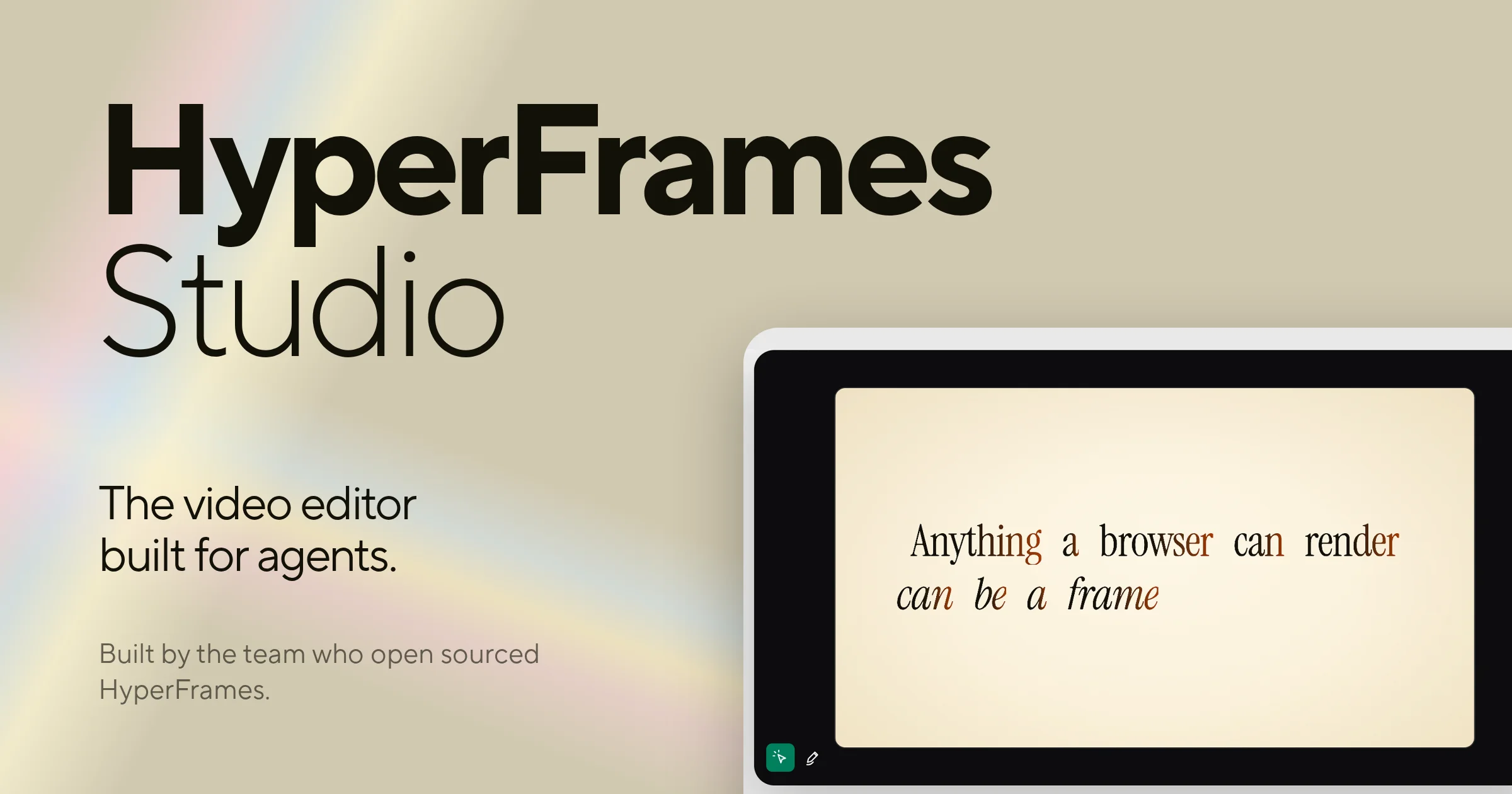
A 1200×630 social card set on a warm khaki field with a soft iridescent rainbow leak entering from the top-left corner. The left third is a pure typographic stack — a very heavy geometric sans wordmark over a light-weight second line, then a mid-size sans tagline and a small muted credit — while the right half is a dark app window cropped off the canvas edge, containing a cream 'frame' panel set in a serif headline with rust-red and italic accent words. Hierarchy is carried almost entirely by extreme type-scale contrast (≈160px display against ≈20px captions) and a single warm accent colour; there are no buttons or badges, only the blurred gradient, the cropped mockup and two tiny toolbar glyphs.
Prompt preview
## Reference images

Study these alongside the description below: hierarchy, rhythm, spacing, colour. Build for the product you are asked about, using this design language.

- Screenshot: https://kage-design-assets.t3.tigrisfiles.io/screenshots/hyperframes-studio-desktop/e21de680-5a51-4657-affa-f6d5b4f30aed-1791266530862.webp
- Design on Kage: https://kage.design/designs/hyperframes-studio-desktop-og-image

## Before you start

Ask the user what they are building, who it is for, and what brand assets they already have (brand name, exact colour values, typeface preferences, the tagline the card should carry, and where it will be shared — X, Slack, LinkedIn). Wait for the answers before writing any code. Everything below is applied to *their* product with *their* branding, never to the reference product.

**Deliverable:** one self-contained HTML file with a fixed 1200×630 stage (`body { width:1200px; height:630px; overflow:hidden; margin:0 }`), plus instructions to screenshot it to PNG at exactly 1200×630 with a headless browser (or an equivalent standalone SVG). No external assets except web fonts.

## Page structure

- **Canvas** — exactly 1200×630, a single fixed composition: no navigation, no CTA buttons, no footer, no URL strip. Safe margins ≈80–90px on the left and top.
- **Background** — flat warm neutral (khaki/sand) across the whole canvas, with one soft blurred pastel-rainbow band entering from the top-left corner only (pink/peach/pale blue/pale green, blur ≥60px, opacity ≤35%).
- **Type column (left ~45%)** — line 1: the brand name in a very heavy geometric sans (≈150–170px). Line 2: the product/sub-name in the same family at light weight, same size, tight leading, so it reads as a subtitle. Below, a two-line tagline in medium sans (≈32–36px). Below that, a one-to-two-line credit line at ≈18–22px in muted warm grey.
- **Product visual (right ~55%)** — a dark rounded app window (near-black chrome, radius ≈28px) whose right edge bleeds off the canvas, cropped rather than scaled down. Inside it, an inset cream panel (radius ≈16px) with a centred two-line serif headline in which two or three key words are italic and/or rust-red. Bottom-left of the dark chrome holds two tiny glyphs: a small filled rounded-square badge (≈28px) and a bare icon beside it.

## Design language

- **Scale does the hierarchy.** Three type sizes only: display ≈150–170px, tagline ≈32–36px, caption ≈18–22px. Nothing in between.
- **Wordmark pairing:** one sans family in two contrasting weights (Black + Light) stacked with tight leading; the lighter second line balances the heavy first without a second typeface.
- **Colour ground (approx hex, swap for the user's palette):** khaki background ≈`#C8C1A6`, ink ≈`#141414`, cream panel ≈`#F5EEDC`, muted warm grey ≈`#7D7767`, one rust-red accent ≈`#8F3B26`, small emerald badge ≈`#0E7B5C`.
- **Accent discipline:** rust red appears only inline on 2–3 words inside the serif headline — never on the background, chrome or wordmark. Mix roman and italic within the same headline for texture.
- **Type pairing:** a geometric grotesque sans for wordmark/tagline/credit; a bookish serif with a true italic for the headline inside the frame panel. The serif lives only inside the 'screen' area — the type column stays sans.
- **Corners and shadow:** generous radii on the window (≈28px) and inner panel (≈16px); shadows almost absent — at most one very soft ambient drop under the window; no visible borders, edges are implied by colour contrast (dark chrome on khaki, cream panel inside dark chrome).
- **Composition:** asymmetric — typography owns the left, one object owns the right, and the object bleeds off-canvas to imply a larger product. Keep the type column airily spaced (≥80px gaps between wordmark, tagline and credit).
- **Density:** extremely low. One wordmark, one tagline, one credit, one visual. Resist adding buttons, QR codes, logo rows or extra copy.

## Never

- Never reproduce the HyperFrames name, wordmark, tagline copy, the serif headline text, or its green sparkle/pencil icons — use the user's brand or neutral placeholders ('Brand', 'Studio', copy they supply).
- Never present the result as HyperFrames Studio or mention the reference product anywhere in the card.
- Never add sections the composition doesn't call for (nav, CTAs, footers, borders around everything) — the card works because it is sparse.