kage
kage
conifer.build
Design analysis
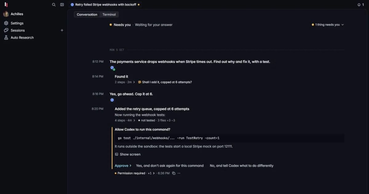
A 1200×630 dark social card uses a cropped product-interface view as its primary visual, with a near-black canvas, fine gray dividers, and compact white interface text. The focal hierarchy comes from the bright conversation timeline and yellow status accents inside a framed workspace, while a small top-left mark and sparse chrome establish the wordmark area without competing with the product imagery.
Prompt preview
## Reference images

Study these alongside the description below: hierarchy, rhythm, spacing, colour. Build for the product you are asked about, using this design language.

- Screenshot: https://kage-design-assets.t3.tigrisfiles.io/screenshots/parallax/ce8d20d5-e702-4b3f-93fc-1fac3dbe346d-1792216865291.webp
- Design on Kage: https://kage.design/designs/parallax-og-image

## Before you start
Ask the user what they are building, who it is for, and what brand assets they already have, including the product name, logo or wordmark, colours, and typefaces. Wait for their answers before designing. Apply the direction below to their product, using placeholder branding and copy until those details are provided.

## Page structure
- **1200×630 social-card canvas:** Create a fixed 1200×630 image intended for sharing on X, Slack, LinkedIn, or iMessage; keep all essential content inside a generous safe area.
- **Dark background field:** Use a nearly black background as the uninterrupted base, with a subtle tonal difference between the outer canvas and the embedded product surface.
- **Top-left brand area:** Place a small placeholder symbol or compact wordmark near the upper-left edge, aligned to the same horizontal system as the interface imagery.
- **Embedded product-interface focal area:** Fill most of the card with a cropped, dark application workspace rather than a conventional marketing illustration. Show a left navigation rail, a slim top bar, and a large conversation or activity panel.
- **Conversation timeline:** Use stacked rows of compact messages, timestamps, status markers, and one prominent approval or command block to create the recognizable focal content. Let the timeline occupy the visual center and lower-middle of the card.
- **Peripheral application chrome:** Add restrained tabs, search or utility glyph placeholders, and small status labels around the workspace edges so the card feels like a live tool without becoming difficult to read at thumbnail size.

## Design language
- **Build hierarchy through crop and contrast:** The application workspace is the hero. Keep the outer canvas quiet, make the central timeline slightly brighter, and reserve the strongest contrast for the key message and command/approval block.
- **Use a restrained dark palette:** Start with near-black `#0d0e12`, use deep charcoal surfaces around `#11121a`, muted dividers around `#242631`, cool gray secondary text around `#7d808b`, and off-white primary text around `#e6e7eb`.
- **Add one warm signal colour:** Use a muted yellow or amber near `#e7c84a` for status dots, attention states, and a thin accent rule. Keep it sparse so it reads as an operational signal rather than decoration.
- **Pair compact UI type with clear emphasis:** Use a neutral sans-serif for all copy, with small 11–14px interface labels, 15–18px focal text, and a short bold headline or product claim only if the user's content requires one. Avoid oversized promotional typography that would obscure the product view.
- **Use a technical grid:** Align the wordmark, chrome, timeline, and status elements to consistent left edges and narrow columns. Combine a wide visual panel with a slim navigation rail and generous dark negative space.
- **Keep surfaces crisp:** Use 1px low-contrast borders, little or no shadow, and small 4–8px radii on panels and controls. Avoid gradients, glossy glass, heavy cards, and ornamental illustration.
- **Design for thumbnail legibility:** Reduce interface detail to a few readable rows, one clearly dominant interaction block, and a limited number of status markers. Maintain strong luminance separation even when the image is viewed small.
- **Render as an image:** Produce the final result as a 1200×630 social-card image, for example by building HTML/CSS and rendering it to PNG or by authoring an SVG and exporting it to PNG. Use placeholder branding and copy, and make sure no important text or mark is clipped.
- **Keep the composition static and editorial:** There is no need for animation; use alignment, cropping, density, and small operational accents to create energy.

## Never
- Do not copy the reference product's logo, wordmark, product name, interface text, exact icons, or distinctive copy.
- Do not reproduce the reference screenshot pixel-for-pixel; create a new product-interface composition with placeholder branding and copy.
- Do not use photography, illustrations, or a decorative icon set in place of the interface-led imagery.
- Never present the result as Parallax or imply an affiliation with the reference product.