kage
kage
trypalomino.com
Design analysis
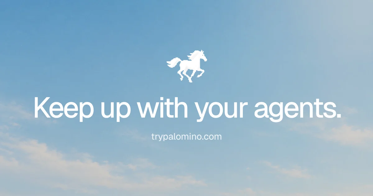
The card runs on a single visual tension: a crisp one-bit pixel-art horse floating over a soft photographic sky. Everything sits on one vertical centre axis — sprite mark at the upper third, a ~90px white neo-grotesque headline ending in a full stop, then the domain at roughly a third of the headline size — with the remaining canvas left as pure negative space. Colour does all the branding: mid-blue sky deepening toward the top and hazing into warm cream cloud at the lower-left, with white as the only foreground colour and no borders, cards or shadows anywhere.
Prompt preview
## Reference images

Study these alongside the description below: hierarchy, rhythm, spacing, colour. Build for the product you are asked about, using this design language.

- Screenshot: https://kage-design-assets.t3.tigrisfiles.io/screenshots/palomino/9b9216b3-b1d2-4236-a8ce-3fd8fa8dcc34-1792216833311.webp
- Design on Kage: https://kage.design/designs/palomino-og-image

## Before you start
Ask the user what product this social card is for, who it is for, and which brand assets they already have (name, a one-line headline or tagline, domain, a logo or mark, brand colours, typeface). Wait for the answers. Everything below is applied to *their* brand with placeholder copy — never to the reference product.

## Page structure
Produce a single static image, exactly 1200×630 (export at 2×, 2400×1260, if possible). Build it as one self-contained HTML file sized 1200×630 rendered to PNG via a headless-browser screenshot, or as a standalone 1200×630 SVG. It is one canvas with four stacked layers, all centred on a single vertical axis:

1. **Background layer** — full-bleed photographic sky filling the whole canvas. A soft vertical gradient: mid blue at the top, lighter blue through the middle, a hazy warm cream drift of cloud in the lower-left corner. If the user has no photo, synthesise it with CSS/SVG gradients plus blurred cloud shapes.
2. **Brand mark** — the user's logo rendered as a deliberately low-fi element (a pixel-art or 1-bit-style sprite is the reference move; use whatever low-fidelity treatment fits their mark). Centred horizontally, sitting at roughly 28–35% of canvas height, about 100–120px tall so it reads as an icon, not an illustration scene.
3. **Headline** — one short sentence, the largest element on the card (~92–100px), centred at the vertical middle. Sentence case, ending in a full stop for a declarative tone.
4. **Domain line** — the product's URL, small (~26–28px), centred ~40–60px below the headline, full opacity.

Nothing else. No footer, no badges, no UI chrome.

## Design language
- **One axis, three elements.** Mark, headline and domain share a single vertical centre line; hierarchy comes from scale steps (sprite ≈ 110px, headline ≈ 96px, domain ≈ 28px), not from position or weight changes.
- **Negative space is the layout.** Leave the top ~25% and bottom ~20% of the canvas empty; horizontal margins ≥ 60px. If a fourth element seems necessary, delete something else instead.
- **Background carries the colour.** Approximate values: top sky `#8FB8E0` → mid `#B9D6EE` → lower haze/clouds `#E6DED0`. Keep it photographic and soft; the card's energy comes from the background gradient, not decoration.
- **White is the only foreground colour.** All type and the mark in `#FFFFFF`, no scrims, no text shadows, no borders, no cards. Legibility comes from choosing a mid-tone sky, not from overlays.
- **Type.** One neo-grotesque family (Helvetica Now / Inter class) throughout. Headline in regular-to-medium weight with slightly tightened tracking (~-1%), sentence case, terminal period. Domain in the same family at regular weight — same colour, smaller size, nothing else changes.
- **The contrast motif.** Pair exactly one hard-edged, low-resolution element (the pixel-sprite mark) against the soft photographic background. That tension is the design idea; do not soften the sprite or add a second retro element.
- **Motion: none.** This is a static asset; no animation, and nothing that implies interaction (no buttons, arrows, cursors).

## Never
- Do not reuse the pixel-art horse, the copy "Keep up with your agents.", the domain trypalomino.com, or the name Palomino — all branding and copy must be the user's own placeholders.
- Do not present the result as the reference product or include its visual identity in any form.
- Do not add UI screenshots, device mockups, buttons, gradient meshes, borders or shadows — the card is background + mark + two lines of type, nothing more.