kage
kage
incredible.one
Design analysis
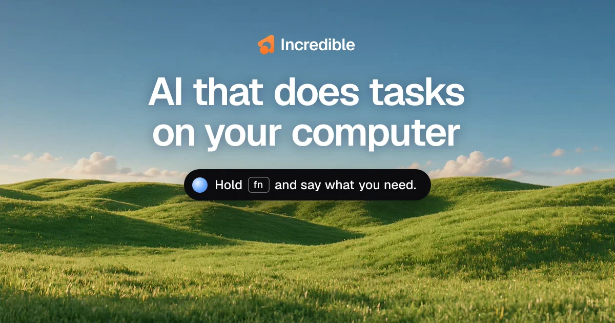
A social card composed like a keynote slide: a full-bleed photograph of rolling green hills under a blue sky fills the 1200×630 canvas, and everything else is one small centered stack. A compact orange-mark wordmark sits top-centre, a two-line ultra-bold white headline (~90px, tight leading) dominates the optical centre, and a black pill rendering the product's own voice-command UI — blue orb, "fn" keycap, short instruction — anchors the horizon line at roughly 58% height. Legibility over the bright photo comes from a soft drop shadow on the white type rather than overlays, while the only saturated accents (orange logo, blue orb, black capsule) read as brand and product chrome sitting on top of the scene.
Prompt preview
## Reference images

Study these alongside the description below: hierarchy, rhythm, spacing, colour. Build for the product you are asked about, using this design language.

- Screenshot: https://kage-design-assets.t3.tigrisfiles.io/screenshots/incredible/8390884d-f558-4a19-8e01-1e01f830a361-1791353060411.webp
- Design on Kage: https://kage.design/designs/incredible-og-image

# 1200×630 social card — full-bleed photo with a centered keynote-style stack

## Before you start
Ask the user what they are building, who it is for, and what brand assets they already have (product name, logo glyph or wordmark, brand colours, typeface). Wait for the answers. Everything below is applied to **their** product with placeholder branding and copy — never the reference's.

## Page structure
Produce a single fixed-ratio image: 1200×630 (do it as an HTML/CSS file sized 1200×630 rendered to PNG, or as a standalone SVG). One canvas, five layers top to bottom:

1. **Background layer (full bleed, 0–100%).** A calm photographic scene — sky occupying the upper half, softer texture in the lower third. Use the user's brand-appropriate imagery (or a soft two-stop gradient: e.g. `#4D8FC9` → `#C5DCEA`) as a placeholder. No scrim; the photo stays bright.
2. **Wordmark row (~8–12% from top, horizontally centred).** Small logo glyph (~36px) beside the product name in ~30px semibold white. Delicate, subordinate.
3. **Headline block (~25–50% of height, horizontally centred).** The value proposition in two balanced lines, each ~90–100px bold white. This is the largest element on the canvas by far.
4. **Command pill (centred at ~55–62% height, straddling the horizon).** A black capsule, fully rounded, ~80% opacity black, containing a small circular accent button (blue orb with a top highlight), a keyboard-key glyph — a short label inside a 1px-bordered rounded rect — and one short instructional sentence in ~22–24px white. This element is a miniature of the product's own UI.
5. **Lower third (~38% of canvas).** Deliberately empty; only background imagery. This breathing room is what keeps the card from feeling cramped in social feeds.

## Design language
- **Hierarchy = size contrast.** One dominant element (the headline), one medium (the pill), one minor (the wordmark). Nothing else competes; there are no cards, borders or panels other than the pill.
- **Composition is strictly centred and symmetric.** Wordmark, headline and pill share one vertical axis; the pill is placed so it appears to sit on the horizon, anchoring the copy in the sky.
- **Type.** A single neo-grotesque sans (Inter / Helvetica-like). Headline: weight 700–800, line-height ≈1.05, letter-spacing ≈ −0.02em, all sentence case. Wordmark ~30px semibold; pill copy ~22px regular. Maximum three sizes on the whole canvas.
- **Colour.** Sample the background scene for the palette; keep the scene natural (sky blues ≈ `#4D8FC9`–`#C5DCEA`, greens ≈ `#5C7F3C`–`#A9C35B`). Type is pure white `#FFFFFF`. Dark chrome is near-black `#0A0A0A` at 85–90% opacity. Use exactly two saturated accents: the brand colour (placeholder orange `#F05023` on the logo) and one UI accent (placeholder blue `#3B82F6` orb).
- **Legibility over photography.** No boxes or overlays behind the headline; instead a soft shadow on white type, e.g. `text-shadow: 0 2px 12px rgba(0,0,0,0.25)`. Keep the sky area behind the headline low-detail so the type stays crisp.
- **Product-UI motif.** The pill should read as authentic OS chrome: 999px radius, subtle translucency, a keycap glyph drawn with a 1px rounded border and slightly lighter fill, and a glossy orb (radial highlight). It is the only "app" element on the card — that contrast is the idea.
- **Export.** Fixed 1200×630, no responsive behaviour, no hover states. Keep all copy ≥40px except the wordmark and pill so it survives thumbnail sizes.

## Never
Do not use the Incredible name, orange blob logo, the "AI that does tasks on your computer" headline, the "Hold fn and say what you need" copy, or the Windows-XP-style hills photograph. Do not present the output as that product. Use the user's own brand assets, or clearly placeholder name, copy and imagery, and their own choice of background scene.