kage
kage
kilo.ai
Design analysis
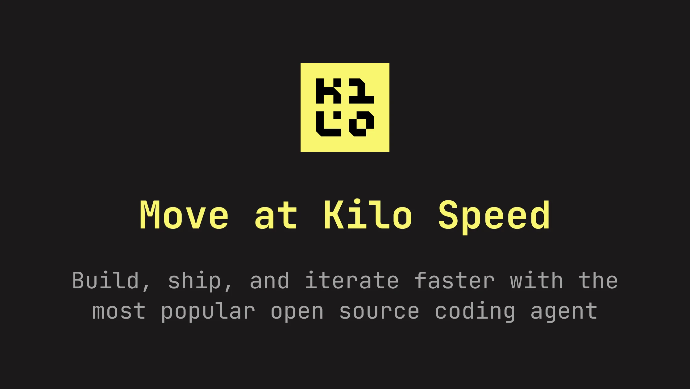
A 1200×630 OG card built almost entirely from two colours: near-black background and acid-yellow accents. Composition is a strict vertical stack, centre-aligned: a square yellow logo tile (with pixel/bitmap-style glyph) sits at the visual centre, a large yellow monospace headline reads "Move at Kilo Speed" below it, then two lines of muted gray monospace subcopy. Hierarchy comes purely from size and colour contrast — no photography, gradients or illustration — giving it a terminal/hacker identity that matches a coding-agent product.
Prompt preview
## Reference images

Study these alongside the description below: hierarchy, rhythm, spacing, colour. Build for the product you are asked about, using this design language.

- Screenshot: https://kage-design-assets.t3.tigrisfiles.io/screenshots/kilo-code-for-ios-and-android/bd334e04-13e5-4d3c-b387-e2d548ff2787-1789538625485.webp
- Design on Kage: https://kage.design/designs/kilo-code-for-ios-and-android-og-image

## Before you start
Ask the user what product the card is for, who it is for, and what brand assets they have (name, logo mark, colours, preferred typeface). Wait for answers before producing anything. Everything below is applied to *their* brand, not the reference.

## Task
Produce a single **1200×630 social card image** (Open Graph / Twitter card). Recommended approach: an HTML/CSS page sized 1200×630 rendered to PNG (e.g. via Playwright/Puppeteer screenshot), or an SVG. Deliver both the source and the exported PNG.

## Page structure
- Full-bleed background in a near-black tone (~#1C1C1A).
- One vertical, centre-aligned stack filling the canvas:
  1. **Logo tile** at ~35% from the top: a square accent-colour tile (~168px) containing the brand mark as a heavy pixel/bitmap-style glyph in the background colour.
  2. **Headline** below it: one short punchy line (5–8 words), large (~90–100px), in the accent colour, generous letter spacing.
  3. **Subcopy** beneath: one or two lines (~44–48px) in muted gray (~#8A8A88) summarising the value prop, max width ~75% of canvas, line-height ~1.3.
- Even vertical margins; the composition breathes — nothing touches the edges.

## Design language
- Two-colour system: near-black background (~#1C1C1A), one saturated accent (~#F0F063 acid yellow), one neutral gray for secondary text. No gradients, no imagery.
- Monospace typeface throughout (e.g. JetBrains Mono / IBM Plex Mono) to signal terminal/developer identity.
- Hierarchy by size and colour only: accent tile → accent headline → gray subcopy.
- Centre-axis symmetry; generous whitespace; flat, no shadows or borders.
- Keep headline under ~8 words so it reads at small share-preview sizes.

## Never
- Do not use the Kilo name, its "K2LO" pixel wordmark, its yellow-on-black palette verbatim, or its copy ("Move at Kilo Speed", "Build, ship, and iterate faster…"). Substitute the user's own branding and copy.