 kage
kage
kinetics.colorion.co
Design analysis
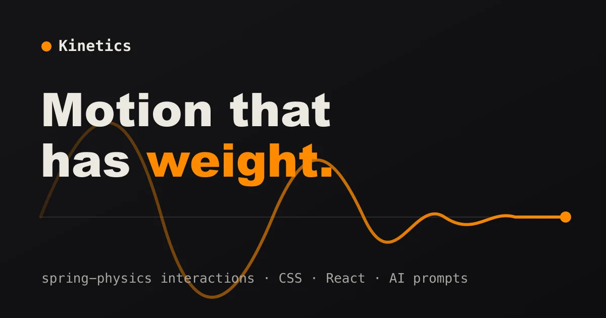
A 1200×630 near-black social card organised into three horizontal bands: a small top-left lockup (orange dot plus bold monospace wordmark), an oversized two-line display headline in extra-bold type where only the final word "weight." flips to orange, and a damped spring curve that enters at full amplitude behind the headline and decays to a settled flat hairline ending in a solid orange dot. A monospace keyword strip in muted gray with middot separators anchors the bottom margin. Colour is restricted to off-white, orange and gray on black, and the pairing of a heavy humanist display face with monospace secondary text gives the whole card a precise, engineering-flavoured tone — the curve literally demonstrates the product's pitch.
Prompt preview
## Reference images

Study these alongside the description below: hierarchy, rhythm, spacing, colour. Build for the product you are asked about, using this design language.

- Screenshot: https://kage-design-assets.t3.tigrisfiles.io/screenshots/kinetics-colorion-co/8c11e6bb-ded0-439c-87f9-655ef593fd93-1789374924182.webp
- Design on Kage: https://kage.design/designs/kinetics-colorion-og-image

# Build a social/OG card in this style

## Before you start
Ask the user what product or project this card is for, who it is for, and what brand assets they already have (name, colours, type, tagline or keyword list). Wait for the answers. Everything below is applied to *their* product; the reference only defines composition and tone.

## Goal
Produce one static social preview image at exactly **1200×630** (optionally also a 2× export). Recommended implementation: a single self-contained `og.html` with a fixed 1200×630 canvas (HTML/CSS + inline SVG), screenshotted to PNG — or a standalone SVG of the same size. Use placeholder branding and copy if the user hasn't supplied final assets.

## Page structure
One canvas, read top to bottom as horizontal bands:

1. **Safe frame** — 72–80px padding on all sides; keep all text and the graphic's endpoint inside this frame, since link previews crop edges.
2. **Top-left lockup** — a small filled accent dot (~14px circle) followed by the product wordmark in bold monospace, ~28–32px, off-white, slight letter-spacing. This is the only branding on the card.
3. **Headline block, upper-middle** — two lines maximum, extra-bold display sans at ~110–124px, line-height ~1.0, normal tracking, off-white, left-aligned to the safe margin. Exactly one word (ideally the last word plus its terminal period) switches to the accent colour.
4. **Hero graphic, mid-band** — a single continuous SVG stroke (~5px, round caps) that *demonstrates* the product's core idea: in this language a damped oscillation that starts at full amplitude on the left, decays over 3–4 humps, settles into a flat line and terminates in a filled accent dot (~10–12px) at the right margin. A 1px low-opacity hairline runs along the curve's zero axis. The curve's left humps rise behind the headline so display text overlaps it while staying fully legible.
5. **Footer strip, bottom margin** — one line of monospace, ~26–30px, muted gray, holding 3–4 short keywords separated by `" · "` middots.

## Design language
- **Canvas:** near-black warm background (~#0F0E0C to #141210). No gradient, no texture, no vignette — the darkness is what makes the single accent colour read.
- **Colour:** three roles only — off-white text (~#F2EDE3), one saturated accent (orange ~#F97C17 here; substitute the user's brand accent), and muted gray (~#8F8B84) for secondary text. The accent appears exactly three times: the lockup dot, one headline word, and the curve + endpoint dot. Nothing else is coloured.
- **Hierarchy:** scale does all the work — headline ≈ 4× the wordmark size; footer ≈ ¼ of the headline. No cards, boxes, dividers or borders anywhere; composition is pure typography plus one line-art graphic.
- **Type pairing:** an extra-bold (weight ~800) humanist grotesque for the headline against a monospace (weight 500–700) for the wordmark and footer. Mono carries the technical voice; the display face carries the promise.
- **Meaningful graphic, not decoration:** the single stroke should visualise what the product actually does (a damped spring for motion, a decaying curve for analytics, a state transition for dev tools). One stroke weight, rounded caps, exactly one endpoint dot.
- **Contrast rule:** where the stroke crosses text, drop its opacity to ~35% or keep it below the baseline so light text never fights light line-work.
- **No shadows, glass, gradients or rounded containers** — the only rounded elements are the dot and the curve's round line caps.

## Never
- Do not use the reference's name ("Kinetics"), its headline copy ("Motion that has weight."), or its keyword list; write placeholder copy for the user's product.
- Do not reproduce the dot-plus-wordmark as a specific brand mark — it is a generic lockup pattern and must use the user's own name and accent colour.
- Do not add stock illustrations, photography, emoji, or colours beyond the three roles.
- Never present the result as the reference product.


