kage
kage
uselateron.com
Design analysis
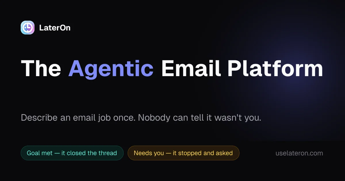
A 1200×630 social card uses a near-black canvas with a soft indigo-violet glow concentrated behind the right side of the headline. A small icon-and-wordmark lockup anchors the upper left, while a very large bold headline dominates the middle with “Agentic” isolated in a saturated periwinkle gradient; a muted supporting line and two compact green/amber status pills create a quieter lower rhythm, with the URL set discreetly at bottom right.
Prompt preview
## Reference images

Study these alongside the description below: hierarchy, rhythm, spacing, colour. Build for the product you are asked about, using this design language.

- Screenshot: https://kage-design-assets.t3.tigrisfiles.io/screenshots/lateron-v2-the-agentic-email-plaftform/33832e18-6bfc-4c92-8bdb-3f6c6ae559f6-1790402642081.webp
- Design on Kage: https://kage.design/designs/lateron-v2-the-agentic-email-plaftform-og-image

## Before you start
Ask the user what they are building, who it is for, and what brand assets they already have, including the brand name, colours, typefaces, logo or mark, and the copy they want on the card. Wait for their answers before designing. Apply everything below to their product, not to the reference brand.

## Page structure
- **1200×630 canvas:** Build a fixed social-card composition intended for Open Graph sharing, with generous horizontal padding and a near-black full-bleed background.
- **Upper-left brand lockup:** Place the user's small logo or abstract mark followed by the product name near the top-left, aligned on one baseline and kept secondary to the headline.
- **Primary headline:** Set a single oversized, bold statement across the central band of the card. Keep the wording short enough to read at thumbnail size and allow one important word or phrase to carry an accent colour.
- **Supporting sentence:** Add one muted explanatory line beneath the headline, using a smaller size and wide enough measure for quick scanning.
- **Status or benefit pills:** Place two compact rounded pills along the lower-left portion, each with a short label and distinct semantic accent such as success and attention. Use them as optional product cues, not as dense UI.
- **URL or metadata:** Add a small, low-contrast URL or product descriptor in the bottom-right corner.

## Design language
- **Build hierarchy through scale:** Make the headline the focal point, using a heavy sans-serif at roughly 68–82px on the 1200×630 canvas; keep the supporting copy around 28–34px, brand lockup around 24–30px, and metadata around 18–22px.
- **Use a restrained dark palette:** Start with near-black around `#08090d` or `#090a0f`, use warm white around `#f4f4f5` for primary text, and gray around `#9698a3` for supporting copy and metadata.
- **Accent selectively:** Apply a periwinkle-to-violet accent around `#8d8cff` to `#665bdf` to one headline phrase or a small focal element. Add a very soft radial indigo glow behind the right half of the headline, fading into the black canvas rather than reading as a hard shape.
- **Keep the composition spacious:** Use a simple left-aligned grid, large empty areas, and clear vertical separation between brand, headline, supporting line, and bottom metadata. The card should remain legible when reduced to a small preview.
- **Treat pills as subtle UI details:** Use thin translucent borders, low-opacity tinted fills, and pill radii around 20–24px. A green pill may use `#67e2c4` text with a dark teal fill; an amber pill may use `#e8c45b` text with a dark brown-gold fill.
- **Keep edges quiet:** Avoid heavy shadows, complex cards, or decorative borders. Use only the atmospheric glow and restrained pill outlines to create depth.
- **Use type consistently:** Prefer a clean modern sans-serif with strong weight contrast; use bold or extra-bold for the headline and regular weight for supporting copy. Keep letter spacing slightly tight in the headline and normal in body text.
- **Make interactions irrelevant to the artifact:** This is a static image, so do not add hover states or animation. If generating via HTML/CSS, render the final result to a PNG; alternatively produce an SVG at exactly 1200×630.
- **Use placeholder branding and copy:** Create an original mark, placeholder product name, and original headline/supporting text supplied for the user's product. Do not reuse the reference wording.

## Never
- Never copy the LaterOn logo, wordmark, product name, headline, tagline, URL, or exact status-pill copy.
- Never use the reference brand's exact icon, imagery, or text treatment as a direct reproduction.
- Never include unrelated logos, wordmarks, product names, copy, illustrations, photography, or icon sets from the reference.
- Never present the result as LaterOn or imply affiliation with it; produce an original 1200×630 social card for the user's product using placeholder branding and copy.