kage
kage
xem.email
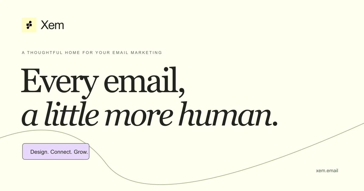
Design analysis
A 1200×630 editorial social card on a warm cream field. Hierarchy is strictly vertical: a small yellow icon tile and wordmark top-left, a letter-spaced uppercase eyebrow, then a dominant two-line serif headline mixing roman and italic for emphasis, and finally a single rounded lavender tag pill. A thin hand-drawn-style contour line sweeps through the lower third, adding warmth without competing with the type, and the domain sits quietly in the bottom-right corner.
Prompt preview
## Reference images

Study these alongside the description below: hierarchy, rhythm, spacing, colour. Build for the product you are asked about, using this design language.

- Screenshot: https://kage-design-assets.t3.tigrisfiles.io/screenshots/xem/931f1655-4756-4537-b2ce-861435a2f149-1790143374704.webp
- Design on Kage: https://kage.design/designs/xem-og-image

## Before you start
Ask the user what product the card is for, who it's for, and what brand assets exist (name, logo mark, colours, typeface preferences, domain). Wait for answers. Everything below is applied to their brand, not to Xem.

## Task
Produce a single 1200×630 Open Graph / social share card as HTML/CSS rendered to PNG (or an inline SVG). Use placeholder branding and copy throughout.

## Page structure (canvas composition)
- Background: a single warm cream field (~#FAF7E8), no gradient.
- Top-left, ~60px from edges: a small rounded icon tile (soft yellow ~#F7EFB2, subtle 1px darker border, small dark glyph) beside a medium-weight sans-serif wordmark (~34px, near-black #1E1E1C).
- Below it, ~90px gap: an uppercase eyebrow line, letter-spaced ~0.2em, ~18px, grey (#5a5a52).
- Centre-left focal block: a two-line display serif headline, ~110px, near-black; first line in roman, key phrase on the second line in italic to create contrast. Tight line height (~1.05), generous but not extreme tracking.
- Lower-left: one rounded pill tag (lavender ~#D9CDF5, 1px dark border, radius ~10px) with short sans-serif copy (~22px).
- Bottom-right corner: the domain in small grey sans (~18px).
- Decorative: a single thin (1px) muted-olive contour/S-curve line sweeping across the lower third, echoing the pill's position; purely ambient, no fill.

## Design language
- Hierarchy by type scale contrast: tiny tracked eyebrow → massive serif headline → small UI-like pill. Everything left-aligned on one vertical axis except the corner domain.
- Serif/sans pairing: editorial display serif (e.g. a Playfair/Source Serif class) for the headline only; clean geometric sans for wordmark, eyebrow, pill and domain.
- Colour is sparse and warm: cream ground, near-black ink, plus exactly two small accent notes (yellow tile, lavender pill). Accents never exceed ~5% of the canvas.
- Borders over shadows: 1px hairline borders and radius ~10px; no drop shadows, no gradients, no imagery.
- Keep ≥60px padding on all sides; leave the right half of the headline zone breathing so the card reads at thumbnail size.

## Never
No logos, wordmarks, copy, illustrations or icon sets from the reference; never present the output as that product.