kage
umbra.masn.studio
Design analysis
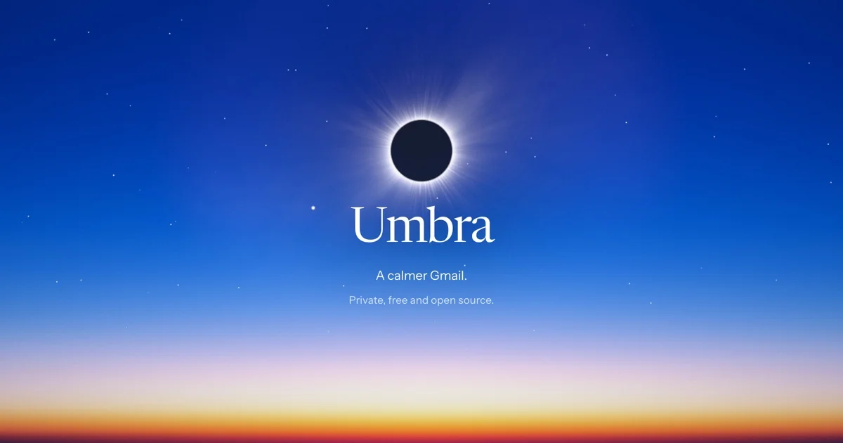
A 1200×630 social card built on a photographic dawn gradient: deep indigo sky with a sparse starfield dissolving into pale lavender, then a thin orange-red horizon strip along the bottom edge. A single centred vertical axis carries a black eclipse disc with a blooming white corona, the "Umbra" wordmark in a high-contrast white serif, and two small periwinkle sans-serif lines. Hierarchy is achieved almost entirely through scale and brightness steps against vast negative space, letting the gradient and glow carry the mood.
Prompt preview
## Reference images

Study these alongside the description below: hierarchy, rhythm, spacing, colour. Build for the product you are asked about, using this design language.

- Screenshot: https://kage-design-assets.t3.tigrisfiles.io/screenshots/umbra-mail/60fedced-2c5d-48da-ba7b-08e4b3627f1f-1792476205387.webp
- Design on Kage: https://kage.design/designs/umbra-mail-og-image

# Social card — twilight gradient with a glowing focal disc

Produce a single **1200×630 Open Graph social card** (the image shown when a link is shared on X, Slack, LinkedIn, iMessage). Build it as a fixed-size HTML/CSS canvas (`body { width:1200px; height:630px; overflow:hidden }`) rendered to PNG at 1× or 2×, or as a standalone SVG with a 1200×630 viewBox. Use placeholder branding and copy throughout.

## Before you start
Ask the user:
1. What product or project is this card for, and what is the one-line tagline?
2. What brand assets exist — name, wordmark, colours, typefaces?
3. Where will the card mainly appear (X, Slack, LinkedIn) so crop-safe margins can be tuned?
Wait for the answers. Everything below is applied to *their* product; the reference is only for composition and atmosphere.

## Canvas structure (top to bottom)
- **Full-bleed sky gradient**: one vertical gradient filling the entire canvas — deep indigo at the top, easing through mid blue, into a pale lavender-white band around 70% height, and ending in a thin warm orange-red horizon glow along the bottom edge (~8% of height). This gradient is the whole background; no panels, borders or cards.
- **Starfield**: 40–60 tiny white dots (1–3px, varying opacity 0.2–0.9), scattered only in the upper two-thirds, denser near the top corners.
- **Focal element**: a near-black circular disc (~110–130px diameter) sitting slightly above vertical centre, with a soft white corona bloom — layered radial gradients plus a faint outward ray streak. This is the visual anchor; nothing else competes with it.
- **Wordmark**: the brand name as plain text in a large, elegant, high-contrast serif, pure white, centred directly below the disc.
- **Supporting line 1**: one short value-proposition sentence in a small light sans, pale periwinkle, centred.
- **Supporting line 2**: a smaller, dimmer secondary line (e.g. availability or pricing note), centred.
- Everything sits on one vertical centre axis with wide empty margins left and right; the card contains nothing else — no buttons, URLs, badges or screenshots.

## Design language
- **Hierarchy by scale and brightness, not weight**: a glowing image element, then a ~110–130px serif wordmark, then ~20px and ~14px sans lines. Each step drops sharply in size; no bold weights, no underlines, no containers.
- **Colour treatment**: dominant deep indigo-blue (`#1e2f7a` → `#4a67c9` mid, `#c9d4ee` pale band), white (`#ffffff`) for the wordmark and corona, near-black (`#0a0d1a`) for the focal disc, warm accent only at the horizon (`#e8964a` → `#c2452e`). Supporting text uses desaturated periwinkle (`#aebfe8`, dimmer `#8a9cc4`). Colour does the mood work; the palette stays in one cool family plus one warm strip.
- **Type pairing**: a high-contrast display serif for the wordmark (optical sizes, normal tracking) against a quiet geometric sans for the two small lines (slight positive letter-spacing, sentence case). Never more than three text elements.
- **Atmosphere over edges**: all lighting is soft radial gradient and blur; there are no hard shadows, strokes or rounded rectangles. Glow is layered (wide faint halo + tight bright ring + faint rays) so it reads as light, not as a CSS shadow.
- **Density and rhythm**: extreme negative space — content occupies the middle ~50% of the canvas; the only change in rhythm is the warm horizon strip grounding the bottom edge.
- **Crop safety**: keep all text inside the central 1000×420 area so X and Slack previews never clip it; test the card at 400px wide to confirm the wordmark still reads.
- **Interaction**: none — this is a static image; no hover, no motion.

## Never
- No "Umbra", "A calmer Gmail" or any reference copy; write the user's own tagline.
- Do not reproduce the reference's specific eclipse photography, ray streaks or star pattern verbatim — build the glow from CSS/SVG gradients, and swap the dark-disc metaphor for whatever fits the user's brand if they prefer.
- No real logos, wordmarks, icon sets or stock photography from the reference.
- Never present the card as the reference product; it is a template in the same compositional language, populated with the user's branding.