kage
kage
lovable.dev
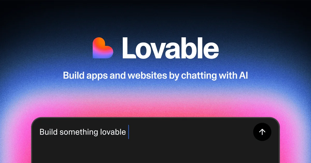
Design analysis
A 1200×630 social card built around a vertical, centred lockup on a near-black navy canvas that ignites into a grainy blue→purple→hot-pink aurora glow rising from the bottom. Hierarchy steps down in three tiers: a heavy white wordmark paired with an orange-to-pink gradient heart glyph, a mid-weight tagline, and finally the product itself — a charcoal chat input with a large radius and a circular submit button that bleeds off the bottom edge. The grain overlay keeps the gradient from banding and gives the glow a tactile, printed feel, while the cropped input bar implies the interface without rendering a full UI.
Prompt preview
## Reference images

Study these alongside the description below: hierarchy, rhythm, spacing, colour. Build for the product you are asked about, using this design language.

- Screenshot: https://kage-design-assets.t3.tigrisfiles.io/screenshots/lovable-growth-tools/c3604765-38d3-4fba-b5f1-3f8870927068-1792216918595.webp
- Design on Kage: https://kage.design/designs/lovable-growth-tools-og-image

## Before you start

Ask the user what they are building, who it is for, and what brand assets they already have (name, logo/wordmark, brand colours, typeface). Wait for the answers. Everything below is applied to their product, not to the reference.

Deliverable: a single social share card at exactly **1200×630**. Build it as a standalone `og-image.html` (inline CSS, no external dependencies beyond a Google Font if needed) and render it to `og-image.png` at 2× for crispness, or produce an equivalent 1200×630 SVG. Leave the file easy to re-export.

## Page structure

Top to bottom, all content centred on a horizontal axis:

1. **Canvas and background** — full 1200×630 surface. Base is a very dark navy/near-black. A large soft radial glow sits low and centre: deep blue at the top of the glow, through purple, into vivid hot pink at the bottom edge. A fine grain/noise overlay sits across the whole canvas so the gradient reads as textured, not banded.
2. **Logo lockup** (~upper fifth of the canvas) — the brand glyph (a simple, single-colour or two-stop-gradient icon) placed inline to the left of the wordmark in heavy white type. Lockup is horizontally centred as one unit.
3. **Tagline** (~middle of the canvas) — one short line of white semibold type directly under the lockup, with comfortable breathing room below it for the glow to show through.
4. **Product anchor bar** (bottom of the canvas) — a dark charcoal, large-radius rounded rectangle representing the product's core surface (a chat input, search field, or the user's equivalent). It is horizontally centred with generous side margins and **bleeds off the bottom edge** of the card — only its top portion is visible. Inside on the left: light grey placeholder text with a thin text cursor; on the right: a small circular black button with a white arrow icon, vertically centred in the visible part.

## Design language

- **Composition rule:** one centred vertical stack — lockup, tagline, product bar. No side-by-side columns, no footer, no extra ornament. The glow does the decorating.
- **Hierarchy by scale, not weight tricks:** wordmark ≈ 110–120px bold (700–800), tagline ≈ 40–44px semibold (600), placeholder text ≈ 30–34px regular (400). Each tier is roughly 2.5–3× smaller than the one above.
- **Colour treatment:** background top ≈ `#060a14`, glow blue ≈ `#3050e0`, glow purple mid ≈ `#8b3ff5`, glow hot pink bottom ≈ `#ff40c0` (brightest at the bottom corners). Product bar ≈ `#1c1c21` with a hairline border `rgba(255,255,255,0.08)`. All type pure white `#ffffff`; placeholder slightly muted (`rgba(255,255,255,0.85)`). The brand accent appears only in the glyph gradient — everything else stays white-on-dark.
- **Type:** one geometric sans throughout (Inter, Manrope or the user's brand face). No serif pairing, no letter-spacing games; let size and weight carry hierarchy.
- **Shape and radius:** the product bar uses a large radius (≈ 28–32px on its visible top corners); the submit button is a perfect circle (≈ 64px). The canvas itself has square corners.
- **Glow and grain:** implement the glow as two or three stacked radial-gradients blurred heavily, plus an SVG `feTurbulence` noise layer at low opacity (≈ 8–12%) over the whole canvas with a soft-light blend. The grain is what makes the gradient feel premium — do not skip it.
- **Spacing:** ≈ 100–120px side margins for the bar, ≈ 60–80px vertical gaps between lockup, tagline and bar. Everything must sit inside a safe zone so link previews never crop the wordmark or tagline.
- **Imagery:** none. No screenshots, illustrations or photography — the card works through gradient, type and one UI fragment. Keep any icon (glyph, arrow) as a simple vector shape.
- **Motion:** static image only; no animation in the deliverable.

## Never

- Do not reproduce the reference product's heart glyph, wordmark, name, tagline copy or placeholder text (