kage
kage
pub-64fe6100d2294ad8b151a79d3b20bd94.r2.dev
Design analysis
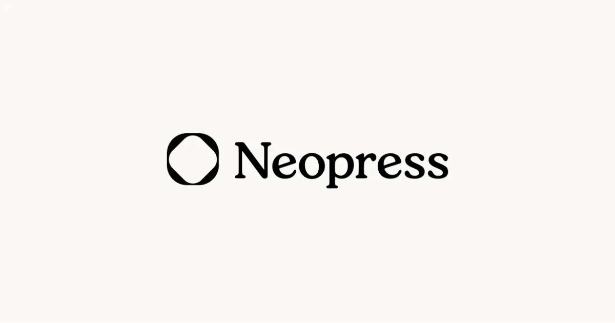
A maximum-restraint social card: a warm cream canvas (roughly #FAF7F0, deliberately not pure white) with a single black lockup dead-centre on both axes. The lockup pairs a thick geometric mark — a rounded-diamond outline whose stroke pinches at the four vertices around a white core — with 'Neopress' set in a bold, high-contrast editorial serif with tight tracking; the icon's height is matched to the cap height so the two read as one unit occupying about a third of the canvas width. There is no headline, URL or imagery: hierarchy, scale contrast (huge ink shapes vs ~25% margins of empty paper) and the serif-on-paper tone do all the work. A stray red pixel in the top-left corner reads as a capture artefact rather than part of the design.
Prompt preview
## Reference images

Study these alongside the description below: hierarchy, rhythm, spacing, colour. Build for the product you are asked about, using this design language.

- Screenshot: https://kage-design-assets.t3.tigrisfiles.io/screenshots/neopress/ba0ff32c-97b4-478a-8e5d-6b7a2c19c47e-1789365677063.webp
- Design on Kage: https://kage.design/designs/neopress-og-image

## Before you start
Ask the user what product or brand this card is for, who it is for, what name should appear on the card, and which brand assets they already have (logo file or mark shape, brand colours, typeface). Wait for their answers before writing any code — everything below is applied to *their* brand, not to any reference.

## Page structure (the card)
This is a single 1200×630 social card image (an Open Graph / link-preview asset), not a scrollable page. Build it as one self-contained `og-card.html` rendered to PNG (e.g. via Playwright or Puppeteer screenshot at exactly 1200×630) or as a single SVG with a background rect. Zones, top to bottom:

1. **Full-bleed background** — one flat, warm near-white colour across the whole canvas. No border, no frame, no gradient.
2. **Centred lockup group** — the only content on the canvas: a single geometric brand mark followed by the brand wordmark, arranged as one horizontal unit, centred on both axes. The mark's height matches the wordmark's cap height; the gap between them is roughly 40% of the mark's width.
3. **Optional tagline (only if the user asks)** — one short line set much smaller than the wordmark, centred, with generous separation below the lockup. Default is to omit it.

## Design language
- **Canvas**: exactly 1200×630. Background `#FAF7F0`-style warm cream (avoid pure `#FFFFFF` — the warm tone is what makes it feel printed, not default). One ink colour only: near-black `#111111` for mark and wordmark.
- **Composition**: one focal element, dead-centre on both axes. The lockup spans roughly 35–40% of the canvas width; keep at least 25% clear margin on every side so platform crops (Slack, iMessage, X) never clip it. Everything else is negative space — resist adding a second element.
- **Mark**: one solid-ink geometric shape (no strokes thinner than the wordmark's stems). Whatever shape the user's brand uses, size it to the wordmark's cap height and optically centre it against the text baseline.
- **Type**: the wordmark is a bold, high-contrast editorial serif (Playfair Display, Source Serif or a Canela-like face; fall back to Georgia). Set it tight — letter-spacing around -0.02em — at roughly 120–140px for a 7–9 character name, weight 700–800. Any optional tagline: a quiet sans or the same serif at ~28px, letter-spacing +0.08em, uppercase or sentence case, ink at full black.
- **Colour discipline**: exactly two colours on the whole card (ink + paper). No gradients, no shadows, no badges, no URL bar, no decorative corners.
- **Readability**: the card must read at 200px wide; thick serif stems and a heavy mark are what make that work. Embed fonts (or use system serif fallbacks) so the render doesn't fall back to Times defaults.

## Never
- Never reuse the reference's name, its rounded-diamond mark, or its exact copy — invent placeholder branding (e.g. a different geometric mark and a dummy name) unless the user supplies real assets.
- No photography, illustrations, UI screenshots, emoji or icon sets from any reference; the card is type and one mark only.
- Never present the result as the reference product or imply any affiliation.