kage
kage
framerusercontent.com
Design analysis
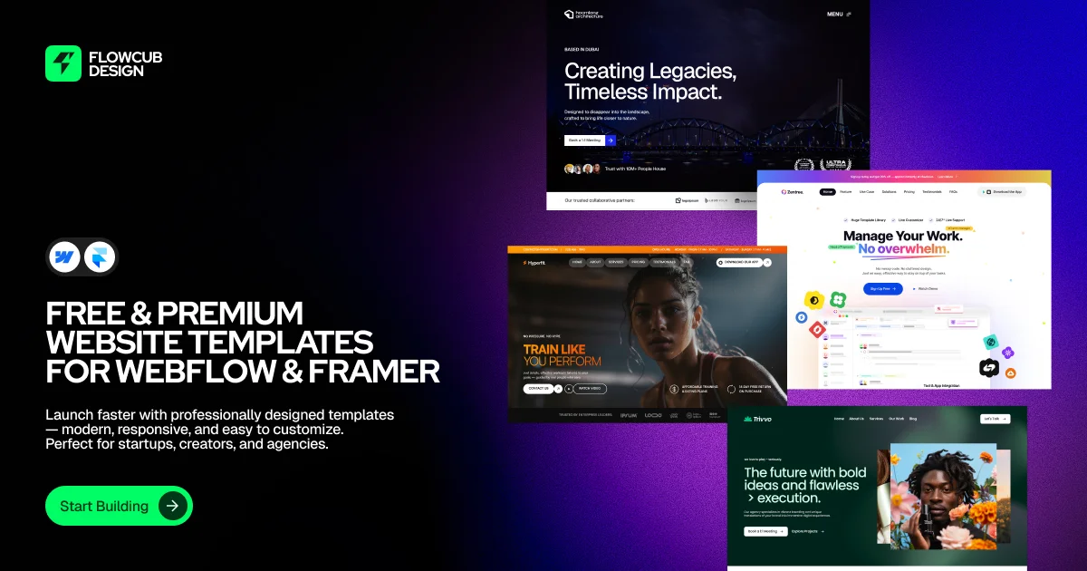
A 1200×630 social card split into a black left rail for the brand stack and a purple-gradient right zone filled with a staggered 2×2 collage of template screenshots that bleed off three edges. Hierarchy runs top-to-bottom on the left: logo lockup, tool badges, a three-line uppercase headline, small subcopy, then a green pill CTA — with the bright green accent reserved for exactly two elements (logo chip and button). The collage cards each carry a different mini-site palette (navy, light SaaS, photo-dark, forest green), signalling variety while the grainy violet gradient keeps the whole canvas unified.
Prompt preview
## Reference images

Study these alongside the description below: hierarchy, rhythm, spacing, colour. Build for the product you are asked about, using this design language.

- Screenshot: https://kage-design-assets.t3.tigrisfiles.io/screenshots/flowcub-com/863cd92c-b4e6-4fd8-b31e-ca584dddbaeb-1790420111030.webp
- Design on Kage: https://kage.design/designs/flowcub-og-image

## Before you start
Ask the user what they are building, who it is for, and what brand assets they already have (brand name, logo shape, one accent colour, typeface if any). Wait for the answers. Everything below is applied to **their** product with placeholder branding — never to the reference brand.

## Page structure
Produce a single **1200×630 social card** (render HTML/CSS to PNG, or emit an SVG), composed as two zones:

1. **Canvas background**: near-black base on the left ~45%, flowing into a vivid violet-to-magenta diagonal gradient on the right ~55%. Add a subtle film-grain/noise overlay over the gradient only.
2. **Brand lockup (top-left, ~56px margin)**: a rounded-square app icon (accent colour, simple white glyph) beside a two-line wordmark in white with wide letter-spacing.
3. **Platform badges (below logo)**: two small white circular/pill badges with tiny generic icons — a nod to the ecosystems the product serves. Keep them ~40px.
4. **Headline (left rail, mid-canvas)**: three stacked lines, ALL CAPS, heavy grotesque, ~64–72px, white, tight leading (~1.05). State what the product offers and for whom.
5. **Subcopy (below headline)**: two-to-three short lines, ~18–20px, white at ~75% opacity, max-width ~420px, sentence case.
6. **CTA pill (bottom-left, generous bottom margin)**: full rounded pill in the accent colour, dark text label, with a small circular arrow chip on its right side. Height ~56px.
7. **Showcase collage (right zone)**: four mini website mockups in a staggered 2×2 arrangement. Top card bleeds off the top edge, right card bleeds off the right edge, bottom card bleeds off the bottom-right — cards may slightly overlap each other for depth. Each mini mock is built in CSS: nav bar, display headline, small paragraph, a button or image block — and each uses a **different** palette (e.g. dark navy, light/white SaaS, photo-dark, deep green) so the collage reads as varied work.

## Design language
- Canvas is exactly 1200×630 with ~56–64px outer margins; keep all text within a safe zone (social platforms crop corners subtly).
- Focal hierarchy is a strict top-to-bottom stack on the left rail: icon → badges → headline → subcopy → CTA. One idea per level, left-aligned to a single vertical line.
- Colour: black base `#0A0A0A`; violet gradient `#8B2BFF → #4A12B8` (or the user's accent-tinted equivalent) restricted to the right half; accent colour (e.g. `#2FE05B`) used **only** on the logo chip and CTA pill — two touches maximum. All card text white/near-white.
- Type: one heavy geometric grotesque for display, set uppercase with tight leading and slight negative tracking; the same family at regular weight and smaller size for subcopy. Build hierarchy with size and case, never with extra colours.
- Mini mockup cards: 12–16px corner radius, thin light border or soft large shadow to lift them off the gradient, internal content at fake-realistic scale (nav 10–12px, headlines 20–28px).
- Depth comes from edge-bleed and slight overlap, not from perspective transforms — keep cards square to the canvas.
- Grain: a low-opacity noise layer (CSS `repeating-conic`/SVG turbulence) over the gradient area to kill banding and add texture.
- Static composition: no motion, no hover states; treat spacing rhythm (equal gaps between left-rail elements) as the main craft lever.

## Never
- No logos, wordmarks, glyphs, template screenshots, photography or copy from the reference — invent a placeholder brand name, icon and headline for the user's product.
- Never present the card as the reference product or reuse its exact tagline or button label.
- Do not exceed the 1200×630 canvas or place critical text in the far corners where social crops bite.