kage
kage
ariso.ai
Design analysis
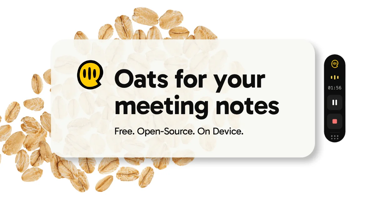
A 1200×630 social card on a cream canvas scattered with photographic oat flakes. A large soft-white rounded rectangle carries the yellow smiley speech-bubble mark beside an oversized two-line black headline, with a short value line beneath; a slim black recorder pill on the right shows a timer and controls, tying the food pun to the meeting-notetaker product.
Prompt preview
## Reference images

Study these alongside the description below: hierarchy, rhythm, spacing, colour. Build for the product you are asked about, using this design language.

- Screenshot: https://kage-design-assets.t3.tigrisfiles.io/screenshots/oats/69fc3135-9d52-490a-9932-ba87dd92d2ff-1789452032777.webp
- Design on Kage: https://kage.design/designs/oats-og-image

# OG social card — "grain mascot + recorder pill" composition

## Before you start
Ask the user what product they are promoting, who it is for, and what brand assets they already have (name, logo/mark, colours, fonts, tagline). Wait for the answers before building. Everything below is a design language to apply to *their* brand, not the reference brand.

## Deliverable
Produce a single **1200×630** social card (Open Graph image). Build it as an HTML/CSS page at exactly 1200×630 rendered to PNG (e.g. via Playwright/Puppeteer screenshot), or as an SVG. Use placeholder brand name, mark, headline and subline where the reference has its own.

## Page structure (canvas layout)
1. **Background**: flat warm off-white/cream (#FDFBF4-ish) canvas. Scatter 20–30 photographic cutout objects of the product's theme (reference used oat flakes; use items that make sense for the user's brand) around the edges, concentrated top-left/centre and bottom-left, leaving clear whitespace behind the text zone. Keep them at varied rotations and scales, in a handful of warm tones.
2. **Central card**: one large rounded rectangle (radius ~40px) in near-white with a subtle soft shadow, covering roughly the middle 65% of the canvas, sitting on top of the scattered imagery so text reads cleanly. Optionally fill it with a very faint large-scale texture of the same imagery.
3. **Lockup**: inside the card, a bold circular mascot/logo mark (~110px) left of the headline. Headline in two lines, extremely large (~110px, heavy geometric sans, tight leading, near-black #1A1A1A), e.g. "{Brand} for your {thing}". Below it a one-line subline in ~34px regular weight: three short value claims separated by periods.
4. **Right rail**: a slim vertical dark pill (~90px wide, rounded full) just off the card's right edge, in near-black (#161616), containing small UI: a tiny yellow brand glyph, three dots, a monospace timer, a pause button and a red stop square. Style it as a miniature of the product's UI.

## Design language
- **Hierarchy**: mark → giant two-line headline → one-line subline → decorative device. Nothing else; extreme restraint.
- **Type**: one heavy geometric sans for headline with tight tracking; same family lighter for the subline; monospace only inside the device UI.
- **Colour**: cream base (#FDFBF4), near-black text (#1A1A1A), one saturated brand accent (reference: yellow #FFD21E) used only for the mark and device accents.
- **Depth**: only two elevation levels — scattered flat imagery, floating card with soft blur shadow. No gradients or borders.
- **Composition**: text block left-of-centre, device pill right, breathing room on all edges; keep key content within the safe zone (avoid ~40px edges).

## Never
- Do not use the "Oats" name, its oat-flake photography, its smiley speech-bubble logo, or its exact tagline copy. Use the user's own branding and copy, and never present the output as the reference product.