kage
kage
world-media.pixverse.ai
Design analysis
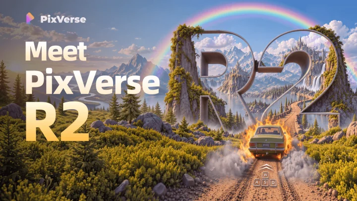
A full-bleed cinematic illustration carries the card: giant extruded "R2" letterforms built as landscape monuments (vine-covered monoliths framing a waterfall and a castle) sit right of centre while a burning station wagon and WASD keys embedded in the dirt road signal the playable, explorable product. The left third is kept calm for type — a small white wordmark lockup top-left, then a three-line stacked headline in a heavy geometric sans with tight leading, white for the first two lines and a warm gold gradient reserved for the version token. Golden-hour light, blue sky and saturated greens hold together at feed sizes.
Prompt preview
## Reference images

Study these alongside the description below: hierarchy, rhythm, spacing, colour. Build for the product you are asked about, using this design language.

- Screenshot: https://kage-design-assets.t3.tigrisfiles.io/screenshots/pixverse-r2/5cd9b2ad-be45-43db-90cc-03cb6fbe69f7-1790402441833.webp
- Design on Kage: https://kage.design/designs/pixverse-r2-og-image

# Build a launch social card in this cinematic illustrated style

The reference is an Open Graph social card (~1200×630) for an AI world-model product. It is one full-bleed illustrated scene with type set into its quietest third, a giant sculptural centrepiece built from the version number, and one small diegetic UI detail embedded in the scene. Recreate that composition language for the user's own product with placeholder branding and copy.

## Before you start
- Ask the user: what product and version/event is this card announcing, who is the audience, which brand assets exist (name, glyph, colours, typeface), and what single message the card must carry (e.g. "Meet X v2", "Now realtime"). Wait for the answers before writing any code.
- Agree the deliverable: a single 1200×630 canvas, built as one HTML file (inline SVG artwork + CSS) rendered to PNG at 2× (2400×1260), or a standalone SVG. No interactivity, no animation required.
- Everything below is applied to the user's product, never to the reference product.

## Page structure
Total canvas: exactly 1200×630, full-bleed artwork edge to edge, ~48px safe margin for text.
1. **Background scene (100% of canvas):** one continuous illustrated landscape with three depth layers — distant peaks/horizon (hazy, low contrast), mid-ground focal structure, detailed foreground (sharpest, warmest light). Compose the horizon in the upper third so the lower half holds foreground detail.
2. **Wordmark lockup (top-left, at the safe margin):** small glyph + bold wordmark in white, roughly 28–32px, the smallest type on the card. Never larger than ~8% of canvas height.
3. **Headline block (left column, upper-middle):** 2–3 stacked, left-aligned lines in a heavy geometric sans at ~100–120px with 0.92–0.96 line-height and slightly negative tracking. It should occupy roughly the left 40% of the canvas and read first, before the artwork.
4. **Hero focal artwork (right ~60%):** one large sculptural centrepiece that literalises the product idea — e.g. the version number or product initial extruded as architecture, with a smaller secondary element (castle, waterfall, doorway) framed inside or behind it. Anchor it just right of centre so it balances the text block diagonally.
5. **Foreground story detail (bottom third):** a small narrative element travelling toward the centrepiece (vehicle, character, object) plus one diegetic UI element embedded in perspective into the scene surface (key cluster, cursor, timeline scrubber) — the hint that the product is interactive, not just a picture.

## Design language
- **One idea per card:** a single scene, a single headline, no feature lists, no URLs, no badges. Secondary meaning is carried by the scene, not by copy.
- **Diagonal balance:** text block upper-left, focal artwork mid-right, story detail bottom-centre — the eye travels down a diagonal instead of scanning a grid.
- **Type treatment:** two type colours only. White (#ffffff) for the name lines; one gradient token for the version/keyword word: a warm linear gradient from #ffe9a8 to #f0a93c with a faint warm outer glow (2–4px soft drop-shadow, low opacity). Reserve the gradient for exactly one word.
- **Palette:** keep to four hues — sky blue (~#8ec9e8), foliage green (~#6b8f3a with darker #3f5d22 shadows), warm gold light (~#f5c96b), and mist white. Saturation stays high but harmonised; nothing neon.
- **Light and depth:** golden-hour backlighting; atmospheric haze softens the background layer so foreground edges and type stay crisp. Vignette very slightly at the corners if the scene needs it.
- **Readability rule:** the headline must sit over the calmest area of the scene (sky, water, or mist). If contrast drops below ~4.5:1, add a soft local scrim or glow behind the text — never a hard panel or full dark overlay.
- **Detail budget:** macro detail (grass, vines, smoke, keys) only in the foreground layer; mid-ground stays simplified. This keeps the card legible when scaled down to a feed thumbnail.
- **Finish:** no rounded frame, no border, no corner ribbons; the artwork itself is the container.

## Never
- Do not reuse the PixVerse name, wordmark, glyph, "R2", the flaming station wagon, the rainbow, the castle, or any of its illustration or copy.
- Never present the result as that product or use its imagery; build an original scene from the user's own metaphor, brand colours and type.
- Do not add stock-photo text effects, drop caps, buttons, or mock UI chrome that isn't the single diegetic detail.