kage
kage
portfolioframe.com
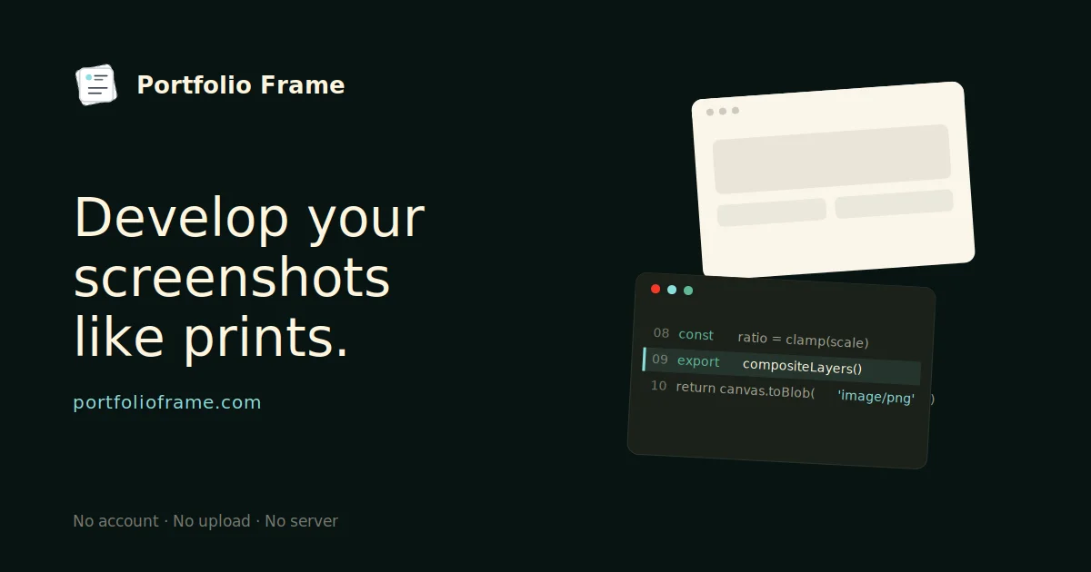
Design analysis
A 1200×630 OG card on a near-black canvas that splits cleanly into two halves: a cream wordmark and large serif-weight headline on the left, and two overlapping tilted window mockups (a cream browser frame and a dark code panel) on the right. Hierarchy is driven by scale — the small top-left logo lockup, the three-line headline as the focal point, a teal URL, and a muted footer strip of trust points. Accents are sparse: teal traffic lights and syntax keywords keep the dark half alive without breaking the monochrome restraint.
Prompt preview
## Reference images

Study these alongside the description below: hierarchy, rhythm, spacing, colour. Build for the product you are asked about, using this design language.

- Screenshot: https://kage-design-assets.t3.tigrisfiles.io/screenshots/portfolio-frame/e6fa325f-9cb2-458c-b0e2-e04104638d1c-1789538512227.webp
- Design on Kage: https://kage.design/designs/portfolio-frame-og-image

## Before you start
Ask the user: what product is the card for, what tagline/headline should appear, what brand name and domain to show, and any brand colours or fonts they already have. Wait for the answers. Everything below is applied to *their* product — do not reproduce the reference product or its copy.

## Task
Produce a 1200×630 Open Graph social card image — as a single HTML file (fixed 1200×630 body, ready to screenshot to PNG) or an SVG — for the user's product, following this composition.

## Page structure
- Full canvas: near-black background (~#0d1512), generous outer padding (~90px left, ~64px top/bottom).
- Top-left: small logo mark (rounded square badge) + bold wordmark, roughly 28px, cream (#f2ede0).
- Left column (~55% width): three-line headline at ~72px, regular-weight humanist sans-serif in cream, tight line-height (~1.15), ending in a period for a printed feel. Below it, the domain URL in muted teal (~#4fb8a8), ~22px.
- Bottom-left footer line: three short trust points separated by middots, in muted grey (~#7a8781), ~18px, anchored near the bottom.
- Right half: two overlapping, slightly rotated (±3–5°) mockup windows with soft drop shadows — a light cream browser window (dots in the title bar, abstract placeholder blocks inside) overlapping a dark code panel (red/teal/grey traffic dots, 3–4 lines of pseudo-code with teal keywords and line numbers). They should bleed slightly past the right edge.

## Design language
- Two-zone composition: text block left, product mockup collage right; keep the split clean with clear negative space.
- Hierarchy purely by scale: wordmark → huge headline → URL → footnote.
- Colour: near-black ground, cream text, one teal accent used sparingly (URL, syntax, traffic dots), grey for secondary text.
- Type: one humanist sans family; regular weight at display size rather than bold; heavy contrast between display and caption sizes.
- Mockups are stylised, tilted, layered with soft shadows — they read as "designed artifacts", not flat screenshots.
- No gradients, no borders on the card itself.

## Never
No logos, wordmarks, product names, copy, code text or illustrations from the reference — use the user's own branding and placeholder mockup content. Never present the result as the reference product.