 kage
kage
posthog.com

Design analysis
The page runs on a single cream canvas with one narrow centred text column, alternating short copy blocks with right-aligned ink-drawn hedgehog illustrations so every section reads as text-plus-character. Hierarchy comes from oversized black sans headings that each carry exactly one blue keyword, yellow highlighter marks behind key phrases, and 1px-bordered white cards (logo wall, pricing table, parody shop) that spike the density against otherwise airy sections. The hero and footer bookend the page with retro-game touches — an illustrated grass-world navigation rail with chalkboard icon shortcuts, a blue-framed tabbed product demo, and a self-aware fake e-commerce card that closes the page on a joke.
Prompt preview
## Reference images

Study these alongside the description below: hierarchy, rhythm, spacing, colour. Build for the product you are asked about, using this design language.

- Full page: https://kage-design-assets.t3.tigrisfiles.io/screenshots/posthog-com/73877279-c1a4-4217-acde-d4b5e92c7eb5-1789060452-full.webp
- Above the fold: https://kage-design-assets.t3.tigrisfiles.io/screenshots/posthog-com/73877279-c1a4-4217-acde-d4b5e92c7eb5-1789060007466.webp
- Design on Kage: https://kage.design/designs/posthog-landing-page

## Before you start
Ask the user what they are building, who it is for, and what brand assets they already have (name, colours, type, mascot or illustration style, existing logo). Wait for the answers. Everything below is applied to *their* product, not to the reference site.

## Page structure
1. **Top nav** — slim full-width black bar: logo left, text links (Products, Tools, Pricing, Docs, Community, Company, More), right-aligned search/theme/account icons plus one orange pill CTA.
2. **Illustrated hero backdrop** — a top-down game-map illustration (grass, trees, paths) fills the edges of the hero. Two vertical rails of chalkboard-style icon shortcuts: help/product shortcuts on the left (Home, Docs, Demo, Talk to a human), company links on the right (About, Changelog, Store, Careers).
3. **Hero card** — a white panel floating over the map: logo lockup, two-line headline where the second line is a blue keyword, 2–3 sentence subcopy with yellow highlighter marks on the key phrases, and a social-proof count line. To the right, a signup card: bold "Set up for free" title, three checkmark reassurance lines (free tier, no credit card, quick setup), an orange primary button and a white secondary button.
4. **Demo stage** — a centred row of three tab labels for different product demos (active tab is a solid blue pill). Below, a large demo frame with a thick blue border containing a platform toggle (Web / Desktop / Slack), a pause control, a real product screenshot on the left and a short explainer card on the right (what you're looking at + one CTA button).
5. **Tool strip** — one quiet line, "Built-in tools for your agents:", followed by icon+label links for each product in the suite. Closes the hero region.
6. **Social proof** — big H2 and a deadpan subline, then one bordered white card split into two labelled columns ("Colorful logos" vs "Sleek logos"), each a wrapped grid of customer wordmarks with tiny superscript dots; a small bordered button sits under the card.
7. **Feature section (data)** — H2 with a blue keyword; left column of short paragraphs plus two bullets; right column a bold-led "ships with" checklist and a mascot illustration; bold underlined link to docs at the end.
8. **Usage-based pricing** — H2, three short honest paragraphs, a mascot-with-money illustration on the right, then a numbered 4-row table (Product / Free tier / Pricing) with icon+link product names and unit prices, closed by an underlined "Explore pricing" link.
9. **Why us** — H2, three bullets with bold lead-ins (each linking out), a mascot-at-whiteboard illustration on the right, underlined "Read more" link.
10. **Bedtime reading** — H2, deadpan intro line, five underlined deep links as a plain list, sleepy-mascot illustration right.
11. **Parody CTA card** — H2 plus jokey subline, then a bordered fake e-commerce card: blue cart banner, retro software-box product shot with a starburst badge, novelty badge, product title, cloud-region radio buttons (US / EU), strikethrough-price joke, big orange CTA, scarcity line with a link, and small-print jokes; mascot illustration beside it.
12. Page ends here — no footer needed for the reference layout.

## Design language
- **Canvas & colour:** cream page background ~`#F5F0EB`; near-black text ~`#151515`; one saturated blue ~`#1D4AFF` reserved for heading keywords, inline links, the active tab and the demo frame border; amber-orange ~`#F59E0B` used *only* for primary CTAs; pale-yellow highlighter ~`#FBE599` behind key body phrases; green ~`#A8CE85` appears only inside illustrations/backdrops; cards are white.
- **Hierarchy:** section headings ~40–48px extra-bold black sans-serif, each carrying exactly one blue keyword; body 16–17px / 1.6 regular; bold lead-ins start each bullet; every onward action is a bold underlined text link, not a button.
- **Rhythm:** one narrow text column (~720px) inside a ~1200px page frame; sections separated by ~96–128px of whitespace; each section follows the same beat — 1–3 short paragraphs → illustration right → one underlined link. Density spikes only inside cards (logo grid, pricing table, store parody) so they read as deliberate contrast.
- **Borders, radius, shadow:** all cards and tables use 1px solid dark/gray borders with 4–6px radius and flat white fills; the only shadow is a soft drop on the floating signup card; the demo frame uses a thick coloured border instead of a shadow.
- **Illustration:** one hand-inked, flat-colour mascot in a consistent character style, 220–320px, placed to the right of text in nearly every section; it carries the personality so the type can stay plain.
- **Components:** tables are plain with thin rules and left-aligned cells; checklists use bold leads after the checkmark; tabs switch between real product screenshots with a one-paragraph explainer beside each.
- **Motion:** minimal — tab switching, hover underlines, nothing parallax or animated; let copy and illustration do the work.
- **Voice:** deadpan and self-aware (honest pricing claims, jokey CTAs, small-print gags), always in short sentences.

## Never
- Never reuse the reference's name, logo, hedgehog mascot, tagline, customer logos, or any of its specific jokes and copy lines.
- Never present the result as that product or imply its endorsement.
- Do not copy its illustrations or icon set; invent an original mascot style for the user's brand, or drop illustration entirely if they have none.
Components from this page
All components
 Framed product navigation shell
posthog.com · Navigation
Framed product navigation shell
posthog.com · Navigation
 Split-panel social proof logo cloud
posthog.com · Logo cloud
Split-panel social proof logo cloud
posthog.com · Logo cloud
 Contextual feature grid
posthog.com · Feature grid
Contextual feature grid
posthog.com · Feature grid
 Usage-based pricing comparison table
posthog.com · Table
Usage-based pricing comparison table
posthog.com · Table
 Editorial feature proof points
posthog.com · Feature grid
Editorial feature proof points
posthog.com · Feature grid
 Editorial resource links
posthog.com · Feature grid
Editorial resource links
posthog.com · Feature grid
 Playful product checkout CTA
posthog.com · Call to action
Playful product checkout CTA
posthog.com · Call to action
Related designs
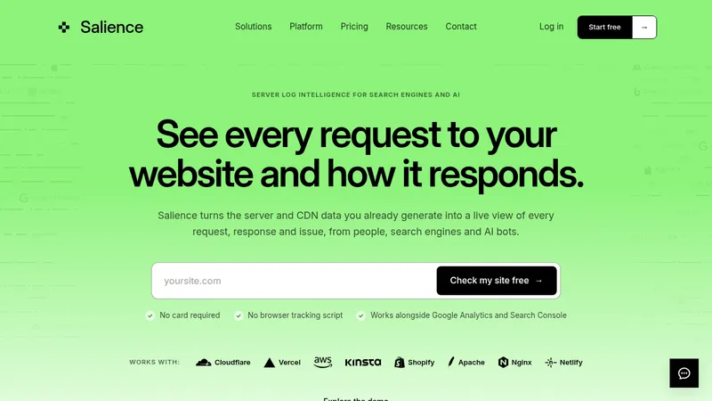

 Salience
Landing page · Analytics & data
Salience
Landing page · Analytics & data
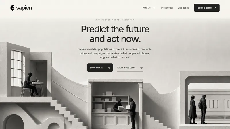

 Sapien
Landing page · Analytics & data
Sapien
Landing page · Analytics & data
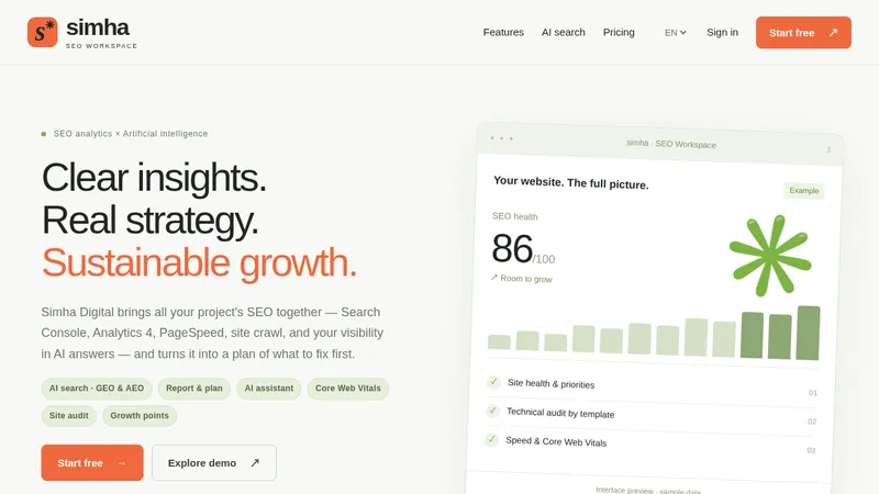

 Simha Digital
Landing page · Analytics & data
Simha Digital
Landing page · Analytics & data
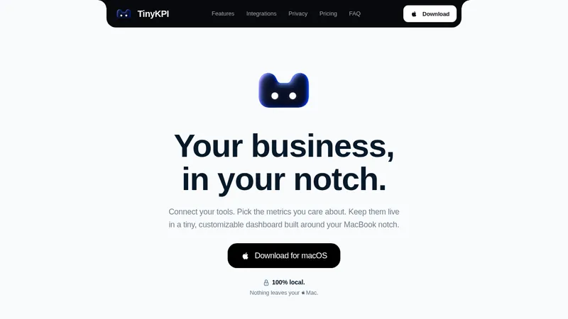

 TinyKPI
Landing page · Analytics & data
TinyKPI
Landing page · Analytics & data


 Basedash in Español Français & Português
Landing page · Analytics & data
Basedash in Español Français & Português
Landing page · Analytics & data


 AI Observability by OpenObserve
Landing page · Analytics & data
AI Observability by OpenObserve
Landing page · Analytics & data