 kage
kage
asksapien.ai

Design analysis
A cream-and-black editorial page carried entirely by typography, monochrome imagery and restraint — there is no accent colour anywhere. The hero sets a cinematic tone with a surrealist grayscale collage of miniature human figures, then the page alternates narrative modes down its length: split text/illustration columns, four stacked isometric line diagrams paired with step explanations, and five real app screenshots cascading in hairline-bordered cards beside an accordion of use cases. Proof arrives as pure typography — an oversized 93.3% stat inside a bordered panel with a thin ascending benchmark line — before the page inverts to a near-black closing band and footer, giving the whole scroll a deliberate light-to-dark arc.
Prompt preview
## Reference images

Study these alongside the description below: hierarchy, rhythm, spacing, colour. Build for the product you are asked about, using this design language.

- Full page: https://kage-design-assets.t3.tigrisfiles.io/screenshots/sapien/bf276bc9-8a7f-4325-84fe-38ac6dd29868-1791093700749-full.webp
- Above the fold: https://kage-design-assets.t3.tigrisfiles.io/screenshots/sapien/bf276bc9-8a7f-4325-84fe-38ac6dd29868-1791093696148.webp
- Design on Kage: https://kage.design/designs/sapien-landing-page

## Before you start
Ask the user what they are building, who it is for, and what brand assets they already have (name, colours, typefaces, product screenshots). Wait for the answers before writing any code — everything below is applied to *their* product, not to the reference site.

## Page structure
Build a single long marketing page in this order:

1. **Top nav** — slim bar on a cream background: wordmark + small geometric mark at left, three text links (one with a dropdown caret) centre-right, and a dark pill button with an ↗ arrow at the far right.
2. **Hero** — a full-bleed monochrome photographic collage (surrealist scenes of small human figures in oversized architectural spaces) sits behind/below centred text: an uppercase letterspaced kicker, a two-line display headline, a short two-sentence subcopy paragraph, then two CTAs — a black pill button and a text link with an arrow and hairline underline. A cream gradient fades the imagery in at the top so text stays readable.
3. **Concept intro** — two-column split on white: left column has a small label, a large two-line headline and a paragraph; right column holds a grayscale annotated illustration (figures on a curved platform with one labelled callout frame).
4. **How it works** — a large left-aligned section heading, then four steps: each step pairs an isometric 1px line diagram (stacked layered planes with nodes and connecting lines) on the left with a heading + paragraph on the right. Close with a hairline rule and a single bold-lead sentence noting the service layer ("Bring the question. ...").
5. **Use cases** — uppercase kicker, a big three-line headline, and a one-line subcopy. Then five large product-UI screenshots, each in a rounded card with a 1px hairline border, cascading down the page. The first card shares a row with a left column containing a small category label, a subhead, a paragraph, and an accordion list of four related use cases (first item expanded). The remaining four cards alternate slightly and each shows a distinct app view (comparison view, video/campaign review, pricing curve chart, audience segmentation table, shelf/overview comparison).
6. **Benchmark proof** — a full-width bordered panel on cream: small kicker, two-line headline, an oversized stat number (e.g. "93.3%"-scale, ~120px+), a bold caption line, then a short explanatory paragraph; a single thin diagonal line climbs across the right half with fine hatched shading beneath it, echoing a growth chart.
7. **Closing CTA band** — near-black full-width section: centred white two-line headline, a two-line subcopy, and two buttons (light pill with ↗ + quiet text link).
8. **Footer** — continues the dark band: wordmark at left, three link columns with small muted headings (Explore / Understand / Continue), then a bottom legal row with copyright, Privacy, Terms, and "Back to top ↑".

## Design language
- **Palette**: cream `#F4F1EA` page background, white `#FFFFFF` cards, near-black `#141414` for text and primary buttons, hairlines `#E4E1D8` on cream and `#E6E6E3` on white, muted body grey `#55554F`. Dark band `#17181A`. **No accent colour** — all emotion comes from value contrast; any photography or illustration is desaturated to grayscale.
- **Type**: one grotesque sans throughout. Display headlines 56–76px, medium weight (500–550), tight tracking (−0.02em), sentence case with terminal periods for a declarative voice. Kickers/labels 11–12px uppercase with +0.08em letterspacing. Body 16–17px at 1.55–1.6 line height. Section headings sit left-aligned; hero and closing CTA are centred.
- **Hierarchy by scale jumps**: tiny uppercase kicker → huge headline → modest body. Let one giant number act as a typographic hero in the proof section instead of adding charts or icons.
- **Rhythm down the page**: alternate composition modes to hold attention — centred hero over imagery → split columns → long stacked step narrative → cascading showcase cards → contained stat panel → dark inversion. Increase vertical whitespace (~120–160px) between major acts; keep within-act spacing tighter (~64–80px).
- **Borders, radius, shadow**: flat surfaces with 1px hairline borders and 12–16px radii; no drop shadows except an extremely faint one under app screenshots. Diagrams and motifs are drawn with 1px strokes in light grey with subtle flat fills — never gradients or glass.
- **Imagery rules**: photography is cinematic, monochrome, and plays with human scale (small figures, large spaces). Product screenshots are shown in the same light theme as the page, framed edge-to-edge inside their cards. Explanatory diagrams are isometric wireframe planes with nodes and thin connectors.
- **Motion**: restrained — soft fade/rise reveals on scroll, accordion expansion in use-case lists, arrow glyphs nudging on button hover, a slow draw-in for the diagonal benchmark line. Nothing bouncy or colourful.

## Never
- Do not reuse Sapien's name, wordmark, logo mark, headline copy, body copy, or footer link labels.
- Do not reproduce their photographs, the population illustration, the isometric diagram artwork, or their app screenshots — create equivalents from the user's own content and imagery.
- Never present the result as Sapien or reference the brand in the built page.
Components from this page
All components
 Top navigation
Sapien · Navigation
Top navigation
Sapien · Navigation
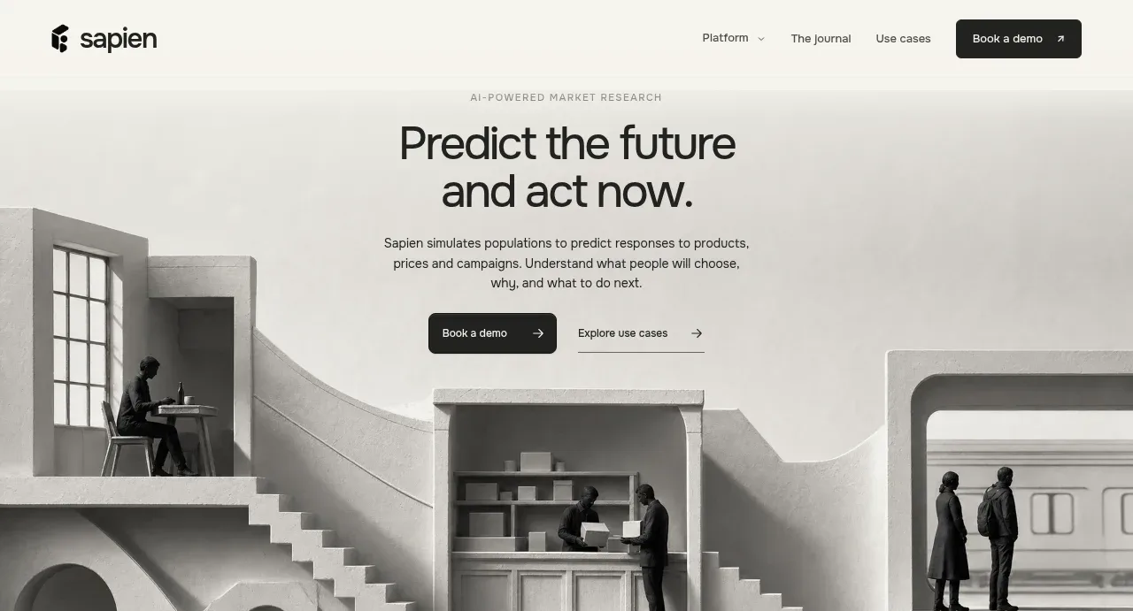 Editorial research hero
Sapien · Hero
Editorial research hero
Sapien · Hero
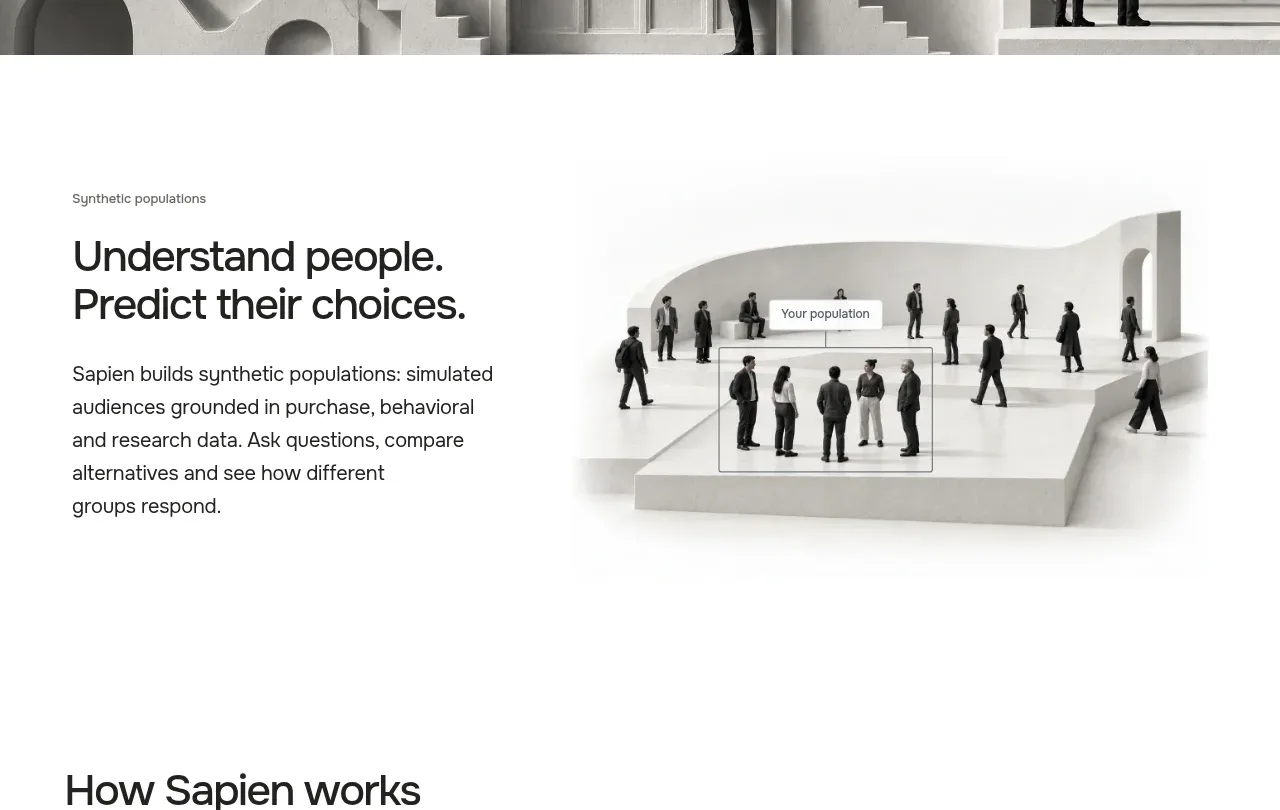 Audience explanation
Sapien · Feature grid
Audience explanation
Sapien · Feature grid
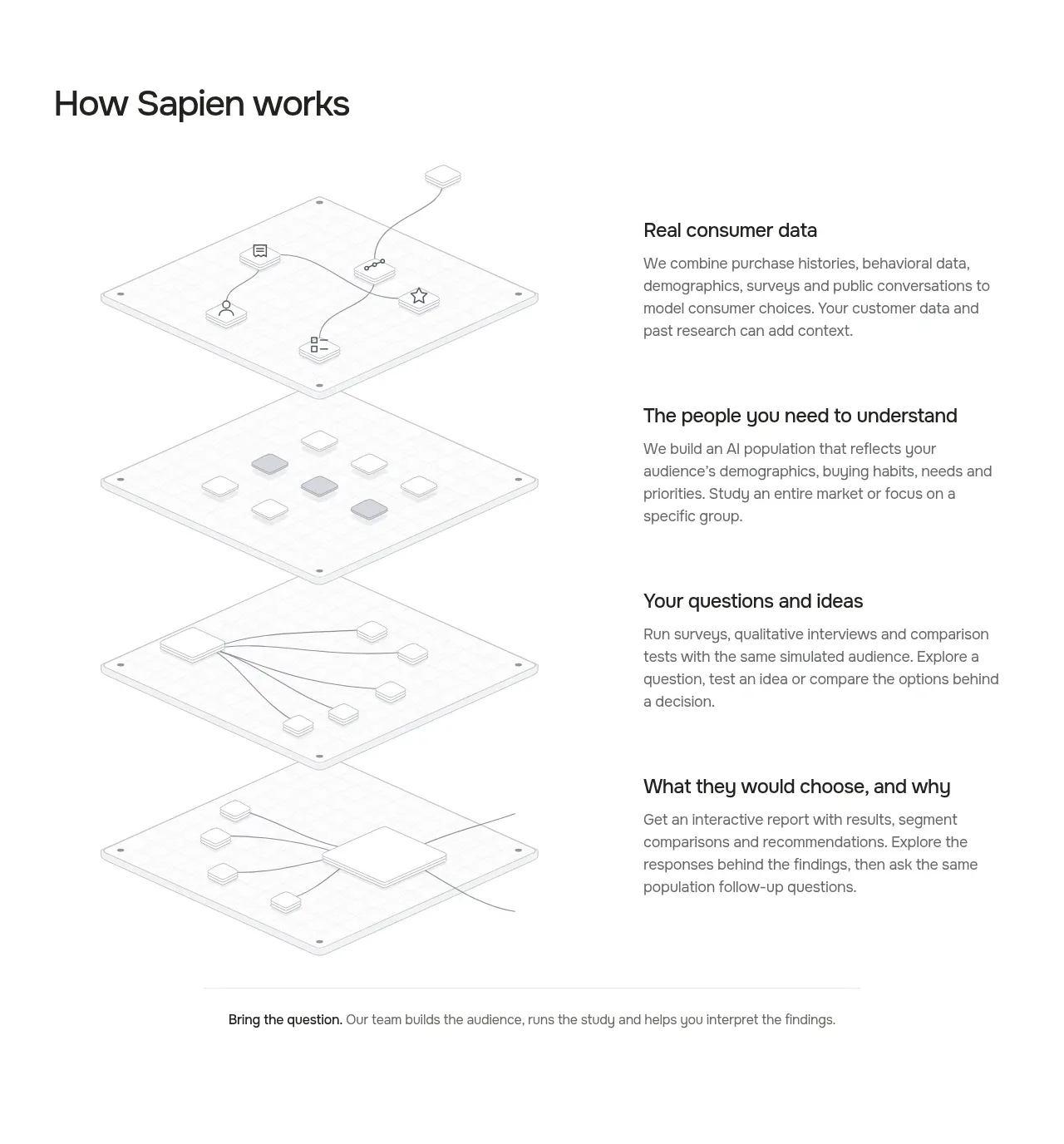 How the system works
Sapien · Feature grid
How the system works
Sapien · Feature grid
 Use-case introduction
Sapien · Feature grid
Use-case introduction
Sapien · Feature grid
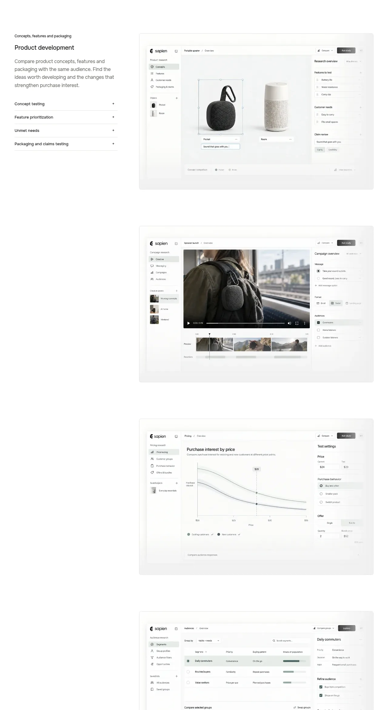 Product use-case gallery
Sapien · Gallery
Product use-case gallery
Sapien · Gallery
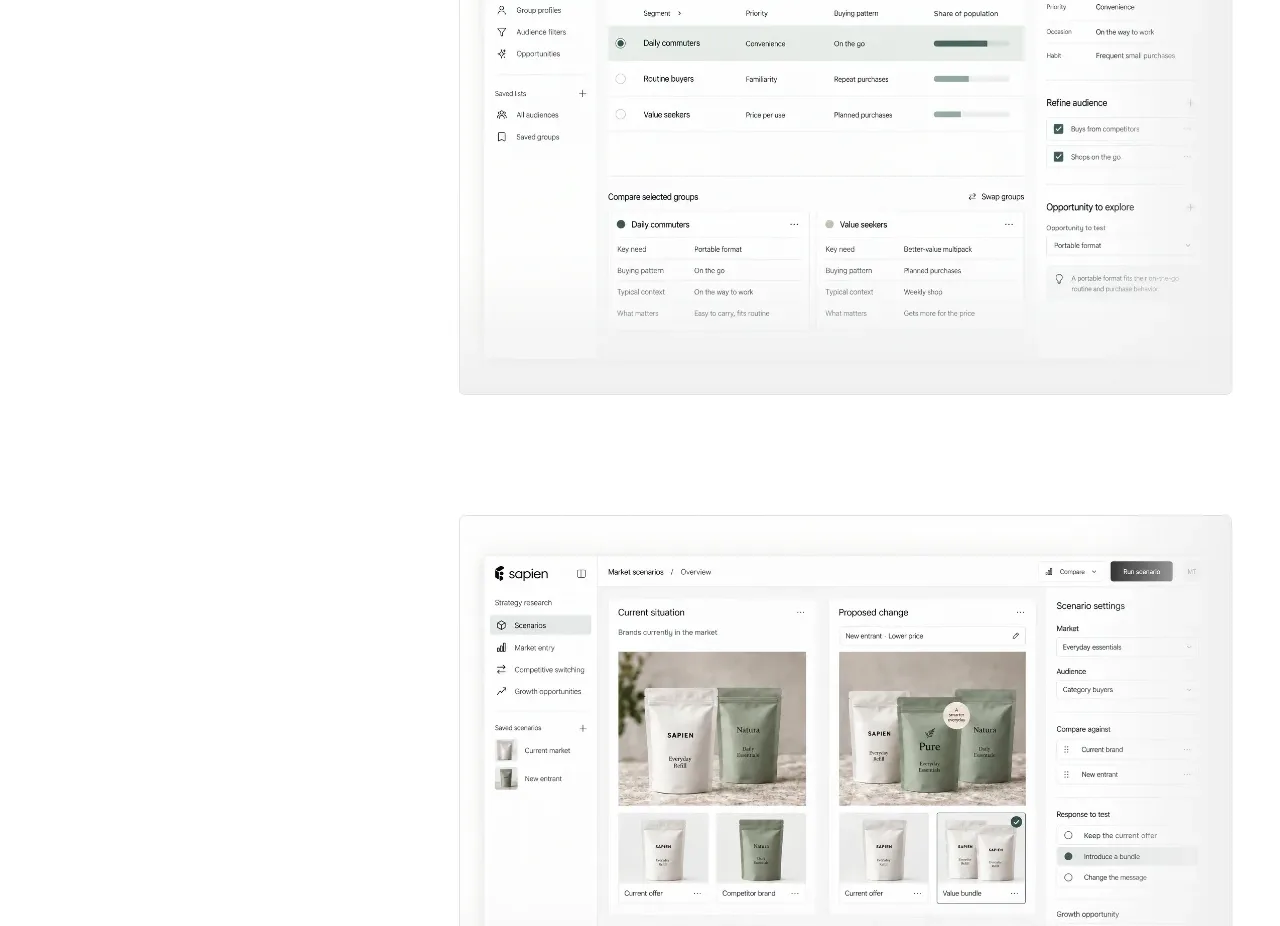 Prediction benchmark statistic
Sapien · Stats
Prediction benchmark statistic
Sapien · Stats
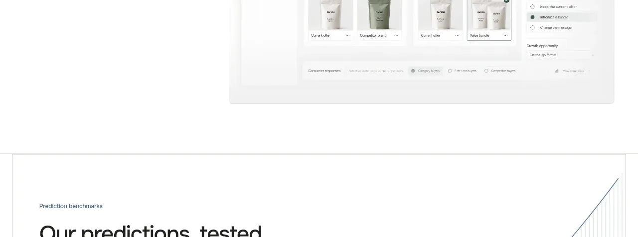 Final conversion call to action
Sapien · Call to action
Final conversion call to action
Sapien · Call to action
 Multi-column footer
Sapien · Footer
Multi-column footer
Sapien · Footer
Related designs
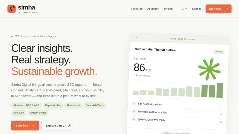

 Simha Digital
Landing page · Analytics & data
Simha Digital
Landing page · Analytics & data
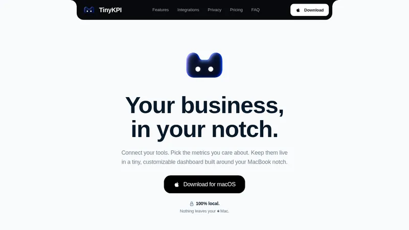

 TinyKPI
Landing page · Analytics & data
TinyKPI
Landing page · Analytics & data


 Basedash in Español Français & Português
Landing page · Analytics & data
Basedash in Español Français & Português
Landing page · Analytics & data


 AI Observability by OpenObserve
Landing page · Analytics & data
AI Observability by OpenObserve
Landing page · Analytics & data


 AdScope
Landing page · Analytics & data
AdScope
Landing page · Analytics & data


 fplxi.com
Landing page · Analytics & data
fplxi.com
Landing page · Analytics & data