 kage
kage

Design analysis
A warm off-white, editorial landing page for a macOS notch analytics app, built on a serif/sans pairing: huge high-contrast serif headlines whose second phrases drop to gray ("Made for your business. / Designed for your Mac."), over small letterspaced uppercase eyebrows and quiet gray body copy. The page alternates centred statements with split editorial sections — a numbered 01/02/03 view switcher, a category list beside a near-black dashboard mockup, a notch pill fanning out into grouped integration columns, and an interactive bento playground of resizable dark cards — each media block carrying a small caption with a hairline rule. Rhythm is airy (very generous vertical gaps) with dark UI previews supplying contrast; a single white launch-price card with a countdown and a minimal + accordion FAQ close the page before a playful two-tone outro.
Prompt preview
## Reference images

Study these alongside the description below: hierarchy, rhythm, spacing, colour. Build for the product you are asked about, using this design language.

- Full page: https://kage-design-assets.t3.tigrisfiles.io/screenshots/tinykpi/a5c6b072-2fc8-4798-bcd8-9bd0bf616d58-1789711371888-full.webp
- Above the fold: https://kage-design-assets.t3.tigrisfiles.io/screenshots/tinykpi/a5c6b072-2fc8-4798-bcd8-9bd0bf616d58-1789711368997.webp
- Design on Kage: https://kage.design/designs/tinykpi-landing-page

# Build a landing page in the "TinyKPI" design language

## Before you start
Ask the user what product they are building, who it is for, and what brand assets they already have (name, logo/mascot, colours, typefaces). Wait for the answers before writing any code. Everything below is a design system to apply to *their* product — never reproduce the reference product itself.

## Page structure
Build a single scrolling marketing page with these sections, top to bottom:

1. **Floating pill navbar** — a fully-rounded dark pill docked at the top centre containing the logo/mascot, five short text links, and a white pill CTA button. Nav is detached from the page edges and floats over the background.
2. **Hero** — centred mascot mark, then a two-line display headline, a two-sentence gray subline, one black pill CTA ("Download for macOS" style), and a one-line privacy/trust microcopy with a small lock icon.
3. **Full-bleed product media** — a large rounded (24–32px) screenshot or video block that shows the product in context (desktop, real UI), with a play affordance. Beneath it, a caption row: short tagline on the left, duration/controls hint on the right, separated by a hairline rule.
4. **Three-up feature strip** — three equal columns, each a thin line icon, a short bold title ("Quiet refreshes." pattern: two-word statements ending in a period), and two lines of gray copy.
5. **Views section** — left: uppercase eyebrow, two-tone headline ("Made for X. Designed for Y."), one gray subline. Right: a numbered tab list (01 / 02 / 03) where the active item is dark with a short blue underline and inactive items are gray. Below, a wide rounded light card holding a product screenshot with a small-caps label ("ALWAYS UP TOP"), a two-line caption at bottom left, and a small note at bottom right.
6. **Integration teaser row** — a centred row of small circular/pill tool badges, each labelled, sitting above the next section as a bridge.
7. **Split: "Your tools. One view."** — left column: eyebrow, short bold headline, gray paragraph, then a vertical list of data categories where the active one is blue with an underline and a small arrow icon. Right column: a large near-black dashboard mockup with metric tiles (big numbers, sparklines, % deltas) and a filter row (All time / 12m / 3m / 30d / Today).
8. **Integrations map** — centred eyebrow + headline + subline, then a black notch-shaped pill showing two live metrics, with thin connector lines fanning down to columns of integration icons grouped under small category labels (Revenue / Web / Product / Users / Your data). End with "Missing yours? → Request an integration" as a blue link line.
9. **Split: layout playground** — left: eyebrow, two-tone headline, copy, a "try it" link. Right: a canvas of rounded dark tiles in a bento arrangement of mixed sizes (1×1, 2×1, 2×2) showing resize handles and size labels, plus an "Add card" button and a "Reset" control. Add a footnote: "Interactive preview with example values."
10. **Privacy statement** — fully centred breather section: small lock icon, tiny "PRIVACY" eyebrow, a very large two-tone headline, and two short gray sentences. Nothing else — lots of whitespace.
11. **Pricing** — split layout. Left: eyebrow, two-tone headline ("Big picture. Small price."), copy, "Pay once" line, and a minimum OS requirement. Right: one white rounded card — small label ("Launch price"), an enormous price figure with a small currency superscript, struck-through regular price, "USD · One-time purchase" microline, black pill CTA, three tiny trust bullets, a license-recovery link, and a live countdown ("Launch price ends in …").
12. **FAQ** — centred eyebrow + headline ("Good to know."), then a single-column accordion: 16px bold questions, hairline dividers, "+" affordance on the right, answers expand/collapse.
13. **Outro** — a giant two-tone joke/tagline headline ("Refreshing Stripe doesn't count as work.") with a gray kicker line, and on the right a small icon + "Check again / Strictly for research" gag control.
14. **Footer** — light, hairline-separated: logo + wordmark left, the same five nav links centre, "Back to top ↑" right; a bottom row with © line, "My purchases", "Privacy Policy", "Terms & Conditions".

## Design language
- **Palette**: warm off-white page background `#F7F6F2`; ink near-black with a slight blue cast `#0F1319`; secondary gray for all supporting text `#8A8F96`; hairline borders `#E7E4DC`; accent royal blue `#2B63F6` used *only* for links, active states and underlines; dark UI mockups in `#0A0A0C` panels with `#17181B` tiles, white text and light-gray labels. Never place large dark blocks on the page itself except mockups — the page chrome stays light.
- **Type**: pair a high-contrast editorial serif for headlines with a neutral grotesque sans for everything else. Scale: hero `clamp(56px, 8vw, 92px)` at line-height ~1.02 with slight negative tracking; section headlines 44–56px; tile metric numbers 28–40px with tabular figures; body 15–16px / 1.6 capped at ~34–40ch; eyebrows 11px uppercase, letter-spacing 0.12em, gray. Headlines end with a period — full-sentence headlines, not fragments.
- **Two-tone headline rule**: the first sentence/phrase renders in ink, the continuation in gray (e.g. "Big picture." dark, "Small price." gray). Use it on every major headline including the outro.
- **Rhythm**: alternate centred statements (hero, privacy, FAQ, integrations map) with split 40/60 editorial sections (views, tools, layout, pricing). Vertical padding between sections ~120–160px; inside sections ~64px. Media blocks are always followed by a caption row: small text left, smaller meta right, hairline top border, generous top padding.
- **Corners & strokes**: fully-rounded pills for the nav, CTAs and the notch metric pill; 24–32px radius on section/media cards; 12–16px on inner UI tiles; 1px hairline borders on light cards. Shadows are rare and soft — rely on borders and the dark/light contrast instead.
- **Content density**: headlines huge, everything else small and quiet; metric numbers are the loudest non-headline element. Each section carries at most one idea and one visual.
- **Motion**: quiet and functional — fade-up on scroll for sections, underline/colour transitions on links, accordion expand for FAQ, a draggable/resizable bento preview where tiles show size chips, and a live ticking countdown on the price card. No parallax, no decorative animation.

## Never
- Never use the TinyKPI name, mascot/logo, tagline, FAQ questions, pricing copy, integration names list, or any of its illustrations or screenshots in the result.
- Never present the output as TinyKPI or reuse its Apple-device framing unless the user's product is genuinely a macOS app — adapt the "in context" media to the user's actual platform.
- Never ship the exact copy; write new copy in the same voice (short declarative sentences ending in periods, one idea per section).
Components from this page
All components
 Floating product navigation
TinyKPI · Navigation
Floating product navigation
TinyKPI · Navigation
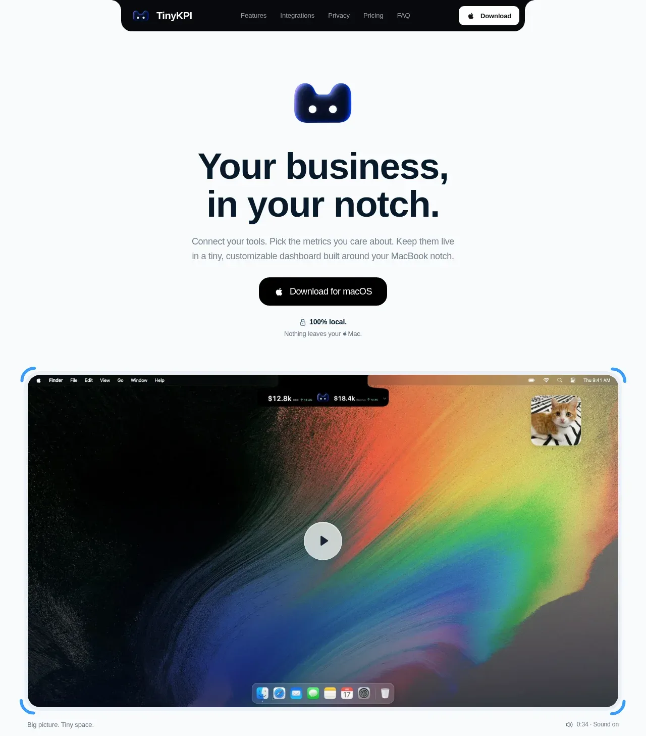 Product promise and demo hero
TinyKPI · Hero
Product promise and demo hero
TinyKPI · Hero
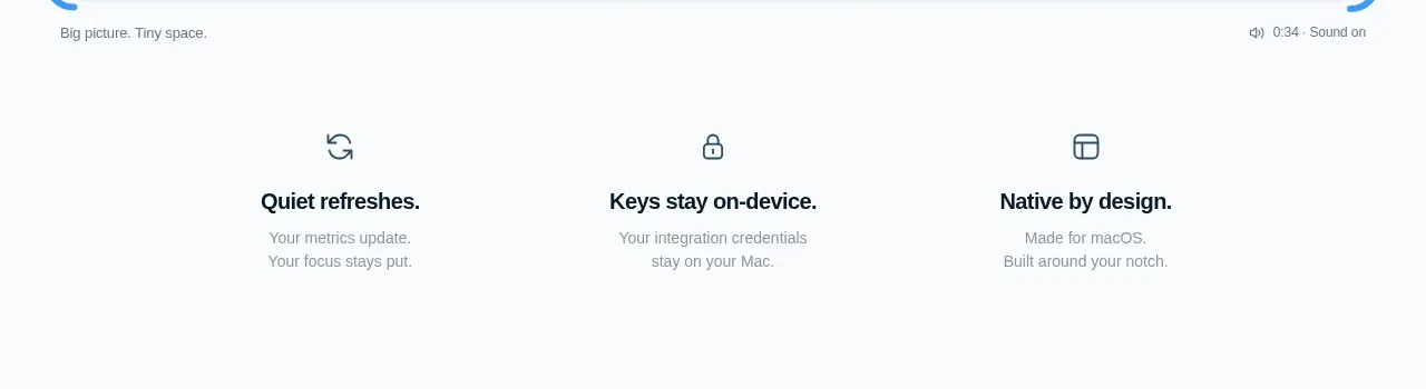 Three quiet product benefits
TinyKPI · Feature grid
Three quiet product benefits
TinyKPI · Feature grid
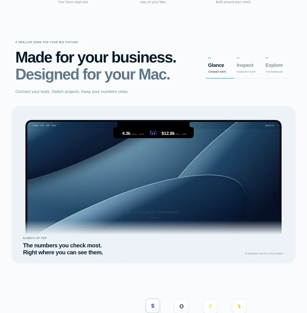 Feature showcase: glance and inspect
TinyKPI · Card
Feature showcase: glance and inspect
TinyKPI · Card
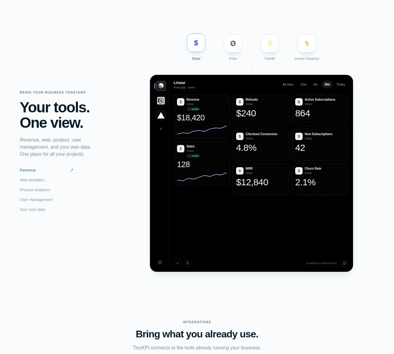 Unified dashboard feature
TinyKPI · Card
Unified dashboard feature
TinyKPI · Card
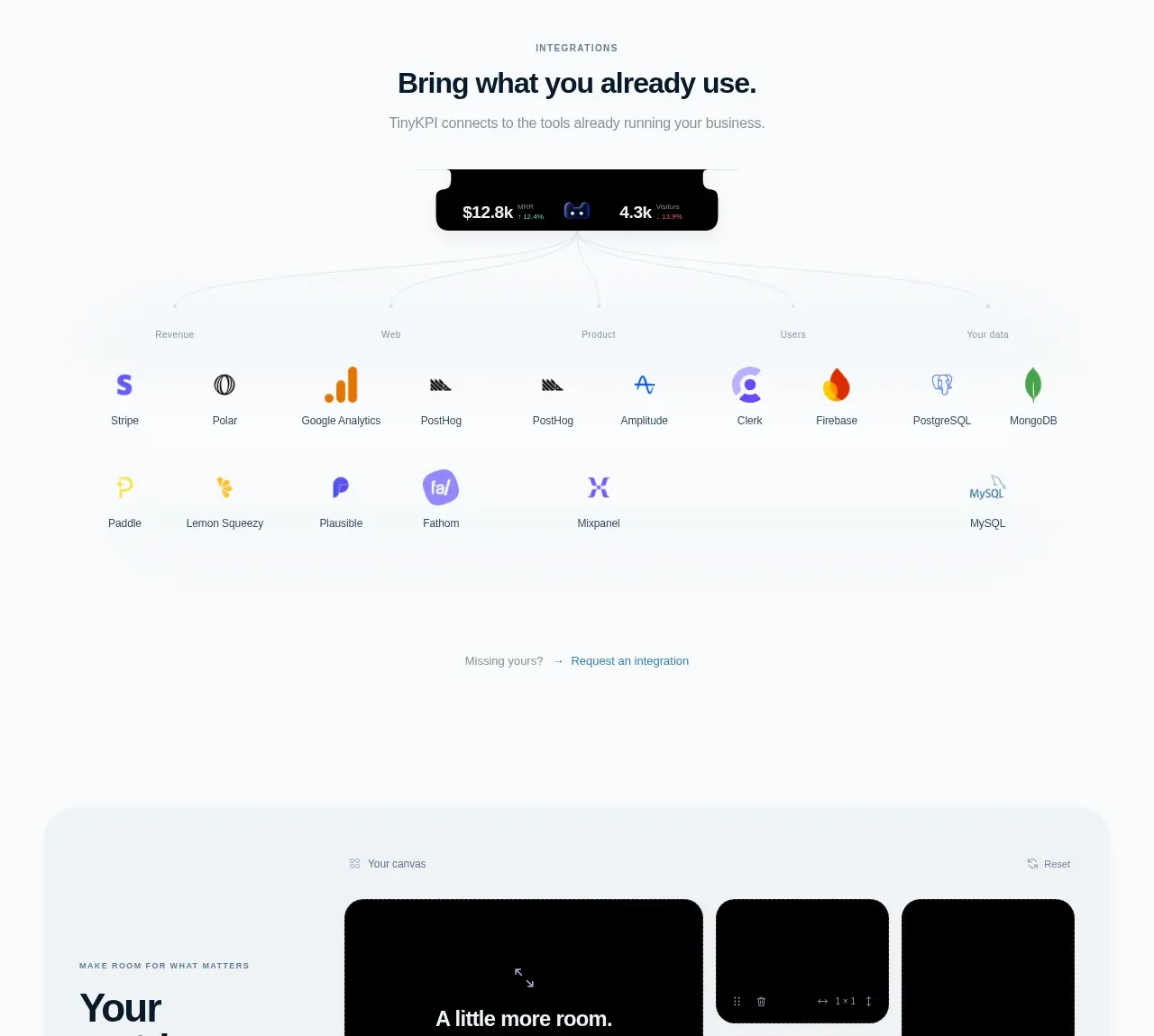 Integration ecosystem
TinyKPI · Logo cloud
Integration ecosystem
TinyKPI · Logo cloud
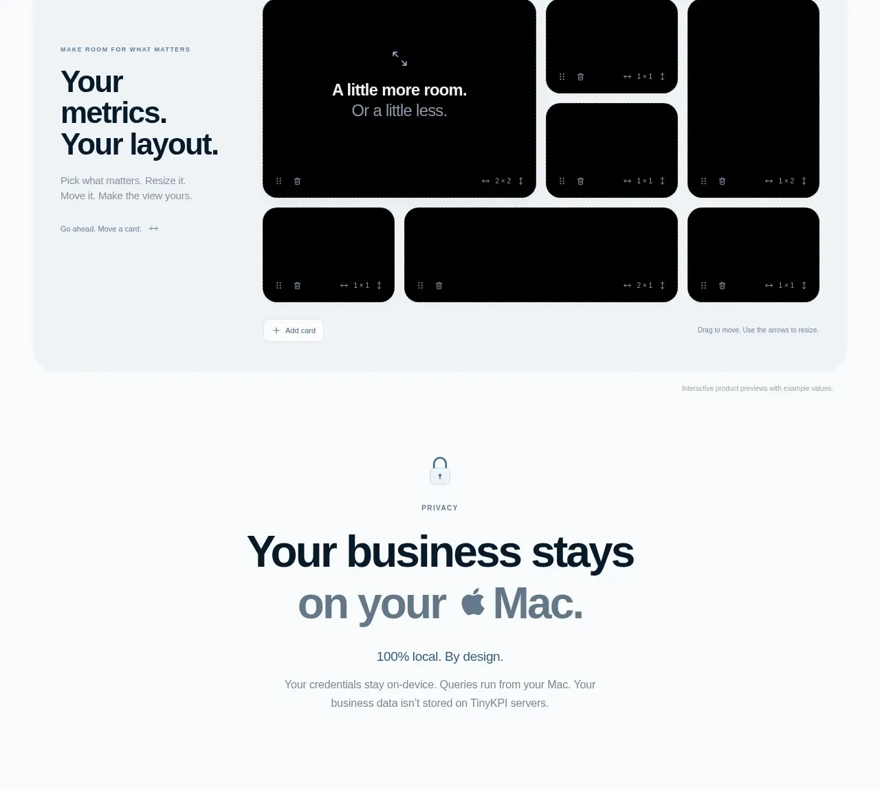 Customizable metrics canvas
TinyKPI · Card
Customizable metrics canvas
TinyKPI · Card
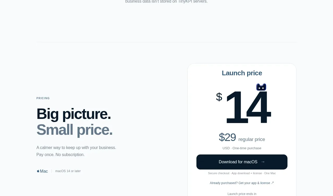 Privacy promise
TinyKPI · Call to action
Privacy promise
TinyKPI · Call to action
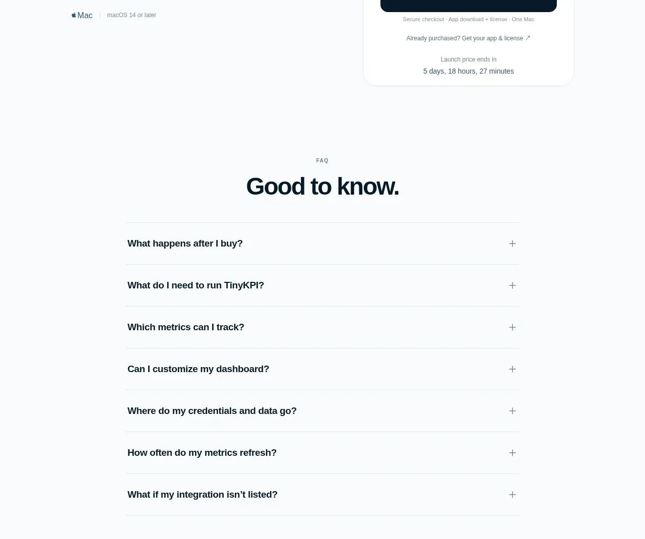 Single launch price offer
TinyKPI · Pricing table
Single launch price offer
TinyKPI · Pricing table
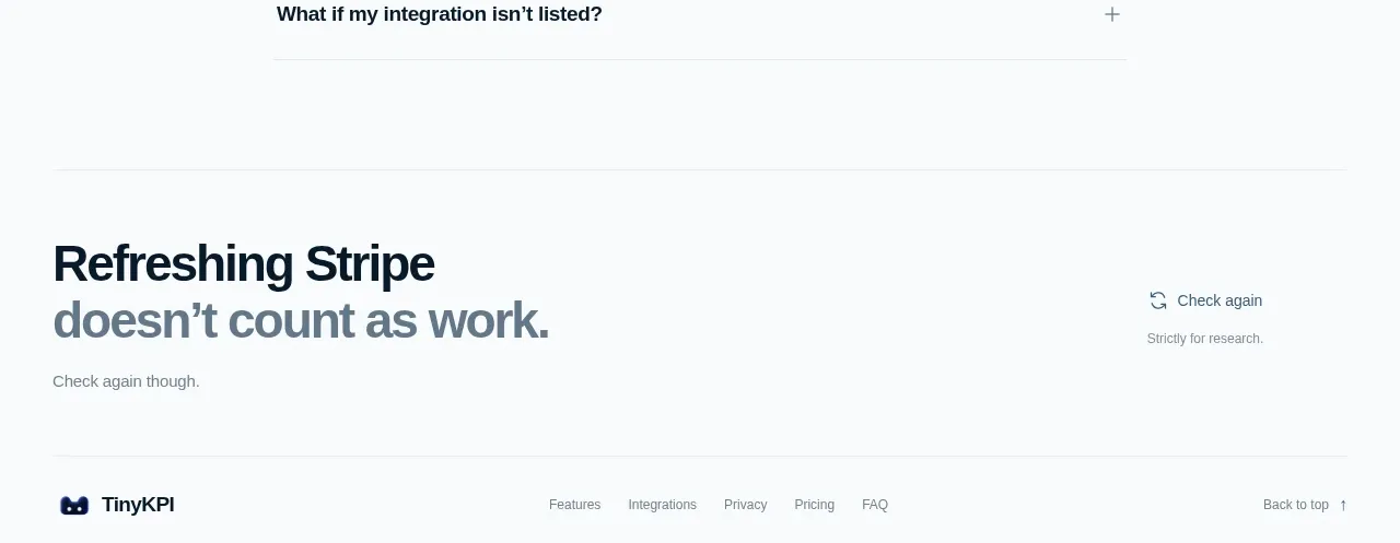 Purchase and product FAQ
TinyKPI · FAQ
Purchase and product FAQ
TinyKPI · FAQ
 Footer navigation and research note
TinyKPI · Footer
Footer navigation and research note
TinyKPI · Footer
Related designs


 Basedash in Español Français & Português
Landing page · Analytics & data
Basedash in Español Français & Português
Landing page · Analytics & data


 AI Observability by OpenObserve
Landing page · Analytics & data
AI Observability by OpenObserve
Landing page · Analytics & data


 AdScope
Landing page · Analytics & data
AdScope
Landing page · Analytics & data


 fplxi.com
Landing page · Analytics & data
fplxi.com
Landing page · Analytics & data


 posthog.com
Landing page · Analytics & data
posthog.com
Landing page · Analytics & data


 datafa.st
Landing page · Analytics & data
datafa.st
Landing page · Analytics & data